Gionee Elife E7 review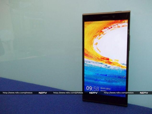

If Gionee is trying to set itself apart from low-cost Indian smartphone companies, it's doing a good job. While dozens of brands with little to no name value are busy fighting it out in the sub-Rs. 15,000 segment, Gionee has dared to try selling a phone priced above Rs. 25,000. Our market generally has a low opinion of Chinese products, even though it's well known by now that nearly all Indian smartphone companies source their devices wholesale from China. Despite this (or perhaps because of this), Gionee seems to be trying to position itself above our local brands.
The new Elife E7 uses surprisingly powerful components and delivers performance scores which rival those of products priced significantly higher. In fact, it's probably the cheapest device available with a Snapdragon 800 SoC and full-HD screen. It's exactly the kind of product that will give Gionee some real legitimacy and brand power, if it works as it should. We're going to see if Gionee has cut any corners in order to achieve this kind of low price, and whether your buying decision should be influenced by the name on the box.
Look and feel
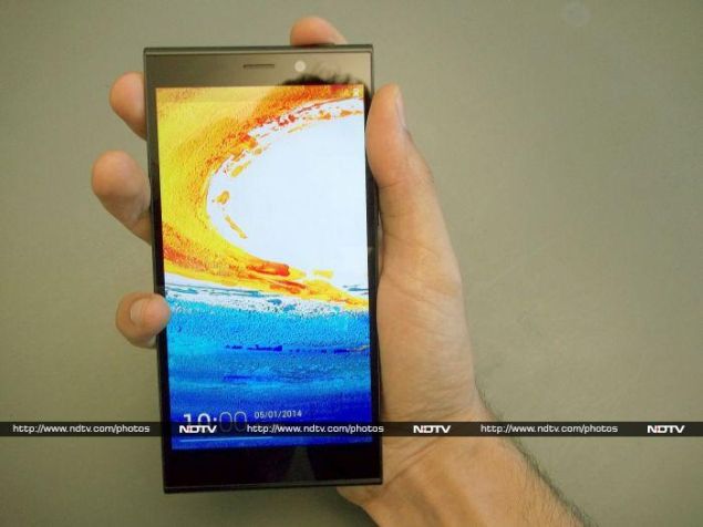
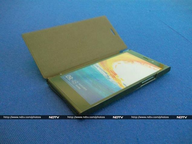
The E7 isn't bad looking at all, even if it does remind us a little bit of some of Nokia's more recent designs. The body is a single block of plastic, which in our case was a very glossy black. The plastic has an interesting granite texture, but the surface is totally flat and is almost too smooth to get a grip on.
The E7 isn't bad looking at all, even if it does remind us a little bit of some of Nokia's more recent designs. The body is a single block of plastic, which in our case was a very glossy black. The plastic has an interesting granite texture, but the surface is totally flat and is almost too smooth to get a grip on.
The front panel is predictably bare, and thankfully free of ugly branding. The capacitive buttons below the screen are completely invisible when not illuminated, which is a tiny bit of a problem for usability. Above the screen, you'll see only a small earpiece and front camera lens. The notification LED and sensors are well hidden.
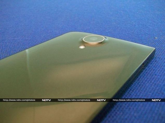
The E7's body bulges out a little at the back, and the camera lens protrudes even more. The two sides are completely flat, while the top and bottom are curved. The unibody construction is excellent, and we had no problem at all with the fit and finish of this phone. There's only one ugly part of the design: all the mandatory regulatory information such as IMEI number is printed on a sticker on the lower back of the phone. We didn't try peeling off the one on our test unit, but we hope it comes off easily so that users can really show off the E7's smooth body.
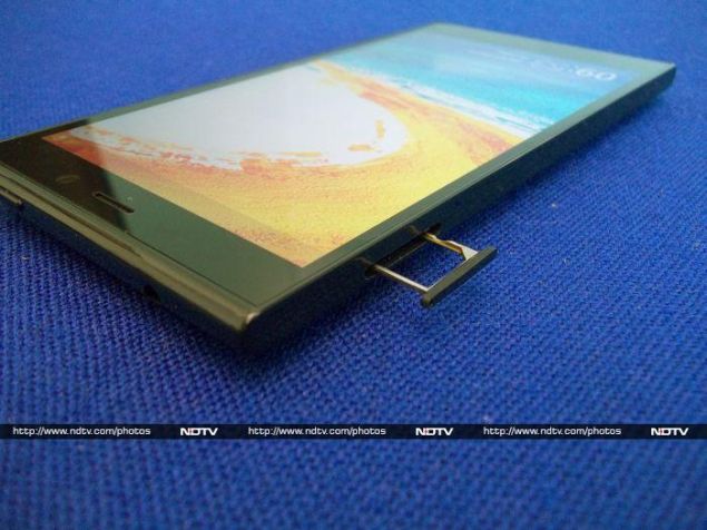
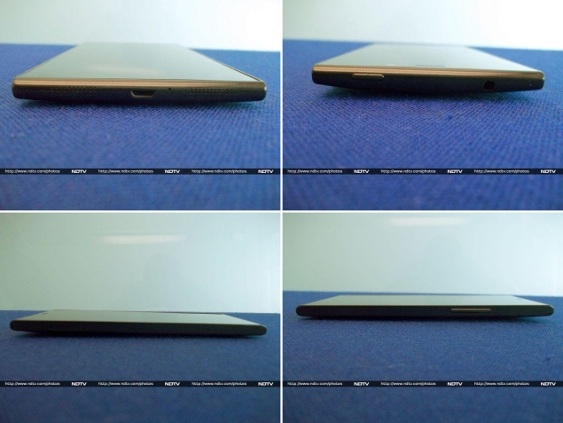
Gionee has bucked at least one current design trend, and so the power button is in its traditional place on the top panel rather than on the right, which seems to be popular on large phones today. You can use the volume down button to wake the phone from standby, which is a welcome compromise. Everything else is fairly standard: there's a volume rocker on the right edge, headset jack on top, USB port on the bottom, and SIM card tray on the left. The tray sits perfectly flush with the E7's body, and you'll need a pin to eject it.
Features and software
The Gionee Elife E7 has pretty much every major box checked when it comes to current top-end must-have features. The processor is a Qualcomm Snapdragon 800, running at up to 2.2GHz. Our test unit came with 16GB of built-in storage space and 2GB of RAM, but there's also another variant with 32GB of storage and 3GB of RAM. Considering the relatively small price difference between the two, and the fact that this phone doesn't have a microSD slot for additional space, we really can't see any reason to choose the 16GB variant over the 32GB one.
The Gionee Elife E7 has pretty much every major box checked when it comes to current top-end must-have features. The processor is a Qualcomm Snapdragon 800, running at up to 2.2GHz. Our test unit came with 16GB of built-in storage space and 2GB of RAM, but there's also another variant with 32GB of storage and 3GB of RAM. Considering the relatively small price difference between the two, and the fact that this phone doesn't have a microSD slot for additional space, we really can't see any reason to choose the 16GB variant over the 32GB one.
The screen is crisp and bright, thanks to the full-HD resolution at 5.5 inches. It is highly reflective and gets washed out a bit in sunlight unless you really raise the brightness level. Wireless is covered with Bluetooth 4.0, NFC, Wi-Fi and GPS. The battery weighs in at a hefty 2,500mAh.
The E7 is a single-SIM phone with 3G but not LTE support. That and the lack of expandable storage are the only things missing from the feature list, but considering the state of LTE in India, the 32GB variant is still highly competitive with other manufacturers' top offerings.
Our positive impressions of the E7's hardware are unfortunately diluted by its lacklustre software. The E7 runs Android 4.2.2, which by anyone's standard is behind the times. Gionee has evidently spent a lot of time and effort in customising the interface, but absolutely none of it is an improvement over stock Android. For starters, there are no home screens: you are taken directly into the app grid from the lock screen. This means that widgets are completely unavailable, except for a weather readout that stays permanently attached to the top of the screen.
From the lock screen, you can swipe left to show shortcuts to the camera, voice recorder, torch and "FakeCall" apps, which are all pretty handy. Tapping the FakeCall icon makes your phone ring after 15 seconds, with a totally genuine-looking caller ID screen (which shows a name you can set in advance). If you pick up this fake call, there's even a prerecorded woman's voice saying "Hi, can you send me the file as soon as possible, please".
Swiping up instead unlocks the phone, and the icon grid just slides into view. There's a lot of wasted space, and between the weather widget on top and dock on the bottom, there's only space for 12 icons. The dock isn't visually distinct, so it's odd to see those four icons stay put while the rest slide around when you scroll between pages. You can also swipe down from any point on the icon grid to lock the phone again.
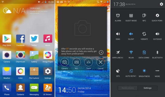
Gionee's personal touches extend to the quick settings panel in the notifications tray, which shows 15 icons that you can choose and reorder. The main settings app is oddly subdivided into two sections, Common Settings and All Settings, which seems a bit redundant. The Common settings are duplicates of entries in All Settings, of which most are the top anyway. There's also no way to search for apps or settings, and no quick access Google web search.
Quite a few apps are included, though few are genuinely useful. UC Browser is the default web browser, replacing Android's default option. Charm Cam offers a number of filters and effects which aren't of very high quality, but are fun enough to use. GioneeXender lets you create Wi-Fi mesh networks to exchange files between devices. NQ security claims to optimise your device, scan news apps and downloads, hide files and call records from spying eyes, and back up contacts.
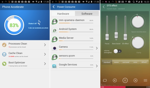
Kingsoft Office is a fairly capable app for viewing, sharing and creating documents in the popular MS Office formats. WeChat, BBM, Facebook and Twitter are preloaded for your various social needs, as are six rather low-quality games. Many of the apps have poorly translated English labels and options, especially a trio of utilities called Phone Accelerator, Power Manager and Traffic Assistant.
Overall, the E7's menu feels cluttered, and we would have liked to have been able to get rid of some of these apps. At least there are plenty of launchers in the Google Play store to replace Gionee's awful skin with.
Camera
Apart from the design and specifications, Gionee is also touting the E7's 16-megapixel camera. Gionee has used a sapphire lens; a feature Apple popularised a year or two ago. In actual use, we were blown away by the camera's quality. The photos it takes are truly outstanding, in a variety of situations and lighting conditions. Photos are richly detailed and accurate, with minimal noise. The camera also does an excellent job of detecting focus, and you can take beautiful close-ups with blurred backgrounds with no more effort than it takes to tap the screen once. We did find in some situations that the HDR mode resulted in overexposed images and exaggerated colours.
Apart from the design and specifications, Gionee is also touting the E7's 16-megapixel camera. Gionee has used a sapphire lens; a feature Apple popularised a year or two ago. In actual use, we were blown away by the camera's quality. The photos it takes are truly outstanding, in a variety of situations and lighting conditions. Photos are richly detailed and accurate, with minimal noise. The camera also does an excellent job of detecting focus, and you can take beautiful close-ups with blurred backgrounds with no more effort than it takes to tap the screen once. We did find in some situations that the HDR mode resulted in overexposed images and exaggerated colours.
Video recording was much the same, with great quality and the ability to dramatically shift focus with a tap anywhere on screen. The E7 defaults to 720p, though 1080p is available in the settings menu. There's also an anti-shake option, though Gionee hasn't mentioned what kind of image stabilisation is at play. You can only zoom in and out by pinching with two fingers on screen, so that's bound to make the phone shake.

(Click to see full size)
The front camera is also pretty impressive, though you don't get the same sort of deep focus ability, and video recording tops out at 720p. 8 megapixels is far better than most cameras offer on their front cameras, so those who love taking selfies will be more than happy.
The default camera app has a pretty basic set of features, so you might want to try third-party alternatives which will let you get even more out of the excellent optics. Apart from a creative options panel, there isn't much you can do in terms of manually adjusting settings. The bundled CharmCam app offers a few filters and special effects, but nothing really worth getting excited over.

(Click to see full size)
Performance
There doesn't seem to be much the Gionee Elife E7 cannot do. It blew through all our benchmark tests, with performance only slightly trailing that of the Sony Xperia Z1 Compact. Both phones share roughly the same specifications, but the Z1 Compact's lower-res screen is easier to drive.
There doesn't seem to be much the Gionee Elife E7 cannot do. It blew through all our benchmark tests, with performance only slightly trailing that of the Sony Xperia Z1 Compact. Both phones share roughly the same specifications, but the Z1 Compact's lower-res screen is easier to drive.
We managed to achieve 22.8fps in GFXbench, and 3Dmark reported "Maxed out", the highest possible score in both, the regular and Extreme Ice Storm scenarios. You'll be comfortable playing most of today's most immersive graphics-heavy games, not just the simple puzzles and runners that others with lesser phones are restricted to.
AnTuTu came in with an impressive 33,686 points, while Quadrant returned 20,246 points overall. Only the browser-based JavaScript tests, SunSpider and Kraken, reported poor scores. We can't pinpoint a single reason for this, due to the variable nature of testing conditions and the fact that the E7's default browser is UC Browser.
As expected, we had no problem whatsoever playing HD videos. Audio quality was decent, but the built-in speaker is not especially loud or clear. The custom Music app offers a DTS effects panel and you can tweak parameters such as 3D effect, Focus, Clarity and Space Reverberation individually, or just choose from five presets. You'll need really good earphones to really feel any difference these settings might make.
Another impressive aspect of the E7's performance was its battery life. We managed to eke out just over nine hours' worth of movie playback time in our loop test. Gionee doesn't seem to have done a good job calibrating the battery, since it reported its remaining capacity as 1 percent for an extraordinarily long time, which meant at least in our case that the phone lasted much longer than it projected it would.
Verdict
There's a lot to like about the Gionee E7. It has a fantastic camera, great screen, top-end performance, and a battery that didn't let us down. The price is also quite unbelievably low - so low, in fact, that we have no problem recommending the more powerful 32GB variant over the base 16GB one.
There's a lot to like about the Gionee E7. It has a fantastic camera, great screen, top-end performance, and a battery that didn't let us down. The price is also quite unbelievably low - so low, in fact, that we have no problem recommending the more powerful 32GB variant over the base 16GB one.
Gionee is also quite aggressive about its plans for India, and that includes a huge network of service centres, eventually. So what it comes down to, finally, is the name. Gionee isn't anywhere near as well established as Samsung, Sony, Nokia or LG, so spending nearly Rs. 30,000 will feel like a bit of a risk even if the value proposition is this good.
If you're in two minds about trusting an unknown manufacturer, there's always the Samsung Galaxy S4, which has now fallen in price, and the Google Nexus 5, which comes with stock Android 4.4. It's also quite likely that last year's other flagships, such as the HTC One, will also drop to this price level soon. The S4 offers expandable storage and the Nexus has far better software, but the Gionee Elife E7 is still a better rounded package.
We hope that Gionee does build a strong sales and service network in India. The E7 is fantastic value for money now, and sets the stage for more premium offerings in the future.

Gionee Elife E7 in pictures


 .
.
0 comments:
Post a Comment