Google reveals new logo and redesigned navigation bar

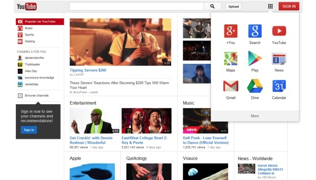
It looks like Google is getting rid of the black navigation bar it places on its sites and introducing a new menu which looks like the Chrome app launcher placed upside down.
According to Google Plus Daily, the drop down launcher will offer nine popular Google services, namely Google+, Search, YouTube, Maps, Play, News, Gmail, Drive and Calendar in a 3x3 grid each represented by the icon and name of the service. The launcher also has a More button at the bottom clicking on which will make eight other Google services -Translate, Books, Offers, Wallet, Shopping, Blogger, Finance and Photos - appear.
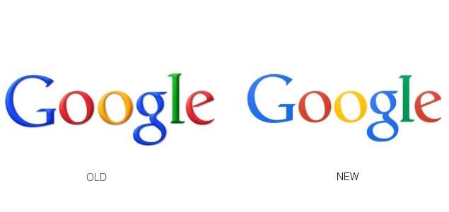
Update: Google has officially confirmed the changes coming to the navigation bar via a blog post and also given a glimpse at its new logo. The company also confirmed that both the changes will be rolling out worldwide gradually.
 Earlier, a screenshot of the new navigation bar was posted
by Google+ Help community member, Gerson Castaneda, following which
Google+ Community Manager, Justine Rivero acknowledged that the new menu
will roll out over the next few weeks.
Earlier, a screenshot of the new navigation bar was posted
by Google+ Help community member, Gerson Castaneda, following which
Google+ Community Manager, Justine Rivero acknowledged that the new menu
will roll out over the next few weeks.As a screenshot in the report points out, a message saying "Welcome to the new way to find your favorite Google products. Click the grid to have a look" will be displayed under the app launcher button.
The new launcher is visually appealing and features different Google services as apps rather than offering them as hyperlinks placed on the top of the page in an omnipresent black navigation bar. It's also a much more minimalistic way of putting a link to all Google services while the user is accessing one of them.
However, one of the disadvantages of this launcher is that a lot of users might not realise it's even there as the app grid is hidden till the user clicks on the launcher button.
It would also be the first time that even YouTube will display the Google navigation bar. The video sharing service currently doesn't feature the black navigation bar seen on other Google services.
As per Google Plus Daily, the new navigation launcher has been in testing for almost half a year with Google Operating system, a Google focused third-party website receiving the first screenshots of the launcher in February.
However, it's worth pointing out that Google had tried to implement a similar menu called Google menu, replacing the black Google bar, in November 2011. But the lack of positive feedback lead to its removal and Google placed all service shortcuts on the black bar in February 2012.


 .
.
0 comments:
Post a Comment