1 "TAKE NO AS A QUESTION "

Wednesday, 9 April 2014

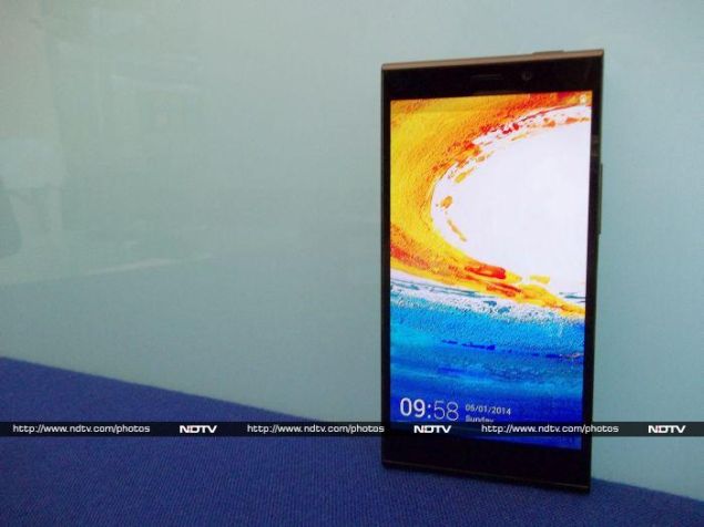
HP Slate6 VoiceTab review
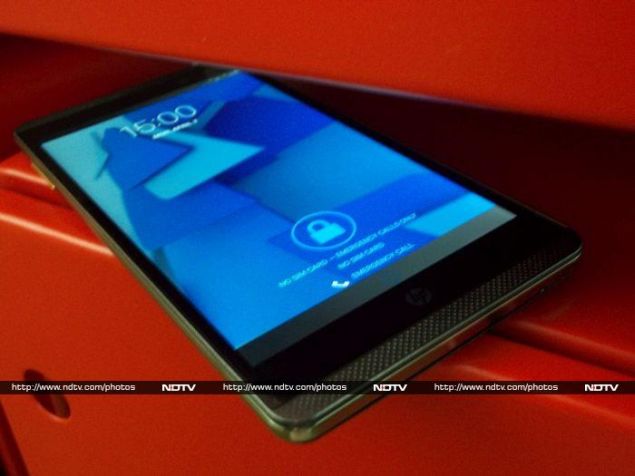
HP Slate6 VoiceTab reviewHP_Slate6_VoiceTab_Cover2_Ndtv.jpg

In a television commercial, Bollywood actress Deepika Padukone talks about how she manages to pursue two passions - acting and badminton - at the same time despite naysayers who believe it is impossible. Later, she introduces the HP Slate6 VoiceTab and says it does something similar by performing the functions of both a smartphone and a tablet. One might find the commercial cheesy but we find the communication effective.
HP's marketing spiel wants us to believe that they are introducing a pioneering new device category, but of course HP isn't the first OEM to introduce a six-inch phablet. Nearly every manufacturer today has aspirations of tapping into a market craving for big-screened smartphones.
Revolutionary or not, this oddly-sized device faces tough competition in its price range. A full review might help quash doubts about how the VoiceTab fares against heavyweights in this category.
HP_Slate6_VoiceTab_Hand_Ndtv.jpg
Look and Feel
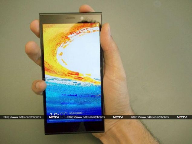
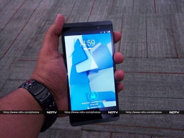
The ergonomic tradeoff of a six-inch device is always a point of contention for prospective buyers. TheSlate6 has a thin bezel, which works to its advantage. The Slate6 is also strikingly thin at 8.98mm. But the device isn't exactly what you'd call pocket friendly, and you'll need to use both hands for most basic tasks.
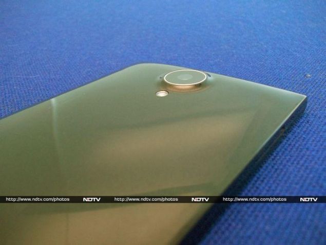
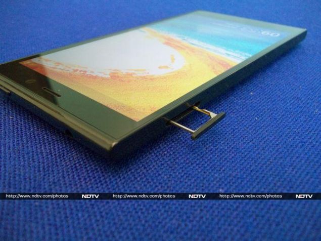
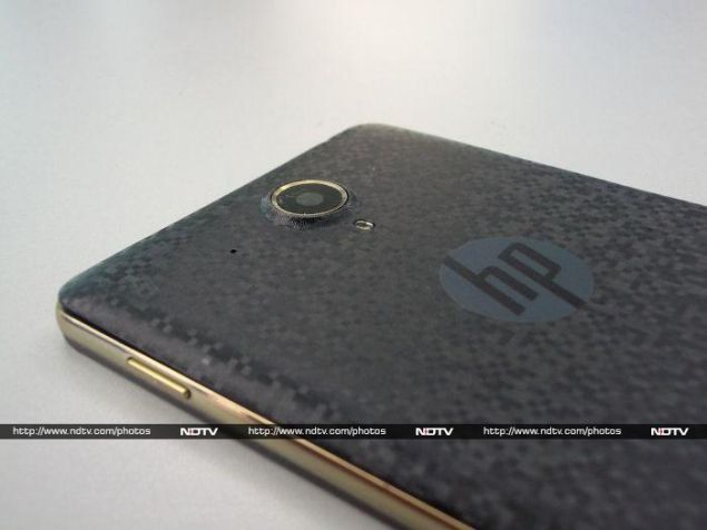
The rear cover is made of plastic and has a mosaic design. The HP logo sits right below the 5MP camera and flash on the rear. The name of the device - Slate6 - is so subtle against the mosaic print that it feels as though HP doesn't want us to read it. The device doesn't provide a firm grip and is somewhat slippery. The mechanism that is used to open the rear cover is similar to Samsung's smartphones. Once open, we can see a huge 3000mAh battery, a slot for the memory card, and two SIM card slots; one mini and one micro.
HP_Slate6_VoiceTab_Top_bottom_left_right_Ndtv.jpg
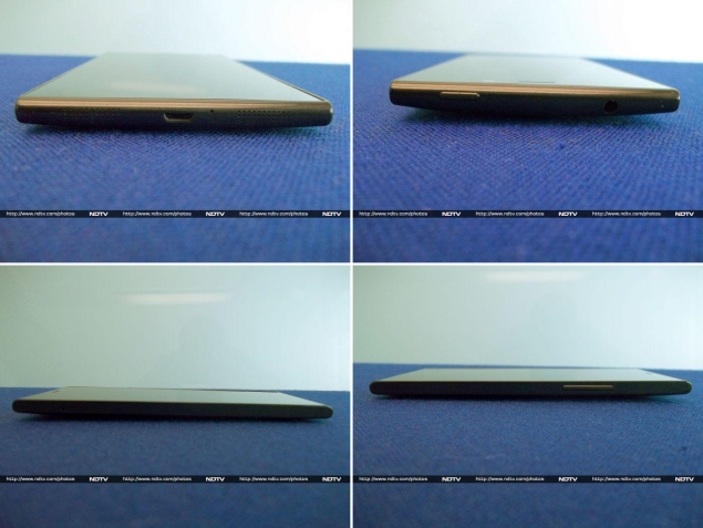
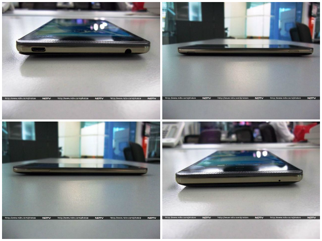
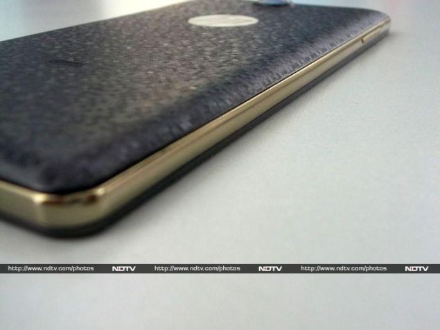
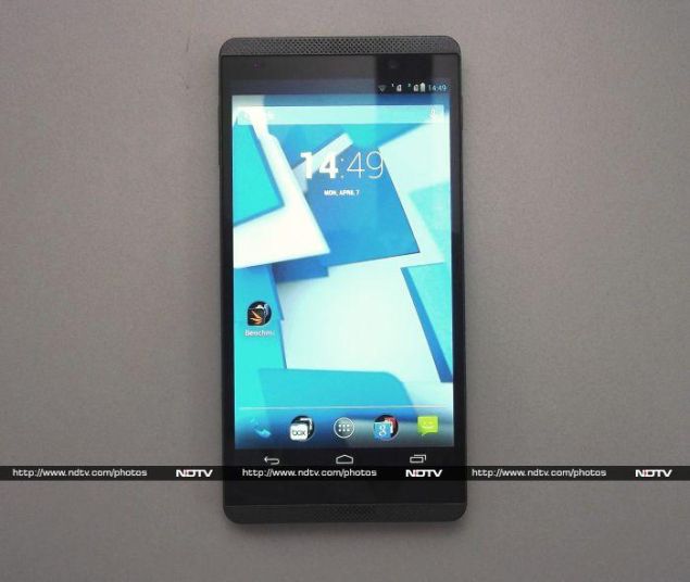
The rather grey and somber front of the Slate6 has the six-inch screen with onscreen buttons made popular by the Galaxy Nexus and Android 4.0 ICS. Right above the screen is a front-facing camera and the proximity sensor. Also flanking the top and bottom of the LCD are front-facing speakers. The bottom seems bare, until you notice a miniscule hole for the microphone. The top has space for a 3.5mm jack and a Micro-USB port for charging and data transfer. A rather unusual dull gold trim runs around the edge of the device. The left and right edges house the volume rocker and power button respectively.
HP's Slate6 is definitely a looker and managed to grab attention with its flashy rear cover, but its size might put a few people off. Moreover, the device flexes at the slightest pressure, which doesn't bode well for its construction quality.
HP_Slate6_VoiceTab_Gold_Border_Ndtv.jpg
Features and Specifications
It is always advisable to keep expectations in check with a mid-range device. Unfortunately for OEMs today, the price-to-performance ratio of devices like the Moto G leads users to expect the moon from any device priced above Rs. 15,000.
The Slate6 features a Marvell PXA1088 quad-core processor clocked at 1.2 GHz and a Vivante GC1000 GPU (also found in the Samsung Galaxy Tab 3). For storage, the Slate6 offers 16GB of internal storage and support for microSD cards up to 32GB in capacity. Additionally, HP bundles 25GB of online storage from Box.com, which is valid for life. HP has fitted the Slate6 with a 5MP rear camera with flash, and the front-facing one is a 2MP unit. Both cameras are capable of recording video at 720p resolution. 
HP_Slate6_VoiceTab_Camera_Ndtv.jpg
Both SIM cards on the Slate6 can connect to 2G networks on the 850/900/1800/1900 bands. There is no LTE connectivity but HP provides 3G for high-speed internet connectivity. We were slightly disappointed by the older Bluetooth 3.0 specification. There are a few sensors, including an accelerometer, gyro, proximity sensor, and compass.
The HP Slate6's screen is a 720p panel. This means the pixel density is around 245ppi. Even at maximum brightness, the screen is dull. There is a perceptible yellow tinge to the whites, which is especially obvious when browsing web pages. The viewing angles are below par as the screen dims the moment you hold it at an angle of more than 45 degrees.
HP_Slate6_VoiceTab_Front_Ndtv.jpg
Software
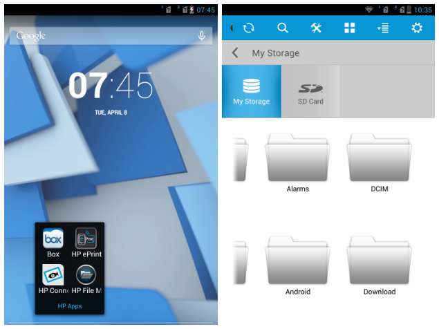
We are fans of vanilla Android, and any device without unnecessary customisation will provide a smooth experience. Most OEMs that fork Android to add their own customisation layer tend to make it either ugly or bloated. We have to give HP brownie points for not fiddling with Android, but the fact that it's the older version 4.2 Jellybean on the Slate6 is also disappointing.
When HP launched this phone in the market initially, there were a few performance issues which have since been rectified with a software update. We downloaded it and it worked. For the most part, the operating system is smooth except when opening apps. 
HP_Slate6_VoiceTab_Screenshot1_Ndtv.jpg
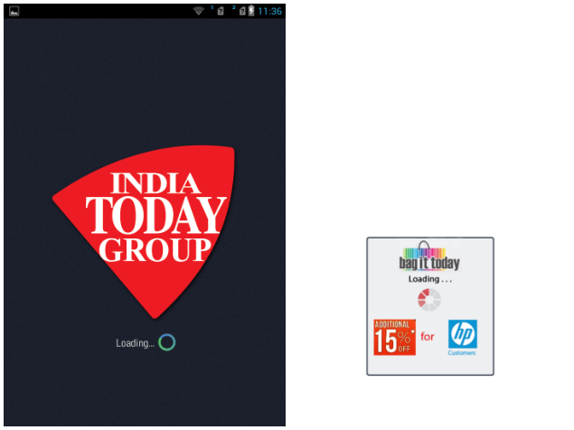
For people interested in this device, there are a few perks that HP bundles in the form of exclusive offers, such as a free three-month India Today subscription, travel vouchers worth Rs. 5,100 on MakeMyTrip, and a 15 percent discount on in-app purchases made using the Bag It Today app. HP also bundles the Kingsoft Office suite with the Slate6, which is definitely a useful addition.
The Slate6 also features a few additional HP apps, such as HP Connected Music, HP e-Print, HP Connected Photo and HP File Manager. We tried HP File Manager a couple of times but it was sluggish almost to the point of being unusable, thanks to an unnecessarily flashy interface.
HP_Slate6_VoiceTab_Screenshot2_Ndtv.jpg
Camera
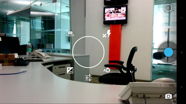
There is no special camera app bundled with the Slate6. The default Android app is barebones with respect to features, but it works.
The performance of the 5MP camera indoors was a pleasant surprise. We were happy to see photographs came out with neutral colours that weren't overblown. The situation takes an odd turn when we tried it out in daylight. The green leaves in our daylight shots merged into each other, leading to a loss of detail in some photographs. Low-light performance was below par and unusable. Also, the camera seems to have an issue focusing on the right area.
HP_Slate6_VoiceTab_camera_app_Ndtv.jpg
Videos are saved in 3gp format. Despite being recorded at 720p, videos are almost unusable. There is a very evident colour spill in moving objects, and the level of detail captured isn't great either. The 2MP front camera only works decently under good light. Overall, the cameras are a mixed bag.
IMG_20130101_055752.jpg
(Click to see full size)
Performance
Most Android devices these days boast of at least a quad-core processor. However, that's no guarantee of performance. In day-to-day usage, the Marvell processor inside the Slate6 felt sluggish while opening apps. Our benchmark results corroborated this impression.
AnTuTu returned a score of 11,207 while the Slate6 scored a low 3,534 overall in our Quadrant benchmark. Devices priced much lower perform better. HP's choice of processor is the culprit. Moreover, the Vivante GC1000 is a non-performer. Don't expect the Slate6 to run any graphically intensive games. The GFXbench score was an abysmal 5.1fps. In fact, we ran it thrice just to confirm the results. Adding to our woes was the below average 3DMark score of 3,054. Browser tests didn't fare any better - the SunSpider score was 1,686ms and Browsermark 2.0 returned a score of 1,927.
HP_Slate6_VoiceTab_Box_Ndtv.jpg
Surprisingly, HP pulls a rabbit out of the hat with the Slate6's video performance. To our complete surprise, the default video player played all the files we threw at it without any artefacting or skipping frames. This includes our heaviest 1080p video encoded at 40mbps. It doesn't play .avi files out of the box. The chinks in the armor are the dual front-facing speakers, which are soft and not very clear. HP doesn't bundle earphones with the Slate6. We used our own reference headset and were generally impressed with the quality of audio. 
HP_Slate6_VoiceTab_video_Ndtv.jpg
The 3,000mAh battery under the hood lasted for 6 hours, 33 minutes in our continuous video loop test. This is a mediocre result, and users will need to charge the device at least once a day.
Verdict
Proponents of big-screen devices - a large majority today - always argue that watching videos is a great experience and typing on a larger keyboard is easier. We find it difficult to recommend this device even to them. Yes, it plays most video formats out of the box, but so will the Sony Xperia T2 Ultra and the Gionee Elife E7. The latter has a 5.5-inch screen and is a powerhouse device packing a top end Snapdragon 800 under its hood. Considering the competition, quite frankly, you can easily give the HP Slate6 VoiceTab a miss. And no amount of insistence by Ms. Padukone can change that fact. 

HP Slate6 VoiceTab in pictures

HP Slate6 VoiceTab

Rs. 22990
  • Design
  • Display
  • Software
  • Performance
  • Battery life
  • Camera
  • Value for money
  • Good
  • Decent camera
  • Vanilla Android experience
  • Good video playback quality
  • Bad
  • Dismal graphics performance
  • Average battery performance
  • Sub-par build quality


Hi guys If u like this post please leave a comment in comment box... comment box will top right of every post and bottom of every post. its useful for me give a better information.. check top of the blog there is menu bar in that go to comments i replied for u r comments because there is no direct option for reply for u r comments. if u want to give any suggestion in bottom of blog there is contact information option please leave a msgs with u r mail id sure i will get u.


Gionee Elife E7 review

Gionee Elife E7 reviewGionee_Elife_E7_vertical_ndtv.jpg

If Gionee is trying to set itself apart from low-cost Indian smartphone companies, it's doing a good job. While dozens of brands with little to no name value are busy fighting it out in the sub-Rs. 15,000 segment, Gionee has dared to try selling a phone priced above Rs. 25,000. Our market generally has a low opinion of Chinese products, even though it's well known by now that nearly all Indian smartphone companies source their devices wholesale from China. Despite this (or perhaps because of this), Gionee seems to be trying to position itself above our local brands.
The new Elife E7 uses surprisingly powerful components and delivers performance scores which rival those of products priced significantly higher. In fact, it's probably the cheapest device available with a Snapdragon 800 SoC and full-HD screen. It's exactly the kind of product that will give Gionee some real legitimacy and brand power, if it works as it should. We're going to see if Gionee has cut any corners in order to achieve this kind of low price, and whether your buying decision should be influenced by the name on the box.
Gionee_Elife_E7_hand_ndtv.jpg
Look and feel
The E7 isn't bad looking at all, even if it does remind us a little bit of some of Nokia's more recent designs. The body is a single block of plastic, which in our case was a very glossy black. The plastic has an interesting granite texture, but the surface is totally flat and is almost too smooth to get a grip on.
The front panel is predictably bare, and thankfully free of ugly branding. The capacitive buttons below the screen are completely invisible when not illuminated, which is a tiny bit of a problem for usability. Above the screen, you'll see only a small earpiece and front camera lens. The notification LED and sensors are well hidden.
Gionee_Elife_E7_rear_ndtv.jpg
The E7's body bulges out a little at the back, and the camera lens protrudes even more. The two sides are completely flat, while the top and bottom are curved. The unibody construction is excellent, and we had no problem at all with the fit and finish of this phone. There's only one ugly part of the design: all the mandatory regulatory information such as IMEI number is printed on a sticker on the lower back of the phone. We didn't try peeling off the one on our test unit, but we hope it comes off easily so that users can really show off the E7's smooth body.
Gionee has bucked at least one current design trend, and so the power button is in its traditional place on the top panel rather than on the right, which seems to be popular on large phones today. You can use the volume down button to wake the phone from standby, which is a welcome compromise. Everything else is fairly standard: there's a volume rocker on the right edge, headset jack on top, USB port on the bottom, and SIM card tray on the left. The tray sits perfectly flush with the E7's body, and you'll need a pin to eject it.
Gionee_Elife_E7_tray_ndtv.jpg
Features and software
The Gionee Elife E7 has pretty much every major box checked when it comes to current top-end must-have features. The processor is a Qualcomm Snapdragon 800, running at up to 2.2GHz. Our test unit came with 16GB of built-in storage space and 2GB of RAM, but there's also another variant with 32GB of storage and 3GB of RAM. Considering the relatively small price difference between the two, and the fact that this phone doesn't have a microSD slot for additional space, we really can't see any reason to choose the 16GB variant over the 32GB one.
The screen is crisp and bright, thanks to the full-HD resolution at 5.5 inches. It is highly reflective and gets washed out a bit in sunlight unless you really raise the brightness level. Wireless is covered with Bluetooth 4.0, NFC, Wi-Fi and GPS. The battery weighs in at a hefty 2,500mAh.
The E7 is a single-SIM phone with 3G but not LTE support. That and the lack of expandable storage are the only things missing from the feature list, but considering the state of LTE in India, the 32GB variant is still highly competitive with other manufacturers' top offerings.
Gionee_Elife_E7_sides_ndtv.jpg
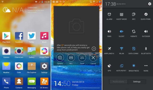
Our positive impressions of the E7's hardware are unfortunately diluted by its lacklustre software. The E7 runs Android 4.2.2, which by anyone's standard is behind the times. Gionee has evidently spent a lot of time and effort in customising the interface, but absolutely none of it is an improvement over stock Android. For starters, there are no home screens: you are taken directly into the app grid from the lock screen. This means that widgets are completely unavailable, except for a weather readout that stays permanently attached to the top of the screen.
From the lock screen, you can swipe left to show shortcuts to the camera, voice recorder, torch and "FakeCall" apps, which are all pretty handy. Tapping the FakeCall icon makes your phone ring after 15 seconds, with a totally genuine-looking caller ID screen (which shows a name you can set in advance). If you pick up this fake call, there's even a prerecorded woman's voice saying "Hi, can you send me the file as soon as possible, please".
Swiping up instead unlocks the phone, and the icon grid just slides into view. There's a lot of wasted space, and between the weather widget on top and dock on the bottom, there's only space for 12 icons. The dock isn't visually distinct, so it's odd to see those four icons stay put while the rest slide around when you scroll between pages. You can also swipe down from any point on the icon grid to lock the phone again.
Gionee_Elife_E7_customUI_ndtv.jpg
Gionee's personal touches extend to the quick settings panel in the notifications tray, which shows 15 icons that you can choose and reorder. The main settings app is oddly subdivided into two sections, Common Settings and All Settings, which seems a bit redundant. The Common settings are duplicates of entries in All Settings, of which most are the top anyway. There's also no way to search for apps or settings, and no quick access Google web search.
Quite a few apps are included, though few are genuinely useful. UC Browser is the default web browser, replacing Android's default option. Charm Cam offers a number of filters and effects which aren't of very high quality, but are fun enough to use. GioneeXender lets you create Wi-Fi mesh networks to exchange files between devices. NQ security claims to optimise your device, scan news apps and downloads, hide files and call records from spying eyes, and back up contacts.
Gionee_Elife_E7_customUI2_ndtv.jpg
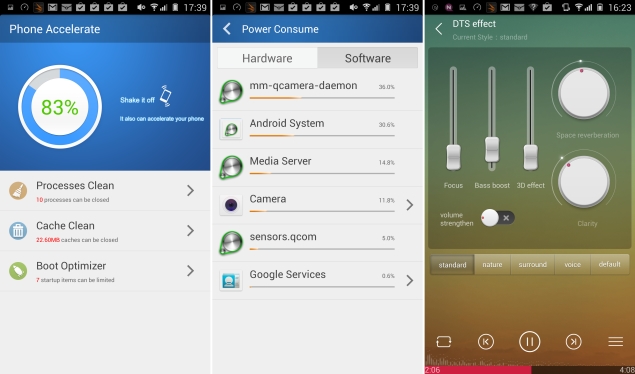
Kingsoft Office is a fairly capable app for viewing, sharing and creating documents in the popular MS Office formats. WeChat, BBM, Facebook and Twitter are preloaded for your various social needs, as are six rather low-quality games. Many of the apps have poorly translated English labels and options, especially a trio of utilities called Phone Accelerator, Power Manager and Traffic Assistant.
Overall, the E7's menu feels cluttered, and we would have liked to have been able to get rid of some of these apps. At least there are plenty of launchers in the Google Play store to replace Gionee's awful skin with.
Camera
Apart from the design and specifications, Gionee is also touting the E7's 16-megapixel camera. Gionee has used a sapphire lens; a feature Apple popularised a year or two ago. In actual use, we were blown away by the camera's quality. The photos it takes are truly outstanding, in a variety of situations and lighting conditions. Photos are richly detailed and accurate, with minimal noise. The camera also does an excellent job of detecting focus, and you can take beautiful close-ups with blurred backgrounds with no more effort than it takes to tap the screen once. We did find in some situations that the HDR mode resulted in overexposed images and exaggerated colours.
Video recording was much the same, with great quality and the ability to dramatically shift focus with a tap anywhere on screen. The E7 defaults to 720p, though 1080p is available in the settings menu. There's also an anti-shake option, though Gionee hasn't mentioned what kind of image stabilisation is at play. You can only zoom in and out by pinching with two fingers on screen, so that's bound to make the phone shake.
Gionee_Elife_E7_camsample1.jpg
(Click to see full size)
The front camera is also pretty impressive, though you don't get the same sort of deep focus ability, and video recording tops out at 720p. 8 megapixels is far better than most cameras offer on their front cameras, so those who love taking selfies will be more than happy.
The default camera app has a pretty basic set of features, so you might want to try third-party alternatives which will let you get even more out of the excellent optics. Apart from a creative options panel, there isn't much you can do in terms of manually adjusting settings. The bundled CharmCam app offers a few filters and special effects, but nothing really worth getting excited over.
Gionee_Elife_E7_camsample2.jpg
(Click to see full size)
Performance
There doesn't seem to be much the Gionee Elife E7 cannot do. It blew through all our benchmark tests, with performance only slightly trailing that of the Sony Xperia Z1 Compact. Both phones share roughly the same specifications, but the Z1 Compact's lower-res screen is easier to drive.
We managed to achieve 22.8fps in GFXbench, and 3Dmark reported "Maxed out", the highest possible score in both, the regular and Extreme Ice Storm scenarios. You'll be comfortable playing most of today's most immersive graphics-heavy games, not just the simple puzzles and runners that others with lesser phones are restricted to.
AnTuTu came in with an impressive 33,686 points, while Quadrant returned 20,246 points overall. Only the browser-based JavaScript tests, SunSpider and Kraken, reported poor scores. We can't pinpoint a single reason for this, due to the variable nature of testing conditions and the fact that the E7's default browser is UC Browser.
Gionee_Elife_E7_coverangle_ndtv.jpg
As expected, we had no problem whatsoever playing HD videos. Audio quality was decent, but the built-in speaker is not especially loud or clear. The custom Music app offers a DTS effects panel and you can tweak parameters such as 3D effect, Focus, Clarity and Space Reverberation individually, or just choose from five presets. You'll need really good earphones to really feel any difference these settings might make.
Another impressive aspect of the E7's performance was its battery life. We managed to eke out just over nine hours' worth of movie playback time in our loop test. Gionee doesn't seem to have done a good job calibrating the battery, since it reported its remaining capacity as 1 percent for an extraordinarily long time, which meant at least in our case that the phone lasted much longer than it projected it would.
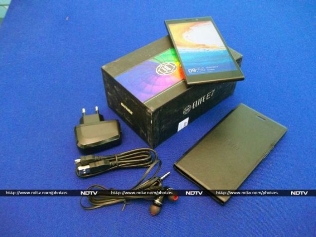
Gionee_Elife_E7_box_ndtv.jpg
Verdict
There's a lot to like about the Gionee E7. It has a fantastic camera, great screen, top-end performance, and a battery that didn't let us down. The price is also quite unbelievably low - so low, in fact, that we have no problem recommending the more powerful 32GB variant over the base 16GB one.
Gionee is also quite aggressive about its plans for India, and that includes a huge network of service centres, eventually. So what it comes down to, finally, is the name. Gionee isn't anywhere near as well established as SamsungSonyNokia or LG, so spending nearly Rs. 30,000 will feel like a bit of a risk even if the value proposition is this good.
If you're in two minds about trusting an unknown manufacturer, there's always the Samsung Galaxy S4, which has now fallen in price, and the Google Nexus 5, which comes with stock Android 4.4. It's also quite likely that last year's other flagships, such as the HTC One, will also drop to this price level soon. The S4 offers expandable storage and the Nexus has far better software, but the Gionee Elife E7 is still a better rounded package.
We hope that Gionee does build a strong sales and service network in India. The E7 is fantastic value for money now, and sets the stage for more premium offerings in the future.

Gionee Elife E7 in pictures
Gionee Elife E7

Rs. 26999
  • Design
  • Display
  • Software
  • Performance
  • Battery life
  • Camera
  • Value for money
  • Good
  • Fantastic camera
  • Top-end specifications
  • Good battery life
  • Good screen
  • Bad
  • Awful custom Android skin
  • 16GB variant has less RAM and slower CPU than 32GB variant
Read detailed Gionee Elife E7 review


Hi guys If u like this post please leave a comment in comment box... comment box will top right of every post and bottom of every post. its useful for me give a better information.. check top of the blog there is menu bar in that go to comments i replied for u r comments because there is no direct option for reply for u r comments. if u want to give any suggestion in bottom of blog there is contact information option please leave a msgs with u r mail id sure i will get u.


cloudGOO lets you consolidate Dropbox, Google Drive, and other cloud storage

cloudGOO lets you consolidate Dropbox, Google Drive, and other cloud storagecloudGOO.jpg

Thanks to free giveaways, most of us probably have a couple of GB in Dropbox, and a free account in Box, not to mention OneDrive and Google Drive accounts, to make the most of all that free cloud storage, right?
The problem, at least for this reporter, is managing all those different accounts. It sounds like a lot of free space at first, but once you start syncing photos from your phone, uploading your comic books collection or filling it with movies from... backing up your DVD collection, each account gets filled up pretty fast. There's a lot of free space if you look at all the different accounts available, but keeping track of what is saved where very quickly becomes a nightmare. It's easier to just pay Dropbox $9.99 a month (approximately Rs. 600) or $99.99 for a year, and get 100GB of storage.
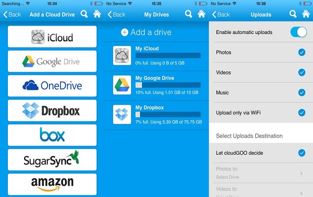
That's where cloudGOO comes in. Available as an app for both Android (Rs. 59.88) and iOS (Rs. 60), cloudGOO lets you connect all your cloud drives together, and then access them as a single drive. This means that instead of 2GB here and 10GB there, you can connect all the free accounts available and access over 100GB from a single app on your phone or tablet.
You don't even have to install each app individually, and then connect them all to cloudGOO - instead you log into them via the cloudGOO app and start using them right away. The app supports a number of cloud storage providers, such as iCloud, Google Drive, OneDrive, Dropbox, Box, SugarSync and Amazon Cloud Drive. It uses APIs from the other providers so it's not storing your credentials for the other accounts anywhere, and it figures out the best places to save the files for you.
There are other solutions like Jolicloud, which lets you manage multiple cloud storage providers, but the difference is that you have to decide where you're saving files, and the search function also handles one provider at a time.
With cloudGOO on the other hand, the search is universal across your accounts, and it also has a simple graphical interface to help you find documents, or photos, or movies, or music. The logic of how it decides where to save the files isn't really clear, but as long as you have the app, you can quickly find the files you want, so it doesn't really matter.
There is one downside which is worth pointing out - cloudGOO doesn't have its own desktop client. When you're saving files from your computer, you'll still have to go to the individual cloud storage providers that you're using directly. Aside from that, there's no way to see where the file has been saved by cloudGOO, which can be a bit of a problem if you want to find files outside of the app. However, as long as you stay inside the app, there's no problem.
According to the listing on the Play store, the current pricing is an introductory discount, but from what we've seen, it's well worth paying a dollar for, instead of ten times as much, on a monthly basis, for paid storage.


Hi guys If u like this post please leave a comment in comment box... comment box will top right of every post and bottom of every post. its useful for me give a better information.. check top of the blog there is menu bar in that go to comments i replied for u r comments because there is no direct option for reply for u r comments. if u want to give any suggestion in bottom of blog there is contact information option please leave a msgs with u r mail id sure i will get u.


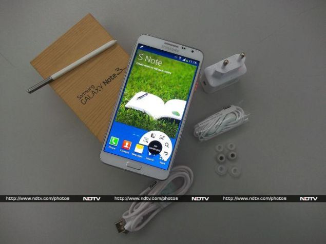
Samsung Galaxy Note 3 Neo review

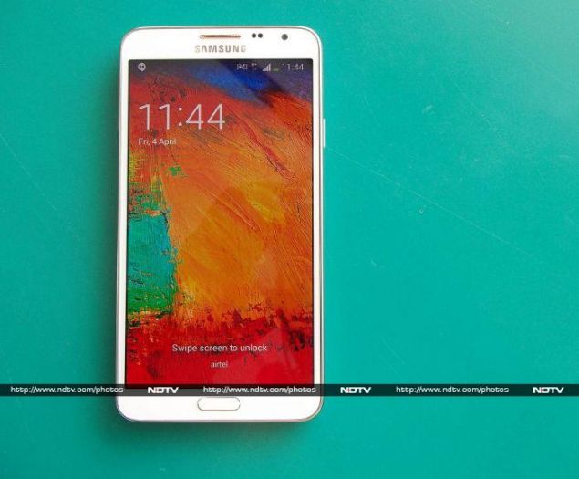
Samsung Galaxy Note 3 Neo reviewSamsung_Galaxy_Note3_Neo_Cover_NDTV.jpg

Late last year, a video showcasing the prototype of a modular phone - Phonebloks - circulated virally around the Web. The idea of a phone that can be whatever you want it to be definitely met with approval, and we might soon see it turn into reality, thanks to Motorola.
Samsung seems to have the same goal, but its approach has been to create a new model for every possible need. Did we hear someone enquiring about a smartphone with a 5.1-inch screen and top-of-the-line specs? We have the Galaxy S4/S5 for you. No? Do you want a slightly bigger screen with a full-HD display and a stylus? Take a look at the Galaxy Note 3. You think that's too expensive but don't mind a slight compromise on the screen resolution and camera specifications? Enter its younger sibling - the Galaxy Note 3 Neo.
For the uninitiated, this cacophony of device names might be unnerving. Did we mention there is also a Samsung Galaxy Note 3 Neo Duos? Now, while we are at the topic of bewildering monikers, check this out.
The Neo is slimmer and sleeker than its namesake, and Samsung is also blowing its trumpet about the hexacore processor housed inside the device. Is the younger sibling rough around the edges? How is the performance compared to the Note 3 which is slightly more expensive? Is there a single redeeming feature for us to recommend the Note 3 Neo? Read on to find out.
Samsung_Galaxy_Note3_Neo_Front1_NDTV.jpg
Look and Feel
This 'lite' edition also has the faux leather plastic back with a distinctive stitch design running across the border akin to its elder sibling. The Neo feels comfortable to hold if you have big hands, but it isn't too comfortable for single-handed operation. Reaching the top of the screen with your thumb is bound to be a hassle.
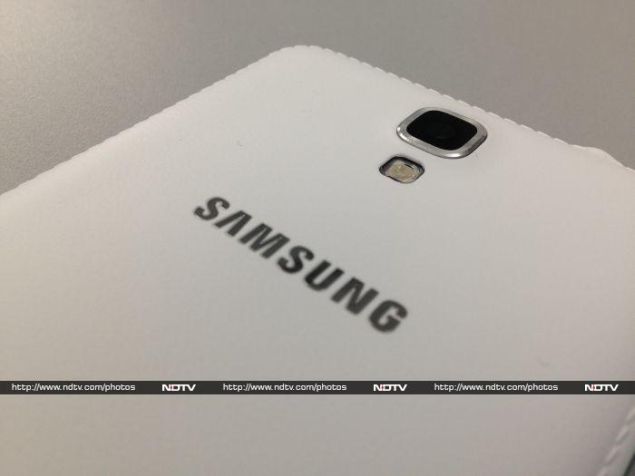
Looking at it from the back, the camera and flash modules sit on top of the Samsung logo running across the breadth of the device. Removing the rear cover reveals the removable 3100mAh battery, a slot for the SIM card, and another one for the microSD memory card. It is interesting to note that the NFC module is a part of the battery.
Samsung_Galaxy_Note3_Neo_Camera_NDTV.jpg
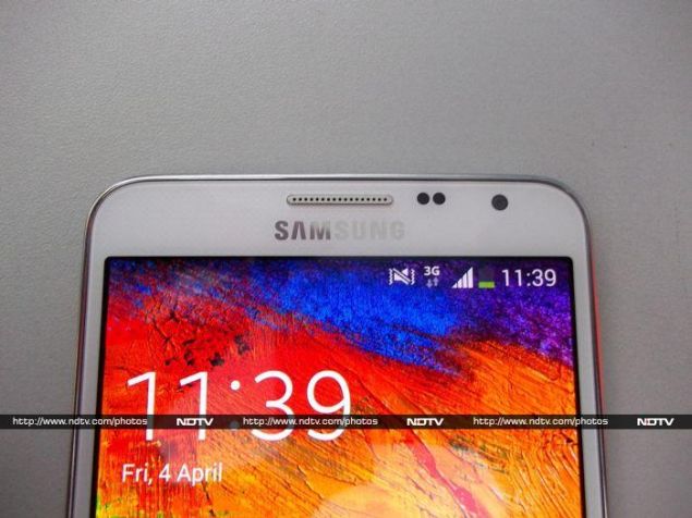
We reviewed the alluring white edition and it is definitely a dust magnet. However, the Neo is also available in classic black and cool mint (which looks rather bland). This phablet has a single physical button for the home function which is flanked on either side by the back (right) and menu (left) buttons. Right above the screen is the earpiece grille. To its right are the proximity and light sensors, and the front camera module. To its left, you can see a discreet (almost invisible) notification LED. A bit too cramped in our opinion.
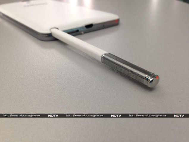
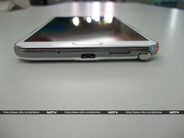
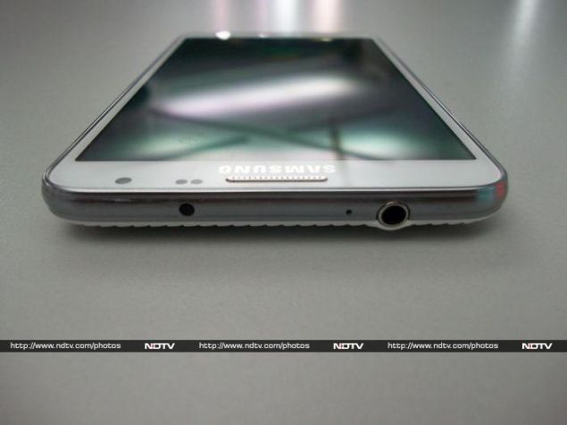
A chrome trim runs around the border, which houses most of the buttons and ports. The left edge has a volume rocker and the power button sits on the right edge, which is great for accessibility considering the size of the device (we're looking at you, HTC). The bottom is the busiest, with the Micro-USB charging/data port, speaker grille, microphone, and enclosure for the S Pen stylus. The top is also crowded, with the 3.5mm jack, extra microphone for the speakerphone, and an infrared LED.
The oft-used statement 'don't judge a book by its cover' holds true in the case of the Neo, since the faux leather might give it a premium look. Once we pry open the rear cover, it is unmistakably and unapologetically plastic. Despite this, the Galaxy Note 3 Neo is a sturdy device with no signs of flex. 
Samsung_Galaxy_Note3_Neo_Fronttop_NDTV.jpg
Features and Specifications
The USP of this Samsung phablet is the hexacore processor, which includes a quad-core Cortex A7 clocked at 1.3 GHz and a dual-core 1.7GHz Cortex A15, supported by a Mali T-624 graphics subsystem. The Neo has 16GB of internal memory and supports up to 64GB more using a MicroSD card. Two gigabytes of RAM are available for the user, which is a gigabyte less than on the Note 3. The rear camera is an 8MP variant (again stripped down from the Note 3's 13MP) with flash and there's also a 2MP front-facing camera capable of capturing 1080p video for those long Skype sessions.
Coming to the connectivity, Samsung has all bases covered, with 2G, 3G, LTE (no support for 2.3GHz band, though), GPS, Wi-Fi 802.11 a/b/g/n/ac, NFC, and Bluetooth 4.0. Moreover, Samsung has added a multitude of sensors including an accelerometer, gyro, proximity sensor and compass.
Since the Neo is supposed to be a stripped down version of the Galaxy Note 3, Samsung has made a compromise on the screen, which is a 5.5 inch 720p Super AMOLED capacitive touch panel. It translates to a pixel density of approximately 267 per inch. Despite being a PenTile screen, it isn't bad by any stretch of the imagination. In fact, the accurate colour reproduction and impressive viewing angles are an advantage. The screen also has Gorilla Glass 3 for protection just like the Note 3, which should allow it to handle a few scratches.
Samsung_Galaxy_Note3_Neo_Stylus1_NDTV.jpg
Software
Colourful wallpapers and icons are standard for TouchWiz - Samsung's custom UI on top of all its Android (4.3 Jellybean, in this case) devices. It is garish, loud, cartoonish, and we are no strangers to it anymore. Nothing's changed in the case of the Galaxy Note 3 Neo.
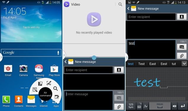
The Neo carries forward all the software embellishments Samsung introduced with the Note 3. The most interesting of the lot is Air Command, which uses the S Pen (capacitive stylus) exclusive to the Note series. Basically, the moment you detach the S Pen, you'll see a semi-circular wheel of commands on screen. Using the S Pen, the user can select any of the following tools: Action Memo, Scrapbooker, Screen Write, S-Finder and Pen Window. Except for Pen Window which is used to launch apps compatible with Samsung's multitasking scheme, the rest of the features seem to have limited value. Still, we noted that the S Pen works better than any stylus in the market.
A few other features like Smart Stay, Smart Scroll and Smart Pause are present too. They work occasionally, but using Smart Scroll, for example, appeared to bystanders as though we were performing advanced neck exercises.
Samsung_Galaxy_Note3_Neo_Screenshot1_NDTV.jpg
Samsung provides a panel of applications that the can run on screen simultaneously, and we found ourselves using this quite often, especially when we wanted to watch a video and do other little things such as sending a text message alongside.
TouchWiz offers a plethora of options in the notification panel and frankly, despite looking messy, it is indeed functional. Also, Samsung's default keyboard includes a number row on top of the QWERTY layout which is handy. Another nifty addition is the handwriting-to-text feature on the keyboard that works like a charm.
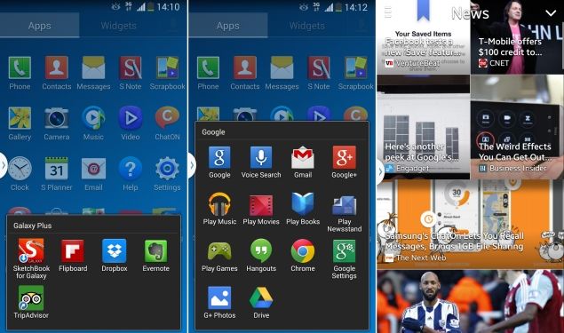
Users can find the regular set of Google apps, including Chrome, bunched up in a folder. We can always expect Samsung to fill their devices with bloatware, and they don't disappoint in the case of the Neo. Here is the laundry list: Samsung Apps, Samsung ChatON, Samsung WatchON, Samsung Link, Screen Mirroring, S Voice, S Health, Group Play, Story Album, and S Translator.
Samsung also bundles Evernote, Dropbox, Flipboard and Tripadvisor with the device. The apps are placed in a folder called Galaxy Plus. Samsung teams up with Flipboard for content syndication for the Magazine app and tries to emulate the functionality of HTCs Blinkfeed, which in itself shares design ideologies with Flipboard. The user can swipe from the bottom of the screen to pull up Magazine.
Samsung's idea is to give the user plenty of choice, but these apps are a part of the core system, and there's no easy way to delete them.
Samsung_Galaxy_Note3_Neo_Screenshot2_NDTV.jpg
Camera
Samsung's Note series of phablets tend to deliver great camera results. In the case of the Note 3 Neo, Samsung has bumped down the rear camera's specification compared to the Note 3, which incidentally has one of the best smartphone cameras on the market today. This model features an 8MP rear shooter compared to the 13MP one on its elder sibling, and a 2MP one in front. Both are also capable of recording 1080p full HD videos. 
Samsung_Galaxy_Note3_Neo_CameraApp_NDTV.jpg
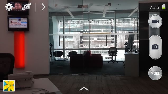
Users accustomed to Samsung's camera interface will feel at home. The various available shooting modes largely eliminate any need for third-party apps. We found ourselves reaching for the Best Photo, Best Face and Sound and Shot modes more often than not.
We tested the image quality of captured photographs under different conditions. At first glance, images captured in broad daylight look great but on closer inspection we found that the leaves on a tree had a bit of chromatic aberration. Indoor shots under incandescent lighting reproduced natural colours with minimal noise. Samsung enhances performance in low light using a feature called Smart Stabilization. Noise levels are high despite using the enhancement. Video captured at 1080p skipped frames and had interlacing issues when panned. All we can say is that the camera could have been better.
Samsung_Galaxy_Note3_Neo_CameraSample_NDTV.jpg
(click to see full size)
Performance
We ran a bunch of synthetic tests to determine the Neo's processor performance and fortunately it performed to our expectations. AnTuTu returned a score of 29,075 and in the Quadrant test, the phablet clocked in an overall score of 11,858. The hexacore processor of the device is definitely a workhorse, and it shows in the buttery smooth performance while sifting through homescreens and the app drawer in general.
For graphically intensive processes we used GFXbench and 3DMark's Ice Storm tests. The scores were 24.3 fps and 9446, respectively. This is definitely not top-tier performance, and a few other devices in the same price range such as the LG G2 and Sony Xperia Z1 perform much better. 
Samsung_Galaxy_Note3_Neo_Top_NDTV.jpg
SunSpider took 870.8ms to complete and Mozilla Kraken returned a score of 8,106ms. Once again, the other phones performed better. Our disappointment was compounded by the fact that opening multiple heavy web pages at once caused the Neo to stutter.
Video playback is a cause of concern, especially since the default apps refused to play 1080p videos. If the encoded audio is 5.1 channel, the default app throws up the 'audio codec not supported' message. VLC, on the other hand, managed to play all the files we threw at it, but the heavier 1080p files had artifacts cropping up from time to time and dropped frames occasionally. We felt shortchanged with the experience on the 'supposedly' high-end hardware.
The bundled earphones are the same ones that Samsung includes with most of its high-end Galaxy devices, and are mediocre at best. The shrill treble overpowers the muddled bass. The only saving grace was tight mids in songs which emphasise only vocals. Audio purists will have a better experience with third-party earphones, and we noted that the quality of sound improved drastically when we tried our own.
Samsung_Galaxy_Note3_Neo_Bottom_NDTV.jpg
At its highest volume, the loudspeaker is a bit soft but definitely not enough to be a deal-breaker. Once a call was made, the Neo managed to hold on the cellular network signal even where performance is generally supposed to be weak. The 3100mAh under the hood is a revelation since it lasted a good 12 hours, 22 minutes in our continuous video loop test. Discounting the testing process, during normal usage, we reached for the charger only twice in five days.
A look at the aforementioned observations, hexacore processor or not, reveals that the Note 3 Neo is not meant to be a powerhouse device but a workhorse.
Samsung_Galaxy_Note3_Neo_Box_NDTV.jpg
Verdict
All points considered; if you are looking for a sturdy phablet with a powerful stylus for note taking, a big, beautiful screen and great battery life, then look no further than the Samsung Galaxy Note 3 Neo as it might just serve the purpose. But be warned, the performance of the Neo is middling for an expensive device.
At the time of this review, online e-commerce websites were retailing it at approximately Rs. 36,500 whereas the Note 3 retails for Rs. 43,500. Give the elder sibling a serious thought before settling on the Neo. If you don't need the stylus and can live with a smaller screen, we would also suggest that you take a look at the Sony Xperia Z1 Compact and the LG G2, which perform better.

Samsung Galaxy Note 3 Neo in pictures
  • Design
  • Display
  • Software
  • Performance
  • Battery life
  • Camera
  • Value for money
  • Good
  • Great battery life
  • S Pen functionality
  • Good viewing angles
  • Decent colour reproduction
  • Bad
  • Mediocre camera
  • Sub-par graphics performance
  • Plain design


Hi guys If u like this post please leave a comment in comment box... comment box will top right of every post and bottom of every post. its useful for me give a better information.. check top of the blog there is menu bar in that go to comments i replied for u r comments because there is no direct option for reply for u r comments. if u want to give any suggestion in bottom of blog there is contact information option please leave a msgs with u r mail id sure i will get u.


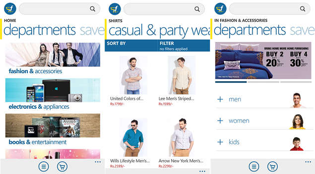
Flipkart app finally available for Windows Phone platform

Flipkart app finally available for Windows Phone platformflikart_windows_phone_app_released_official.png

Months after introducing apps for Android and iOS users, Flipkart has finally launched its official app for Windows Phone users on Tuesday.
The Flipkart app for Windows Phone is compatible with devices running Windows Phone 8 and Windows Phone 8.1. The app is not a direct port of the Android and iOS apps, but rather, sports a design especially made for the platform, incorporating the Metro UI. It aims to enable easy browsing of items via a pane placed at the bottom of the app's interface.
The e-commerce website is looking for suggestions by users in order to bring some more changes in the app later. "Our Windows App is here! Give it a twirl and give us feedback. Rs. 100 OFF on purchases of Rs. 1500 & above as well!," tweets Flipkart.
(Also see: Flipkart for iPhone shopping app launched)

Free to download, the official Flipkart app is sized at 2MB. Flipkart notably also has its Flipkart eBooks app available for the Windows Phone platform.
The following are the features mentioned on the Flipkart app's listing page on the Windows Phone Store.
-Easily navigate through different departments to find products
-Search for products, categories or brands
-Quickly narrow down search results using Sort and Filter functions
-View product images up close with the zoom feature
-Read reviews that other users have written about different products
-Pay by Cash on Delivery, Credit/Debit Cards, EMI, NetBanking, Flipkart Wallet and Flipkart eGVs
-Track status of the order
-View recently browsed products and their details
-Access the saved cart and user details by logging in through Flipkart, Facebook or Google login


Hi guys If u like this post please leave a comment in comment box... comment box will top right of every post and bottom of every post. its useful for me give a better information.. check top of the blog there is menu bar in that go to comments i replied for u r comments because there is no direct option for reply for u r comments. if u want to give any suggestion in bottom of blog there is contact information option please leave a msgs with u r mail id sure i will get u.


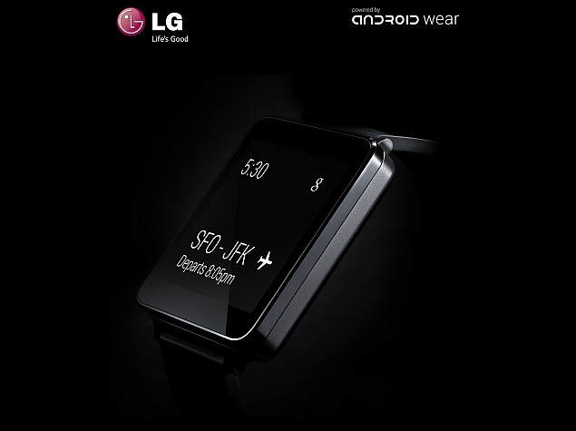
Android Wear-running LG G Watch gets a July launch date

Android Wear-running LG G Watch gets a July launch datelg_g_watch_android_wear_smartwatch_official_teaser.jpg

LG jumped onto the wearable bandwagon with the announcement of its first smartwatch, the G Watch, in March.
The LG G Watch runs Google's Android Wear, a software project that extends Android to wearables and the South Korean company had revealed that its first smartwatch will be released in Q2 2014.
Now, LG has confirmed to Pocket-lint that the G Watch will be released in UK priced below GBP 180 (roughly Rs. 18,000) and will be available before July. As of now, the company has not revealed the complete specifications of its first smartwatch. The LG G Watch is expected to feature a 1.65-inch display with a 280x280 pixel resolution, 512MB of RAM and 4GB of built-in storage. Further, there is no word on global rollout of the LG G Watch.
Earlier, LG teased its G Watch wearable device via a single clear image in a Twitter post. The post stated "LG #GWatch - Coming Soon!" followed by an image. The image showed the G Watch featuring a square screen. The screen showed Google Hangout chats along with time on the top-left corner.
Notably, Motorola also announced its Moto 360 smartwatch running Google's Android Wear. The former Google-owned company had announced that the smartwatch would be available in a variety of styles globally in summer 2014, starting in the US. However, the company is yet to reveal the pricing of the Moto 360.
Google however, besides LG and Motorola, is also teaming-up with other firms for its Android Wear project, out of which some key manufacturers are Asus, HTC, LG, Samsung and the Fossil Group.


Hi guys If u like this post please leave a comment in comment box... comment box will top right of every post and bottom of every post. its useful for me give a better information.. check top of the blog there is menu bar in that go to comments i replied for u r comments because there is no direct option for reply for u r comments. if u want to give any suggestion in bottom of blog there is contact information option please leave a msgs with u r mail id sure i will get u.


HTML Comment Box is loading comments...
MARUTHU Copyright@2014. Powered by Blogger.