1 "TAKE NO AS A QUESTION "

Friday, 24 January 2014

Nokia Lumia 1520 review
Nokia Lumia 1520 review

Nokia-Lumia-1520-%281%29_160814_190824_5434.jpg
The Lumia 1520 has two big things working against it, neither of which is a deal-breaker on its own, but when combined, make it a very interesting product to review. First, it's a Windows Phone. While the platform certainly does have its fans, there's no denying that it isn't as versatile as iOS and Android yet. As a person buying this phone, you will have to put up with a number of limitations and frustrations because of its software. Second, it's huge. So-called "phablets" are big business, but not everybody wants a phone that can't fit in a pocket and be held in one hand. With that said, it's time to examine this phone on its own merits and see whether Nokia has managed to distinguish itself with a winner.
Look and feel
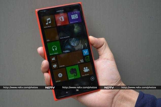
Nokia's first big-screened Lumia seems like a "me-too" product. Sensing that Android manufacturers have been making huge profits with such devices, they want in on the action. Luckily, both Microsoft and Nokia have been able to tweak their software and hardware manufacturing well in time to catch this wave. The Lumia 1520 isn't just a stretched-out version of any other model, although its bright polycarbonate shell fits right in with the rest of the Lumia lineup. We had the glossy red model in for review, and while we were impressed with the quality of materials and construction, we found it a bit too flashy. Other manufacturers' flagship devices use metal or more subtle coloured plastic, and it seems Nokia is specifically going after a young, outgoing sort of customer with its current design direction. The subtler matte finish of the white and black variants will have a much broader appeal.
Nokia-Lumia-1520-(2)_160814_190824_4414.jpg
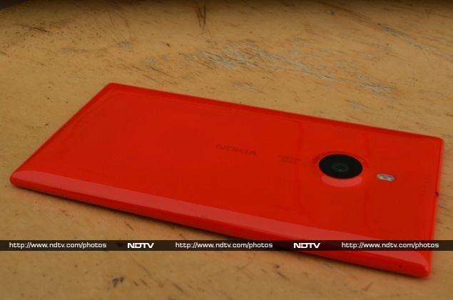
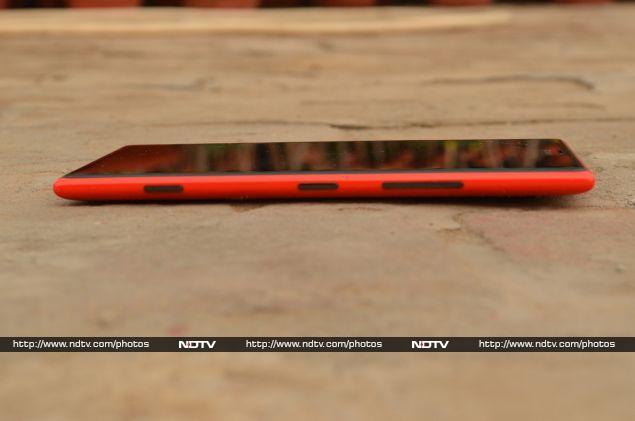
The 1520 is a near-perfect rectangular slab with rounded edges and blunt pointy corners. The back is flat except for a roughly 1mm tall circular bump housing the rear camera's optics. On the whole, the body is impressively thin and still manages to be reassuringly strong when bent or flexed. The front face is made of toughened Gorilla Glass 2, which should be able to withstand a fair bit of abuse. The back is mostly blank, with only the camera lens, dual-LED flash, speaker grille and microphone array visible. Nokia's own branding and PureView logos are printed in a surprisingly subtle, light ink. On the right edge you'll find a volume control rocker, power button and camera button, while a Micro-USB port sits on the bottom and a standard 3.5mm headset jack is the only thing on top. The left edge has slots for your Nano-SIM and microSD cards, both covered by flaps that can be released with a pin or the included eject tool.
Nokia-Lumia-1520-(3)_160814_190824_5004.jpg
At 209g, the Lumia 1520 is the heftiest of its siblings. Its size and weight make it rather cumbersome to carry around and you won't be comfortable holding it in one hand for very long. For the purpose of comparison, Samsung's Galaxy Note 3 and HTC's One Max weigh in at 168g and 217g respectively. The weight and smooth glossy body make it very easy for this phone to slip out of a trouser pocket when you sit down, although you're unlikely to want to keep it in a pocket at all. Unless you wear a jacket or carry a bag every day, you'll probably end up carrying it in your hand.
Features and specifications
On the inside, Nokia hasn't skimped on anything. The 1520 is powered by a top-of-the-line Qualcomm Snapdragon 800 SoC (system-on-a-chip), which consists of a Krait 400 CPU running at 2.2GHz and Adreno 330 graphics processor along with integrated LTE, Wi-Fi, GPS and Bluetooth communications modules. Pretty much every flagship smartphone on the market today and even a few tablets use this particular SoC, so the 1520 is in good company. 2GB of RAM should be more than enough for even the most demanding tasks, including recording continuous HD video and capturing 20-megapixel photos. The battery is non-removable, as is the norm these days. Nokia's ClearBlack IPS LCD is vivid and sharp, with a highly reflective surface. Colours don't pop as much as they do on some of the AMOLED screens used by competitors, which is a matter of personal preference.
Nokia-Lumia-1520-(5).jpg
The Lumia 1520's PureView camera is one of its biggest selling points, but it isn't the same record-setting 41-megapixel unit that first debuted with the Symbian-powered Nokia 808 and later re-emerged on the Lumia 1020. The 1020 thus remains Nokia's current flagship camera phone, which creates an odd division in their product lineup. The 1520 has better specifications all around, especially the screen and processor, but it doesn't get the benefit of what is easily Nokia's best innovation in the entire series. Nevertheless, this camera still bears the "PureView" tag, and with the combination of hardware and software used, you still get optical image stabilisation, the ability to record in RAW format, manual focus, ISO and shutter speed control, advanced post-capture editing options, and of course full-HD video recording at 30 frames per second.
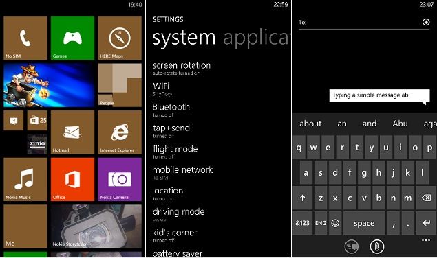
SoftwareThe Windows Phone environment is what truly sets the Lumia 1520 apart from all its big-screened rivals. Microsoft has managed to update the OS to work with large, pixel-dense screens, so everything looks crisp and slick. There's room for an extra column of medium-sized tiles on the home screen, and you can have a maximum of six small ones in a row. Most apps look great, especially ebook apps and games, but surfing the Web is a mixed bag since some sites default to a mobile layout, which just looks ridiculous on such a device.
The high resolution and pixel density help make Windows Phone's various pages full of thin typography feel less sparse, but the sheer size of the screen also amplifies the OS's annoyances, such as the excessive animations that accompany every screen transition and menu fly-out. Other little things matter too: menus roll up from the bottom of the screen but confirmation dialogs are displayed right on top, well beyond the reach of your thumb. You'll find yourself adjusting your grip on the 1520 every time you encounter things like this that just weren't designed with such a large screen in mind.
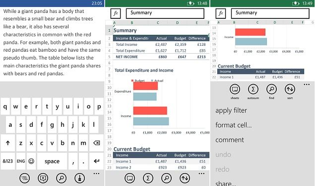
That brings us to the software's biggest flaw: Nokia and Microsoft haven't managed to figure out how to make a soft keyboard work on such a large device. The standard keyboard has simply been stretched to fill the screen's width, but it also retains its original proportions, resulting in keys that are too large and widely spaced for quick two-thumbed typing. This also means that when active, the keyboard obstructs well over half of the available vertical screen space, so while reading documents is a total pleasure, typing and editing are far more frustrating than they should be on such an otherwise capable device. The only people who would actually benefit from this are those who prefer hunt-and-peck typing with a single finger.
One of the platform's flagship features is MS Office integration. Apart from the keyboard issue, working with documents is a fantastic experience, and this is one of the best reasons to choose a big-screened phone. You can view Word, Excel and PowerPoint documents, but creation is limited to Word and Excel. You can type out text documents just like notes, with a few limited formatting options, and create spreadsheets with formulas and even graphs. Again, we ran into limitations in the way that Windows Phone apps are designed: there's a lot of untapped potential given the 1520's screen and processor. Just to prove this point, we loaded the desktop version of SkyDrive in Internet Explorer. The integrated Office Online version of Word loaded perfectly, giving us a much fuller, more powerful tool on exactly the same hardware (although, to be fair, it involved a lot of pinching and zooming to actually make use of).
Nokia-Lumia-1520-(8).jpg
Microsoft includes a voice command feature that's far more basic than Siri on iOS and Android's integrated functions. You can basically only open apps and dial saved numbers, although third-party apps can also add their own commands. The feature is only notable because, at least with the default setting on our review unit, the phone responds to commands in an Indianised voice with overdone inflections. This might have been intended to make users here feel more comfortable, but it really does come across as cartoonish and patronising.
Nokia-specific tweaks
Microsoft's efforts have also been supplemented by Nokia in the form of several apps and tweaks, and the Lumia 1520 is the first device to ship with Nokia's latest "Black" software update preinstalled. The most useful of these is the Glance screen, which basically displays the time, phone status and notifications on the phone's lock screen persistently, even after the screen times out. Users of older Nokia Series 60 smartphones will find this familiar: it's exactly the same as the old "screensaver" feature, but now it's done by keeping the screen backlight very slightly illuminated. This might impact battery life to a very small extent, but Glance uses the phone's proximity sensor to turn itself off when it detects it's in a case or pocket. Similarly, since the power button won't always be easy to reach, you can wake the phone by double-tapping anywhere on the screen when it's asleep. Last but not least, Nokia has also decided to cater (or pander) to Indian buyers with a small collection of Indian ringtones, all of which sound like the background scores of incredibly cheesy tourism ads.
Nokia-Lumia-1520-(10).jpg
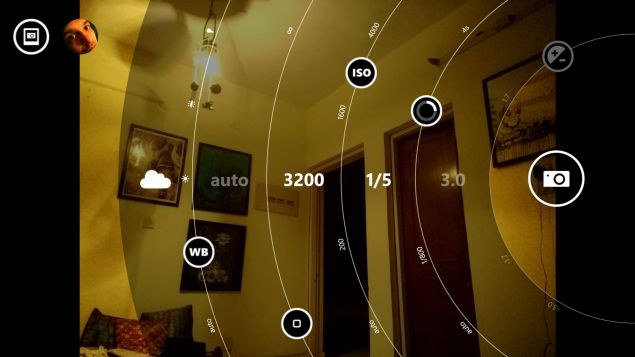
CameraNokia's historical strength in imaging has resulted in the truly excellent PureView series of camera phones, but it isn't only hardware that sets the company apart. Nokia knows perfectly well that a phone's camera is only as good as its interface. After having released a number of well-received camera apps, Nokia has decided to coalesce them all into a single one called -- what else -- Nokia Camera. This app replaces the default Windows Phone camera app, which is truly a blessing. In the default Still mode, you can quickly adjust settings for the flash, white balance, ISO, shutter speed and brightness. You can even manually focus an image as you'd like it. Nudging the shutter release icon inward makes a semi-transparent overlay appear over the display with crescent-shaped sliders for all these settings, and you can see how changing one value affects the others. If you push one too far, you'll see a red highlight and some of the others might become unavailable. This helps you use the best settings for normal shots, but also experiment with artistic ideas.
Nokia-Lumia-1520-(6).jpg
By default, the app is set to capture 16:9 photos at 16 megapixel resolution, but changing this to standard 4:3 actually nets you 19megapixel images, since these are essentially uncropped versions of the same frames. Smaller 5-megapixel versions of all shots are saved in addition to the full size, which are easier to email and upload via various apps. In fact the only way to get the original high-res versions of photos off the phone is to connect it to a PC via USB. In addition to JPG, you can choose to record files in the DNG RAW format, which is uncompressed and allows for much more flexible editing later on a PC (at the cost of enormous file sizes).
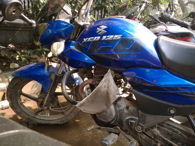
We were very pleased with the quality of shots captured with the Lumia 1520, both in daylight and at night. Zooming in to the full-resolution version of photos, we were able to expose minor imperfections such as JPEG artefacts and noise, but you'll rarely ever see these on screen. The luxury of having such a large image is that imperfections vanish when you scale downwards. It's possible to capture gorgeous macro shots, and of course being able to manually adjust focus is quite a thrill.
(Click to see full size)
In video mode, you only have white balance and focus controls, and can use the flash for constant illumination. There is one neat feature, though: That array of microphones on the rear panel allows the phone to detect where the subjects you're filming are, and boost audio from them while diminishing background noise. Video is captured at 1080p, which can be stepped down to 720p, and 30 frames per second which can be changed to 25 and 24 fps if you prefer. Videos are just as crisp and clear as we expected, and the optical image stabilisation feature really does make a difference.
WP_20140114_12_50_20_Pro__highres.jpg
(Click to see full size)
Finally, the third mode is what used to be Nokia's standalone Smart Camera app. In this mode, holding down the shutter button for a few seconds captures a series of frames in rapid succession. The phone then runs through a few processing algorithms and comes up with what it considers the best shot. You can swipe up and down to perform other tricks, such as superimposing multiple copies of a moving subject against a static background, blurring the background with only the subject in focus, and choosing the best combination of smiles from different frames. The Action Shot and Remove Moving Object modes only really work well when you can ensure that only one thing in the frame is moving, and that too at a particular speed. Playing with Smart Camera is a lot of fun, but it will take a bit of practice to get results that are as good as the ones in Nokia's tutorial and advertising materials. 
Nokia-Lumia-1520-(7).jpg
There's one more photography feature in the form of a standalone app, or a "lens" that can be launched from within the camera app's menu, called Nokia Refocus. This app captures images while also saving information about the scene at multiple different focal lengths. After taking the photo, you can tap different parts of the frame to decide whether the foreground or background should be blurred or focussed. For no apparent reason, there's a trick within a trick here: you can also tap any object in the frame to preserve its colour, while everything else turns to black and white. It's a neat effect, but it's best when used sparingly and subtly.
Other apps
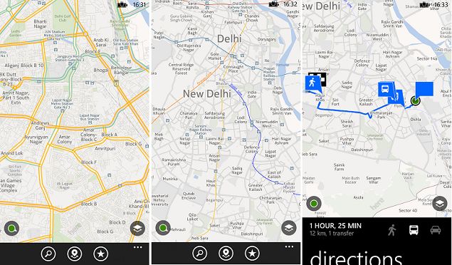
Nokia's other big software selling point is the Here maps app with Drive+ global navigation directions. At least as far as larger cities go, we found the maps to be accurate and useful. Although the maps aren't as detailed as Google's, Nokia should get more credit than it does for its mapping features, especially the directions that include options for walking, driving, and public transport. You can check for updated maps and also save them to the device so you aren't dependent on an Internet connection, which frequent travellers will appreciate. The My Commute feature lets your phone learn where you travel from and to frequently, and it will calculate the best route for you and alert you to bad traffic conditions on any given day. You can pin a special My Commute live tile to the phone's Start screen to stay informed of traffic conditions on the way.
Nokia Beamer is a hidden gem that links your phone to a service that you can access in any Web browser on any other device, and simply mirrors the contents of your screen to it. You can pair the phone by pointing its camera at a QR code displayed on the target machine's screen, after which pairing is effortless. Visuals are transmitted through the Internet, so don't expect perfectly clear video unless you have superfast Internet connections for both the phone and the target device.
Performance and ratings
As expected, the Lumia 1520 sailed through our synthetic benchmarks. We don't anticipate any problem running current or future apps, even graphically intensive ones. Games look incredible on the full-HD screen, which wasn't a surprise either. We noticed a few issues, such as a portion of the screen being cut off in one game, and visible tearing in another. We hope this is just a matter of developers optimising their titles for the new hardware, because the Lumia 1520 certainly has the potential to be a gaming powerhouse.
Nokia-Lumia-1520-(11).jpg
In our subjective analysis, the points that stood out were the device's build quality, overall screen quality, and the performance of the camera hardware and software. We gave it lower marks for UI design, ergonomics, and the quality of its app ecosystem. The Lumia 1520 is ultimately an unbalanced device, with extremely powerful hardware and software that doesn't yet take advantage of it.
Battery life is solid, and we had no problems with normal day-to-day usage, which consisted of receiving calls plus a few hours of watching videos, playing games, and browsing the Web over Wi-Fi. We did notice that the enormous 3400mAh battery takes a really long time to charge up to 100 percent. Our formal video loop test returned a result of 10 hours and 20 minutes, which is quite respectable.
VerdictIf you want a Windows Phone with a supersized high-resolution screen, this is currently the only game in town. Nokia is the only manufacturer truly committed to Windows Phone, and with its acquisition by Microsoft now complete, it's unlikely that any other company will bother developing such a device. The Lumia 1520 retails for roughly the same street price as the Lumia 1020, and both could be described as flagships of the line, depending on your priorities. The 1020's camera is simply unbeatable, and is the only thing keeping the 1520 from dominating the specifications charts in every category. However, the 1520's screen and nearly all its internal components are a generation ahead of the 1020's.
Incidentally, most of the things we loved about the software such as the Glance screen, integrated camera app and Beamer app are contained in Nokia's "Black" update, which means they'll be rolling out to other Lumias shortly. It's also worth noting that Windows Phone 8.1 is expected in the second quarter of this year. While we don't have any clear indications as to what features and improvements it will bring, it's also likely that a new generation of phones will launch alongside it. The Lumia 1520 will almost certainly receive this update too, but we're not convinced it will have a very long shelf life, and that makes it even harder to recommend.
So this is easily the most powerful Windows Phone we've ever used, but does that make it a great phone? We're hesitant to make a recommendation. If you love giant phones, there are quite a few Android options with screens and hardware that match the Lumia 1520, and they have the benefit of better optimised software and a far more substantial library of apps. If you love Windows Phone, there are cheaper options. The Lumia 1520 does stand out when it comes to its camera and looks, but you'd have to be pretty passionate about either of those things to spend close to Rs. 50,000 on this phone.

Nokia Lumia 1520

Nokia Lumia 1520
Rs. 46999
  • Design
  • Display
  • Software
  • Performance
  • Battery life
  • Camera
  • Value for money
  • Good
  • Excellent screen
  • High-quality camera for stills and video
  • Powerful components
  • Bad
  • Interface not optimised for the big screen
  • Uncomfortable grip


Hi guys If u like this post please leave a comment in comment box... comment box will top right of every post and bottom of every post. its useful for me give a better information.. check top of the blog there is menu bar in that go to comments i replied for u r comments because there is no direct option for reply for u r comments. if u want to give any suggestion in bottom of blog there is contact information option please leave a msgs with u r mail id sure i will get u.


HTC One Max review

HTC One Max reviewimage007_171314_181343_8330.jpg

Big-screened phones are nothing new at this point. Samsung, which currently dominates pretty much every price band of the Android market, wasn't the first to market but it did prove that the category could be extremely lucrative. The Galaxy Note was a runaway success, leaving other manufacturers racing to play catch-up.
HTC has had a bad few years, and has in the past relied on software customizations to help it distinguish itself in the market. Last year, it tried to project cheap plastic construction as Samsung's Achilles' Heel, and introduced the all-metal HTC One. The One should have been a runaway success, with its gorgeous looks, full-HD screen and Snapdragon 600 processor, all of which were either industry firsts or pretty close. Still, the beleaguered Taiwanese company faced a lukewarm response from the market, while its Korean rival raced ahead.
image001_171314_181344_2021.jpg
So now, HTC has gone back to doing what everyone else is doing, which is where the One Max comes in. It's a huge phone, because everyone else is making huge phones. It's made of plastic, because, well, that's what everyone else is doing. And it has a fingerprint scanner because, err, that's what at least one competitor is doing and it might have seemed like a good idea to just toss one in just in case.
Look and feel
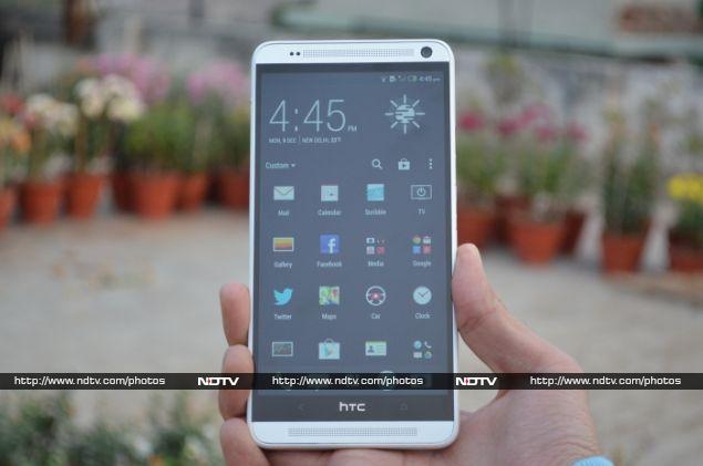
The HTC One Max trades on the One's name and reputation, but unfortunately doesn't do it any justice. HTC isn't in a position to create or market a beautifully crafted flagship device right now, and the company has cut a lot of corners in manufacturing the One Max. Although it has a strong family resemblance to the One, this phone is constructed out of plastic like the One Mini. The front face is nearly identical to that of the One, but you'll immediately notice an unsightly white plastic band around it. Even on the back, it's clear that the metal pieces are only for decoration. The odd combination of plastic, metal and glass gives this phone a very awkward look. It's hard to think of this as a premium device when we know its smaller, older sibling is so much better constructed.
image012_171314_181343_5830.jpg
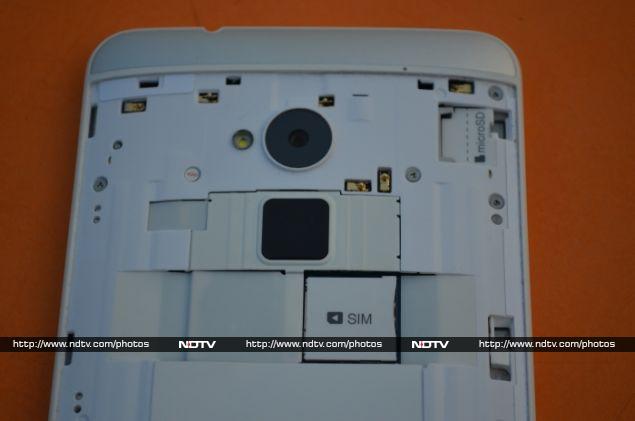
The large aluminium backplate pops off when you press down on a tiny tab that's located, oddly enough, on the phone's upper left edge where control buttons usually reside. You'll notice that the backplate doesn't really sit well in its plastic frame, and the sharp corner nearest to the clasp stays raised enough to be annoying when you hold the phone in your hands. You only ever need to take the panel off to access the SIM and microSD card slots, which seems like a shocking waste. Since the battery isn't accessible anyway, the entire body could have been a lot thinner and better construction could have been applied if the slots had simply been accessible from the phone's exterior.
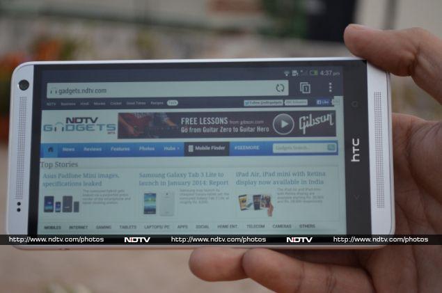
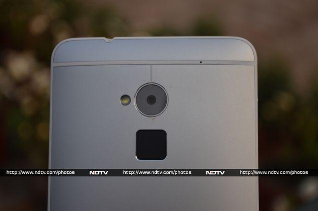
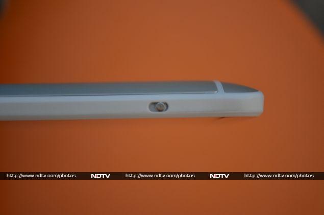
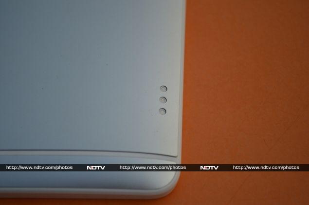
The One Max is pretty bulky, at 217g and over 10mm thick, but its curved back and slim proportions help mask that fact well. You'll find a prominent camera cutout and sensors along the top of the front panel, and there's a battery status and notification LED hidden in the speaker grille as well. The power button and volume rocker sit on the right side, with a microUSB data and charging port on the bottom. There's no camera button, which is perhaps understandable for such an unwieldy device. The left side has only the aforementioned clasp, while the top hosts a standard 3.5mm headset jack as well as an infrared emitter used by some of the bundled apps. Most interesting is the back panel, where the camera and flash share the spotlight with a large square fingerprint reader. Lower down, a set of three electrical contact points seem designed for docking with accessories, though even HTC's own site doesn't offer much information about which accessories use them. We're actually glad to see that HTC has stopped printing giant red Beats Audio logos on the back of its phones -- this is perhaps the sole area in which the One Max looks better than the One.
image021_171314_181345_2462.jpg
Samsung's defining feature for its Note line is the S-pen, an active stylus that works in concert with the customized Android UI and a few third-party apps to let users take advantage of the available screen space. HTC has no equivalent feature in either hardware or software, so you'll be using it with your thumbs just like any other touchscreen phone.
Specifications
On the inside, the HTC One Max finds itself at a disadvantage compared to today's flagships from competing manufacturers. The SoC is a quad-core Qualcomm Snapdragon 600, which is a step lower in both CPU and graphics performance compared to the Snapdragon 800 used by most of its peers. There's 2GB of RAM, which is perfectly fine. In practical terms you aren't likely to notice much difference right now except in the most intensive games and apps, but it's worth noting for future compatibility.
The screen is sharp and bright, and we had no trouble with it even in sunlight. 1920x1080 is the current standard resolution for premium smartphones and we're glad to see that HTC has not skimped in this regard. Videos are generally smooth, and viewing angles are as good as anything we've ever seen. Games, of course, make the best use of the large surface area. We're also happy to note that the screen is protected by toughened Gorilla Glass 3.
image015_171314_181343_4350.jpg
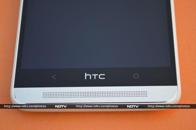
More noteworthy are the twin front-facing stereo speakers, a feature that the company calls BoomSound. The One Max's audio output is deep, rich, and clearly audible from several feet away. It might not fill up an entire room, but when held in your hands, this phone will transform the way you experience movies and games. Even simple games like Temple Run really come alive if you can play with the sound turned up. It's hard going back to the tinny bottom- or rear-firing speakers on most other phones.
As far as connectivity is concerned, the One Max checks most of the right boxes. The latest Wi-Fi standard, 802.11ac is supported, as is Bluetooth 4.0 with aptX audio support. Wireless video streaming is supported using Miracast, and you can use the device as a Wi-Fi hotspot to share your 3G data connection. 4G LTE is supported, though not on the 2.3GHz band that has been adopted in India. The One Max is the sole member of its family to support expandable storage, and you can add up to 64GB using standard microSD cards.
image017_171314_181343_3410.jpg
Camera
HTC has continued the practice of rating its high-end cameras in "Ultrapixels", a word it uses to emphasize the larger physical size of the individual receptors on the sensor surface. First seen on the HTC One, the idea is to allow each pixel to capture more incoming light, thus allowing for superior images in terms of exposure and clarity, especially low-light conditions. While it's still technically a 4-UltraPixel unit, HTC equates the amount of data recorded to competing 13-megapixel models. The tradeoff is that images are smaller than the ones taken by competing devices, but HTC says the lack of compression and higher overall quality is more than enough to make up for that.
We aren't entirely convinced by these arguments. In our testing, the low resolution became apparent in certain situations, especially low-light macros. Larger images tend to look sharper because they're scaled down on screen, but the One Max had no such headroom to take advantage of. Photos are still fine for sharing on social media and via email, but this isn't the type of device that will make you feel like you never need a dedicated camera again. Low-light scenes were indeed well lit, but we feel that this alone is not worth the overall compromise, especially considering the calibre of cameras on other manufacturers' current flagship phones.
The HD test videos we shot with the One Max had an artificial quality about them, and artefacts were visible on the large screen when playing back segments in which we tried to focus on fast-moving foreground objects.
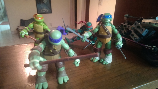
IMAG0008.jpg
(Click to see full size)
If you like adjusting settings manually, the One Max's camera app menu offers options for tweaking the exposure, saturation, sharpness, contrast, ISO and white balance. Preset scenes include HDR, panorama and "dual-capture" (which sticks a "selfie" of the user taken with the front camera on top of regular photos). In video mode, you can choose "Fast HD" for 60fps recording, slow motion, and video HDR.
One of HTC's other headlining features is Zoe, which captures short video clips instead of still photos. This results in short moving pictures that can capture moments more fully, such as spontaneously funny moments. Zoe files aren't easily sharable to other people and devices, so HTC has included an option to convert them into GIFs.
IMAG0013.jpg
(Click to see full size)
Software
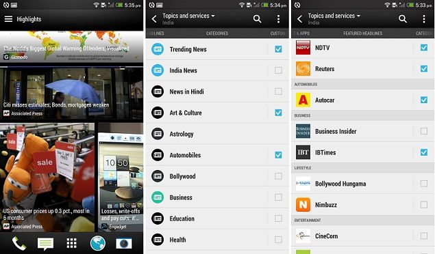
The One Max runs Android 4.3, though we expect the company to push out an update to 4.4 in a month or two. HTC's Sense UI 5.5 customization lives on top of the operating system, and thankfully, as opposed to its past efforts, the current version of Sense is completely unobtrusive. Its most notable feature is Blinkfeed, a visual that displays news and social network updates in a tiled format. Blinkfeed was initially intended to replace the home screen, showing fresh updates every time you turn the phone on. Many users found this irritating, and so HTC has responded by allowing you to set it as a secondary home screen or even turn it off entirely. In addition to Facebook and Twitter, you can now sign in to Instagram and Google+ to see even more social updates. There's an improved mechanism for sorting through available news sources and choose topic areas you're interested in.
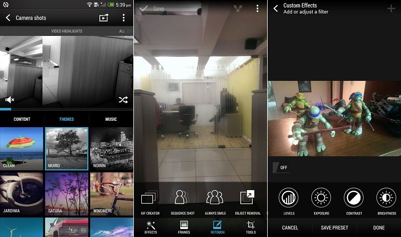
One other tweak worth mentioning is in the Gallery app. There's a tab called Video Highlights, in which you'll see a 30-second video clip made out of photos from your collection, including Zoe moving videos. The app automatically puts photos that it deems to be your "highlights" together, but you can deselect ones you don't want. You can also add a theme, much like the ones found in image filter apps. Finally, you can add a soundtrack of your choice and decide whether the images play chronologically or in a random order. Once done, you can share the highlights video via all the usual social networks.
Screenshot_2014-01-17-17-35-01.jpg
Also in the Gallery app, HTC has provided a number of editing options. You can doodle on top of photos, rotate, crop and flip them. There are also a number of creative filters and frames, plus tools to remove red eye, brighten faces, and reduce glare. If a video is selected, you'll be able to extract a still from it at any point, as well as trim the beginning and end, but that's it for editing options.
The One Max is otherwise mostly unremarkable in terms of software. There's nothing along the lines of Samsung's extensive customisations on the Galaxy Note, which help the user get a lot of value out of the large screen and stylus. There aren't too many bundled apps and home screen widgets either, though a lot of people will appreciate this.
Screenshot_2014-01-17-17-35-01b.jpg
Fingerprint sensor
We were especially curious about how well the fingerprint reader would work. When we first saw leaked photos and then the actual launch announcement of this phone, we had to wonder whether it was just a knee-jerk reaction to Apple's new TouchID sensor feature in the iPhone 5s. We might never know who had the idea first, but unfortunately HTC and any other company that tries a fingerprint sensor now is going to be held to Apple's standard. After a few days of use it's clear that HTC's implementation just isn't as well thought out as Apple's.
First of all, HTC has placed the touch sensor in a really awkward place. It seems that no one wanted to disturb the One Max's looks, and there just isn't any room on the phone's front face, considering the display is already so large. With the sensor on the back, you have to use it without looking. There's nothing to guide your finger to it and we often found ourselves swiping the camera lens, which actually feels exactly the same. Furthermore, once you enrol your fingerprints, the One Max insists you first try to use the sensor to unlock the phone, and it takes an additional tap to show the keypad for passcode entry instead. This also means you can't quickly unlock the phone when it's lying on a table -- you either have to pick it up or tap the screen just to be able to enter your passcode.
You can store up to three fingers' prints, and assign each of them to a different app, so for example, swiping with your middle finger can take you straight to the camera, but swiping with your ring finger will open the Web browser. It's a great idea, except that the software doesn't make it clear that this is optional, so we wound up assigning apps to each finger and then being unable to simply unlock the phone and just go to the home screen.
As far as accuracy goes, we had the best luck with our index fingers. It wasn't perfect all the time, but it didn't take more than three swipes at worst. Perhaps because of the positioning of the sensor and the fact that you have to swipe downwards, recognition with other fingers was not good at all. We often found ourselves swiping four or five times before either being locked out or just giving up and using our passcode.
Finally, it's worth noting that you can't use the fingerprint sensor to wake the phone from standby; you have to first hit the power button and then unlock the phone using the sensor. Once the phone is unlocked, the sensor does absolutely nothing -- you can't even use it to launch your associated apps, which would seem like an obvious thing.
We don't know if HTC plans to open up the sensor to third-party developers or add any new functions in a future software update, but for now, it definitely doesn't feel like a must-have feature that would make anyone rush out to buy this phone.
image002_171314_181344_1451.jpg
Performance and battery life
We've seen how well the One's Snapdragon 600 performs, and since the One Max has exactly the same chip inside, we had an idea of what to expect. We saw scores of 12,188 in Quadrant and 6,903 in our 3DMark HD graphics test run. We also ran a few CPU-intensive JavaScript tests such as Sunspider and Browsermark, which returned decent scores. In terms of raw numbers, these will obviously fall below the benchmark levels set by competing phones that use the higher-performance Snapdragon 800, but in real-world usage there isn't any noticeable practical difference. The One Max handles 1080p HD video without breaking a sweat, and it's only a handful of today's games that could really stress it out.
Despite this, the One Max loses out when we calculate its value for money proposition. If this phone was even a little cheaper than its competition, we'd be comfortable slotting it in just below the rest of today's flagship phones, but it actually commands quite a premium in the market. That makes us question how much useful life you'd get out of it if you bought it today, compared to the other options available.
Audio performance remains the One Max's standout feature, and call quality is no exception. Voices are loud and clear over the phone's speaker.
As far as battery life goes, we put the One Max through its paces with our video loop test, and it lasted for 10 hours, 40 minutes.
image019_171314_181343_2550.jpg
Verdict
HTC's strategy has been to take a winning formula and adapt it to multiple device sizes and price points. For better or worse, the intended top-of-the-line One Max doesn't seem that much more of an improvement over the One. Ultimately, if given a choice between the One Max and the One, we'd go with the latter. With roughly the same power under the hood and even the same screen resolution, the One Max simply doesn't distinguish itself enough. It also doesn't help that it looks way cheaper than the One, and doesn't have any unique features apart from the forgettable fingerprint reader.
If you're more focused on productive work, consider something like Samsung's latest Galaxy Note model. If you like the look and feel of this phone, you'll almost certainly prefer the smaller One. It's only if you're seriously in love with outsized phones and spend a lot of time gaming or watching videos that the One Max is worth considering. 

HTC One Max

Rs. 56490
  • Design
  • Display
  • Software
  • Performance
  • Battery life
  • Camera
  • Value for money
  • Good
  • Great screen
  • Excellent sound
  • Camera works well in low light
  • Bad
  • More expensive than the competition
  • Relatively weak processor
  • Flimsy rear panel and clasp


Hi guys If u like this post please leave a comment in comment box... comment box will top right of every post and bottom of every post. its useful for me give a better information.. check top of the blog there is menu bar in that go to comments i replied for u r comments because there is no direct option for reply for u r comments. if u want to give any suggestion in bottom of blog there is contact information option please leave a msgs with u r mail id sure i will get u.


Texas Instruments to cut 1,100 jobs globally, aims to save $130 million by year-end

Texas Instruments to cut 1,100 jobs globally, aims to save $130 million by year-endtexas-instuments-reuters-635.jpg

Texas Instruments Inc plans to cut 1,100 jobs in the United States, Japan and India, or about 3 percent of its global workforce, in a corporate restructuring to save $130 million by the end of 2014.
The U.S. chipmaker, which in 2012 announced it would lay off 1,700 people as it wound down its mobile processor business, said on Tuesday it wanted to reduce expenses in its embedded-processing division and in Japan.
"Technology markets mature from time to time and you have to rebalance where you spend your money," Chief Financial Officer Kevin March said in an interview. "In the case of Japan, the size of the market there has been declining for a number of years."
While TI is better known to many consumers for its calculators, the Dallas-based company is regarded as a barometer of the chip industry because it makes components for a variety of markets, including industrial, automotive, consumer electronics and communications.
Demand for TI chips has gradually improved in recent months although many on Wall Street have been watching for a larger pickup, including an elusive buildup in inventories by manufacturing customers.
March said most of TI's customers have kept their inventories "extremely lean," largely because TI in recent years has increased its own store of available components so that it can fill new orders quickly.
Job cuts to TI's embedded business are centered mostly on products that have seen slow growth, he said. The job cuts in Japan will include sales and customer support.
TI took a $49 million charge in the fourth quarter, to be followed by about $30 million in the first.
"This to me shows they believe there are some more efficient ways to run the business than they were running it," RBC analyst Doug Freedman said of the chipmaker's job cuts.
TI is the second major chipmaker in the past week to announce layoffs.
Intel Corp said on Friday it plans to reduce its global workforce of 107,000 by about 5 percent this year as the chipmaker, struggling with falling personal-computer sales, shifts focus to faster-growing areas.
TI, which has gradually withdrawn from an intensely competitive mobile phone arena to focus on supplying chips for more lucrative markets like cars and communications, posted fourth-quarter revenue on Tuesday that was up 2 percent from the year-ago period, above expectations.
TI reported fourth-quarter net income of $511 million, or 46 cents a share. The $49 million charge reduced earnings by 3 cents a share due to the restructuring.
In the year-ago quarter, TI had net income of $264 million, or 23 cents.
Revenue rose to $3.03 billion in the fourth quarter - a little higher than expected - from $2.98 billion in the year-ago quarter. TI estimated first-quarter revenue of $2.83 billion to $3.07 billion.
Analysts on average had predicted $2.987 billion in revenue for the fourth quarter and $2.95 billion for the first quarter, according to Thomson Reuters I/B/E/S.
It said it expects EPS in the first quarter of 36 cents to 44 cents.
On a conference call with analysts, TI said it will stop providing mid-quarter updates to its outlook because its business increasingly reflects broad trends instead of changes caused by major customers.
Shares of TI fell 1.59 percent in extended trade after closing up 0.92 percent at $43.85 on Nasdaq.


Hi guys If u like this post please leave a comment in comment box... comment box will top right of every post and bottom of every post. its useful for me give a better information.. check top of the blog there is menu bar in that go to comments i replied for u r comments because there is no direct option for reply for u r comments. if u want to give any suggestion in bottom of blog there is contact information option please leave a msgs with u r mail id sure i will get u.


Seagate hard drives are the least reliable, says BackBlaze

Seagate hard drives are the least reliable, says BackBlazebackblaze.jpg

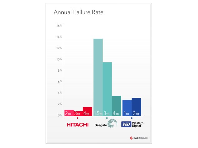
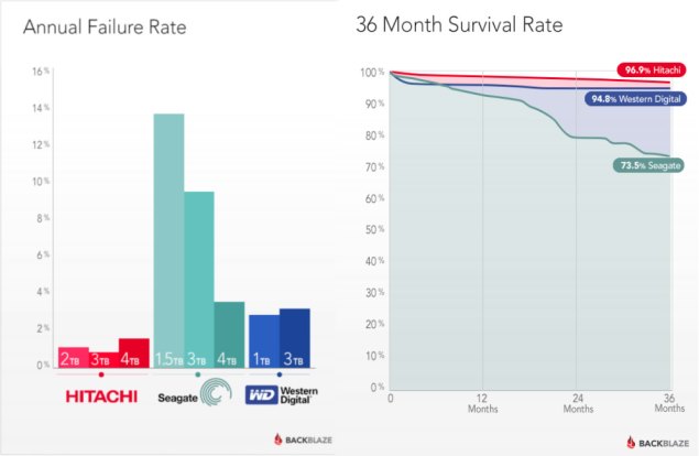
Online backup service provider BackBlaze has published a treasure trove of data about the reliability of the hard drives it uses. The numbers clearly show that on average, Seagate drives fail at a much higher rate than Hitachi and WD drives. Hitachi's failure rates across four models ranged from 0.9 to 1.5 percent, and WD's rate across three models was 3.2 to 3.6 percent.
In stark contrast, Seagate's failure rates across eight models ranged from 3.8 to 120 percent, with the extreme spike caused by two out of the three 1.5TB models used. Excluding these, Seagate's range topped out at 9.8 percent, which is still a considerably higher rate of failure than both its rivals. Newer Seagate 4TB drives are performing on par with WD's drives, but neither company has been able to match Hitachi's low figures.
The particular model that BackBlaze calculated to have such an unbelievable failure rate was the Seagate Barracuda Green (ST1500DL003). The figure exceeds 100 percent because not only did these drives fail, but the ones they were replaced with under warranty did too.
On the other end of the spectrum, Hitachi's Hitachi Deskstar 7K3000 (HDS723030ALA640) and Deskstar 5K3000 (HDS5C3030ALA630) were tied at the top of the reliability list with only 0.9 percent failure rates. Both are 3TB models, but are priced high enough that BackBlaze chose not to continue to buy them.
backblaze2.jpg
In fact, the company reports that it is currently buying more 3TB Seagate and 4TB WD drives, thanks to the balance of cost versus capacity as well as initial outlay versus downtime and replacement cost. The reliability report notes that WD has recently purchased Hitachi, so it remains to be seen whether Hitachi's products deteriorate or WD's products improve.
With 27,134 hard drives from various brands currently in use, the company is in a unique position to test and measure their reliability. The study did not consider drives from Samsung and Toshiba, as BackBlaze has not used enough of them to produce statistically significant data.
The company is well known for its approach to bulk data storage, which involves building massive storage "pods" out of consumer-grade PC hardware, including the drives. Data is saved in a RAID array to ensure speed and redundancy. Considerable effort is put into testing drives before they are deployed in bulk, since multiple units of the same model are likely to fail at the same rate.
Still, it is difficult to estimate whether or not a drive will fail, or after how much time and use it will become likely to fail. Another part of the study reveals that while 96.9 percent of Hitachi drives and 94.8 percent of WD drives remained healthy after three years in use, only 73.5 percent of Seagate drives were likely to make it that long. Seagate's drives also tend to fail more rapidly after roughly 18 months of use, whereas the other two brands' failure rates are more or less linear


Hi guys If u like this post please leave a comment in comment box... comment box will top right of every post and bottom of every post. its useful for me give a better information.. check top of the blog there is menu bar in that go to comments i replied for u r comments because there is no direct option for reply for u r comments. if u want to give any suggestion in bottom of blog there is contact information option please leave a msgs with u r mail id sure i will get u.


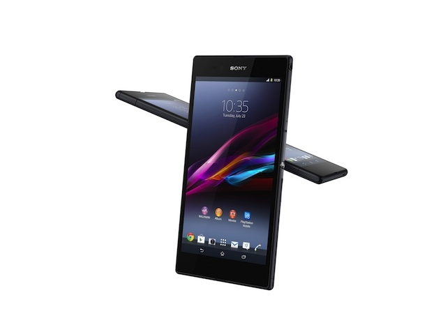
Sony Xperia Z Ultra Wi-Fi only tablet with 6.4-inch full-HD display launched


Sony Xperia Z Ultra Wi-Fi only tablet with 6.4-inch full-HD display launched625201332141PM_635_sony-xperia-z-ultra-db.png

The previously-unannounced Sony Xperia Z Ultra Wi-Fi only variant has been launched in Japan, with the tablet hitting store shelves on January 24.
The 6.4-inch Xperia Z Ultra Wi-Fi only model is available at 52,000 yen, or roughly Rs. 31,000, and is listed on the company's Japanese website. However, the international pricing and availability of the Wi-Fi only variant of Sony Xperia Z Ultra is yet to be revealed.
The users will get the same hardware specs as seen in Xperia Ultra's international variant, which is already available in the market, without the 3G / LTE radio. The tablet runs on Android 4.2 Jelly Bean OS and is equipped with 2.2GHz quad-core Snapdragon 800 SoC, 2GB of RAM, a 1080x1920 pixel 344ppi Triluminos display, all incorporated in a 6.5mm sleek body. The smartphone is available in White and Black colour variants.
Talking about Xperia models, a new report regarding the rumoured Sony Xperia Z2 or D5603 "Sirius" points to the numerous Xperia UI changes expected to be skinned on top of Android 4.4 KitKat when the device ships.
The screenshots were first spotted by Xperia Blog, which also detailed the new features. Some of the features said to be included are 4K recording, Timeshift video, smart backlight control, the presence of two home launchers, USB DAC audio support, and more.
One of the expected features, seen previously in Xperia Tablet Z, is the ability to wake up the screen by double tapping on it (also similar to LG Knock). An answering machine feature is also said to come with the rumoured Xperia Z2's dialler. The Xperia Blog also states that users will be able to choose the type of greeting.


Hi guys If u like this post please leave a comment in comment box... comment box will top right of every post and bottom of every post. its useful for me give a better information.. check top of the blog there is menu bar in that go to comments i replied for u r comments because there is no direct option for reply for u r comments. if u want to give any suggestion in bottom of blog there is contact information option please leave a msgs with u r mail id sure i will get u.


Facebook testing its first mobile ad network on other companies' apps


Facebook testing its first mobile ad network on other companies' appsfacebook-mobile-reuters-635.jpg

Facebook Inc said on Wednesday that it is displaying ads from a small group of marketers on other companies' smartphone apps, the latest sign that the world's No. 1 online social network is closer to launching an ad network business.
Facebook said that the test is currently limited to a "few" advertisers and mobile app publishers.
"Our aim is to demonstrate even greater reach with the same power of Facebook targeting for advertisers both on and off Facebook," the company said in a post on its official business blog.
Facebook generates the bulk of its revenue from ads that appear on its own pages and in the Facebook mobile app. It has experimented with offering ads beyond the confines of its own social networking website in the past, including an effort last year in which it partnered with other ad networks and a previous experiment with social game company Zynga Inc.
Ad networks, which distribute online ads across a constellation of independent websites and apps, typically share a portion of the ad revenue with their partners.
Selling ads that appear in mobile apps could provide Facebook with a new source of revenue by expanding the amount of ads it sells. In the current test, Facebook said it will effectively operate its own ad network.
Analysts expect Facebook, which has roughly 1.2 billion users, to report revenue of $2.34 billion for its fourth quarter next week.
Facebook declined to comment on the financial aspects, including any revenue sharing arrangements, of its mobile ad network test.


Hi guys If u like this post please leave a comment in comment box... comment box will top right of every post and bottom of every post. its useful for me give a better information.. check top of the blog there is menu bar in that go to comments i replied for u r comments because there is no direct option for reply for u r comments. if u want to give any suggestion in bottom of blog there is contact information option please leave a msgs with u r mail id sure i will get u.


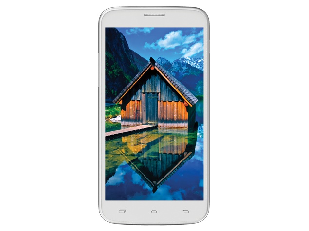
Intex Aqua i15 with 6-inch qHD display, Android 4.2 listed on company website


Intex Aqua i15 with 6-inch qHD display, Android 4.2 listed on company websiteintex-aqua-i15.jpg

Another Intex Aqua-branded mid-range phablet has been listed on the company's official website, dubbed Intex Aqua i15. The smartphone's price and availability is not known yet.
The Intex Aqua i15 runs on Android 4.2.2 Jelly Bean, and additionally supports dual-SIM support (GSM/WCDMA). The device also features a 6-inch qHD (540x960 pixel) IPS display. It is powered by a quad-core MediaTek MT6582 processor clocked at 1.3GHz, alongside a Mali 400 GPU paired with 512MB of RAM.
The camera options of Aqua i15 include an 8-megaixel rear camera with flash, and a 2-megapixel front-facing camera for video chats. The device comes with an 4GB of inbuilt storage, which can be expanded up to 32GB. The phablet supports both 2G and 3G connectivity along with standard Wi-Fi and Bluetooth options.
A 2400mAh battery backs up Intex Aqua i15. The device measures 168.5 x 85.5 x 9.0mm and weighs 190 grams. It will be available in Blue, White and Black colour variants.
More details for the Intex Aqua i15 can be found here.
Intex recently also listed its Aqua Curve budget smartphone on the website. The Intex Aqua Curve runs on Android 4.2.2 Jelly Bean, which also powers most of the handsets in the market. Along with dual-SIM support, the smartphone also features a 5-inch qHD (540x960 pixels) display.
The Aqua Curve smartphone is powered by a quad-core MediaTek (MT6582) processor clocked at 1.3GHz, paired with a Mali 400 GPU and 1GB of RAM. The camera options of Aqua Curve smartphone include an 8-megapixel autofocus rear camera with flash and a 2-megapixel front-facing camera for video chatting purposes.

Display

6.00-inch

Processor

1.3GHz

Front Camera

2-megapixel

Resolution

RAM

512MB

OS

Android 4.2

Storage

4GB

Rear Camera

8-megapixel

Battery capacity

2400mAh


Hi guys If u like this post please leave a comment in comment box... comment box will top right of every post and bottom of every post. its useful for me give a better information.. check top of the blog there is menu bar in that go to comments i replied for u r comments because there is no direct option for reply for u r comments. if u want to give any suggestion in bottom of blog there is contact information option please leave a msgs with u r mail id sure i will get u.


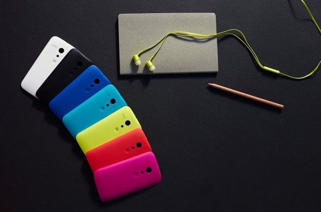
Moto G India launch details to be announced on February 5: Motorola


Moto G India launch details to be announced on February 5: Motorolamoto-g-india-release-635.jpg

Motorola, putting an end to speculation about the Moto G's India launch, has confirmed it will announce the budget smartphone for the country on February 5.
Motorola confirmed the news on Twitter and said, "Moto G launch details for India will be announced on February 5. Stay tuned!" Unfortunately, the Google-owned company has revealed no details about the pricing of the Moto G for the Indian market.
Motorola officially unveiled the Moto G smartphone at an event in Sao Paulo, Brazil in November last year. The Motorola Moto G has been said to be available in at least 30 countries with 60 Google partners by 2014.
The Moto G is currently on sale in Brazil, Mexico, Chile, Argentina, Peru, UK, Germany, France, and Canada and is now also available in selective countries in Latin America, Europe and Asia.
(Also seeMoto G review)
The Motorola Moto G is available with no contract, no SIM lock and an unlockable bootloader at $179 (Rs. 11,300 approximately) for the 8GB storage model in US, while the 16GB variant is available at $199 (Rs. 12,600 approximately). Notably, there is no option for expandable storage available.
motorola-moto-g-rear-panel-635.jpg
Recently, Motorola's chief executive Dennis Woodside on price strategy was quoted saying, "There will be different phones at different price points but we're going to be very aggressive there."
An earlier report has already indicated that Motorola will launch a dual-SIM variant of the Moto G in India.
Motorola announced the Android 4.4.2 KitKat update over-the-air (OTA) for its Moto G budget smartphone in December last year.

Display

4.50-inch

Processor

1.2GHz

Front Camera

1.3-megapixel

Resolution

720x1280 pixels

RAM

1GB

OS

Android 4.3

Storage

16GB

Rear Camera

5-megapixel

Battery capacity

2070mAh


Hi guys If u like this post please leave a comment in comment box... comment box will top right of every post and bottom of every post. its useful for me give a better information.. check top of the blog there is menu bar in that go to comments i replied for u r comments because there is no direct option for reply for u r comments. if u want to give any suggestion in bottom of blog there is contact information option please leave a msgs with u r mail id sure i will get u.


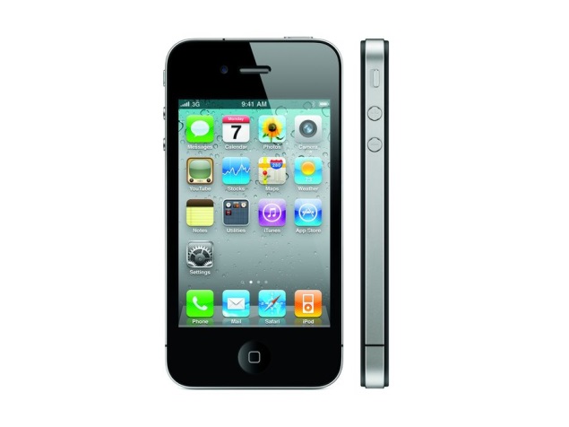
iPhone 4 available in India again, but Apple won't call it a 'relaunch'


iPhone 4 available in India again, but Apple won't call it a 'relaunch'iphone4.jpg

There has been much excitement in the Indian press about Apple supposedly relaunching the iPhone 4 in India. Several media outlets have expressed dismay and derision at news of the company supposedly trying to push the four-year-old model because sales of the high-priced iPhone 5s and 5c aren't meeting expectations. The price of the "new" iPhone 4 (with only 8GB of storage capacity) has been reported to be anywhere between Rs. 15,000 and Rs. 23,000.

We can now confirm that while fresh stocks have arrived in the market, Apple has no plans to call it a relaunch. The iPhone 4 (8GB) has been available for months at several stores and online retailers, although stocks had run out in some cases. The current official MRP is Rs 22,900, although stores are offering it for around Rs. 21,999. Furthermore, we hear that distributors are offering incentives to bulk buyers that could allow prices to fall to Rs. 19,999 in the near future.

Apple itself refuses to comment on speculated launches, but other well-placed sources in the industry confirm that the iPhone 4 is no longer being manufactured. Sales have continued only because stocks still exist, and there are no plans to push the iPhone 4 as a budget-friendly model. 

The iPhone 4 is still actively being sold in China, even through Apple's official website. There, it is priced at 2,588 Yuan (approximately Rs. 26,508, which is roughly the same as its official price in India last year). 

Our source indicates that Apple will not be making any significant advertising effort around the iPhone 4. Its current push for the entry-level segment remains the iPhone 4S, which is still sold around the world as the lowest-priced model (and is available for free with a carrier subsidy in many countries). 

Even at the projected new street price of Rs. 19,999, the iPhone 4 is not a value proposition. Apple is counting on the fact that people will pay a premium for its brand, but educated customers will steer away from it. Not only is the storage space especially constricted at 8GB (non-expandable), but the rest of its specifications are around four years old, which is at least one lifetime in smartphone terms.

The iPhone 4 has the weak Apple A4 chip inside, which simply cannot match up to today's models. It struggles to run even the latest version of its own operating system (iOS 7), and Apple has had to strip out many features just to get it to that point. 

In the same price band, buyers can opt for the Samsung Galaxy Grand 2, the HTC Desire 601, theNokia Lumia 720, or Sony Xperia SP. The Samsung Galaxy S3 and Nokia Lumia 1320 are available for just under Rs 24,000 each.

More interestingly, fresh stocks of the discontinued iPhone 5 (black, 16 GB only) have popped up again in retail channels, at the original price of Rs 45,500. We have confirmed that 2-3 units are available at multiple branches of a popular retail chain in Mumbai. Sources in the channel indicate that these have not come in through official channels like the iPhone 4.

The iPhone 5 was discontinued in favour of the 5c, which has nearly identical specifications but has a colourful plastic shell that looks less sophisticated than the 5's metal and glass exterior did. While the price was reduced by US$ 100, the relative weakness of the Indian rupee compared to its value a year ago has resulted in a meager Rs. 3,000 difference between the price of the iPhone 5 and its supposedly cheaper replacement, the 5c. Thus, the older model still remains attractive at its original launch price, especially for those who prefer the metallic chasis.

Display

3.50-inch

Processor

Front Camera

0.3-megapixel

Resolution

640x960 pixels

RAM

512MB

OS

iOS 6.1.3

Storage

8GB

Rear Camera

5-megapixel

Battery capacity

1420mAh


Hi guys If u like this post please leave a comment in comment box... comment box will top right of every post and bottom of every post. its useful for me give a better information.. check top of the blog there is menu bar in that go to comments i replied for u r comments because there is no direct option for reply for u r comments. if u want to give any suggestion in bottom of blog there is contact information option please leave a msgs with u r mail id sure i will get u.


HTML Comment Box is loading comments...
MARUTHU Copyright@2014. Powered by Blogger.