1 "TAKE NO AS A QUESTION "

Wednesday, 9 April 2014

Samsung, Apple's big smartphone dilemma


Samsung, Apple's big smartphone dilemma

Samsung, Apple's big smartphone dilemma
As the smartphone action shifts to the mass market, leaders Samsung and Apple are under pressure to make their high-end phones more affordable to revive sales

SEOUL: As the smartphone action shifts to the mass market, leaders Samsung Electronics Co Ltd and Apple Inc are under pressure to make their high-end phones more affordable to revive sales. And that may spell trouble for already-softening margins.

Samsung, which said on Tuesday it would likely post a second straight quarterly profit decline, has knocked around a tenth off the price of its Galaxy S5 in South Korea, in the first such move for a marquee smartphone launch — the S5 rolls out globally on Friday. And it's throwing in a free gift pack of media subscriptions and web apps worth 600,000 won ($570).

The mass market — where a smartphone can be had for as little as $25 — is the new mobile device battleground, as high-end growth eases off with sales slowing in mature markets. Japan, for example, may see smartphone shipments shrink this year, according to researcher IDC.

Samsung's flagship S5 price cut suggests the South Korean firm wants to encourage users to trade up to a fancier phone — at a potential cost to its margins. Samsung's mobile business operating margin dipped to 16% in October-December from 18% over the whole of 2013.

"It reflects how much Samsung is agonizing to secure margins. They're now offering premium models at lower prices as the demand outlook for high-end phones remains uncertain," said Lee Seung-woo, an analyst at IBK Securities.

Premium smartphones tend to be priced at above $300 and pack in more features, such as more powerful processing power, high-resolution display, better cameras and fingerprint reading. With the S5, which has few hardware improvements from its S4 predecessor, industry watchers reckon Samsung is aiming more at a broad mass market than tech savvy users.

To be sure, Samsung has a far broader product line-up than rival Apple, and it has some leeway to trim prices given that manufacturing costs have fallen. Lee Min-hee, an analyst at IM Investment, reckons the total cost of production materials for the S5 — from the battery and screen to the processor and sensors —will be 10-15% lower than for the S4.

While this allows vendors to make quality phones for less, it makes it tougher for them to maintain a premium brand image.

"Samsung needs to be very clear about the market segment it's pursuing," said Clement Teo, analyst at Forrester Research in Singapore. "Take Apple — it didn't drop prices on its iPhones, even with the new models. This helps it maintain a margin premium and attracts a certain loyal user base."

But Cupertino, California-based Apple is also taking note of the growing potential of the mass market. Internal documents revealed during an ongoing US patent trial against Samsung indicates some at Apple felt the company priced itself too high.

Less pricing change at Apple
According to an April 2013 presentation filed to a US court, executives had debated plans for Apple's 2014 fiscal year and concluded that consumers wanted what it wasn't offering: cheaper phones — for less than $300 — and bigger screens.

It's unclear how representative that presentation is of Apple's mindset. Nor are there signs that Apple, which thrives on its premium positioning and plays down suggestions that it go mass-market, intends to deviate from its path.

Apple did not respond to requests for comment.

An 'economy' model may wedge Apple more firmly in emerging markets — a segment still seeing strong growth. Apple now relies on discounted older generation phones to reach cost-conscious buyers, but buyers in markets like Brazil and China increasingly want the latest gadget.

IPhone shipments grew just 8% in Apple's 2013 fiscal third quarter, a far cry from five years ago when shipments more than doubled.

"They are foregoing incremental revenue opportunities by not having a product that addresses that market," said BTIG analyst Walter Piecyk, adding that the main hope of investors now is that Apple produce a new product — a wearable device, say — to galvanize revenue growth.

The iPhone 5C, a colorful plastic model priced just $100 cheaper than its premium cousin, was aimed at emerging markets and marked a departure from Apple's focus on premium phones last year. But it's not been a spectacular success. Some analysts theorize that an unwillingness to sacrifice profitability meant the device wasn't priced cheaply enough.

A thinner slice
Apple's iPhone margins have crept south as the company packs more features into its gadgets, trying to stand out in an increasingly crowded field. As its market share dwindles, the company enjoys less leverage to squeeze suppliers. And margins may fall further if Apple introduces bigger screens as expected.

Bernstein Research analyst Toni Sacconaghi estimates that making the screen just 30% larger could wipe 4-5 percentage points off gross margins. IPhone margins are now in the mid-40% range, down from 50-60% a few years ago, analysts estimate.

"With the iPhone 6, Apple is likely to stick to premium pricing as it's widely expected to come with a bigger screen and some innovative design tweaks," said Doh Hyun-woo, an analyst at Mirae Asset Securities. "They are unlikely to make as much change in pricing policy as Samsung does."

The average selling price of a smartphone globally is seen dropping by more than a fifth by 2018, to $260, according to IDC, as more buyers, especially in emerging markets, opt for price over brand, and as manufacturing costs continue to drop.

The iPhone remains the most expensive smartphone, with an estimated average selling price this year of $649, more than double the average price of $247 for Android phones, Samsung's mainstay products, according to IDC. Average selling prices of iPhones will drop only 6 percent to $610 by 2018, while Android prices will decline 18 percent to $202, according to those IDC forecasts.

"Apple has a clear strategy - to be the best in the market segment it competes in, and it has performed well," said Forrester's Teo. "Regardless of 5C sales, the bigger picture is that Apple is relevant to users in their moment of need - through an iPhone, iPad, iPod or its App store."

China chips away
All the while, competition from cheaper smartphone brands is getting fiercer. The share of smartphone shipments by vendors outside the top five — Samsung, Apple, Huawei, LG Electronics Inc and Lenovo Group — rose to 39.3% last year from 27.4% in 2011.

From Nokia to BlackBerry Ltd and a host of Chinese vendors, manufacturers are bringing out cheaper, stripped-down smartphones aimed at hundreds of millions of potential users in emerging markets such as China, India and Indonesia.

Chinese manufacturers — from global names such as Huawei and Lenovo to the less well known Gionee, Oppo and CorePad — are picking up market share as they acquire technical and design expertise to add to their low production costs.

"The winners in the current market conditions will be those who show the best cost-efficiency, and in that sense Chinese players will be in a better position," said IBK's Lee.

($1 = 1055.4000 Korean Won
)


Hi guys If u like this post please leave a comment in comment box... comment box will top right of every post and bottom of every post. its useful for me give a better information.. check top of the blog there is menu bar in that go to comments i replied for u r comments because there is no direct option for reply for u r comments. if u want to give any suggestion in bottom of blog there is contact information option please leave a msgs with u r mail id sure i will get u.


Yuvraj did not deserve this unwarranted criticism: Pietersen


Yuvraj did not deserve this unwarranted criticism: Pietersen

Yuvraj did not deserve this unwarranted criticism: Pietersen
Pietersen loves to be a "realist" and that's the reason he is not feeling stressed ahead of IPL. (TOI Photo)

NEW DELHI: Once labelled a 'pie-chucker' by Kevin Pietersen, beleaguered Yuvraj Singh has found support from the maverick batsman, who says the India left-hander is at the receiving end of "unwarranted criticism" following his scratchy knock in the World T20 final.

Yuvraj's 21-ball 11 sucked the momentum out of India's innings on Sunday and some unruly fans pelted stones at the all-rounder's residence in Chandigarh. India lost the title clash to Sri Lanka by six wickets.

Standing behind Yuvraj, who is now a friend, Pietersen said: "I haven't read the newspapers here but what I have seen on twitter is that he has got a bit of stick. I think that it was unwarranted and he did not deserve this."

Former India players such as Kris Srikkanth and Ravi Shastri had critical of Yuvraj's batting, prompting Pietersen to say that it's "very easy to say things" when one is not an active international cricketer.

"You can't always be good. It's very easy to say things when you stop playing. I see a lot of players talking who don't even play international cricket and wished they were playing, have a lot of things to say. Because criticising is the easiest thing to do," he said.

Set to lead Delhi Daredevils in the upcoming seventh edition of Indian Premier league, Pietersen is happy that he will have to face a selection dilemma when it comes to having his pick between 'Million Dollar Man' Dinesh Karthik and the new South African sensation Quinton de Kock when they kickstart their campaign.

While De Kock has made grand entry into international cricket, Karthik's Rs 12.5 crore bidding makes him slightly favourite to get the nod.

"Of course, it is good to have selection dilemmas as it is quite a good thing to have. I kind of enjoy having selection dilemmas. You have got to hate the fact that you can only choose from only 11 players.

"You should be wanting that your squad of 16 is ready to have a go. Yes, it will be a difficult pick for the first match but we would certainly settle down with time," he said.

Life without international cricket is not something that Pietersen would have ideally imagined but then he has been a non-conformist in many ways.

Pietersen loves to be a "realist" and that's the reason he is not feeling stressed ahead of IPL.

"I don't see any pressure. In fact, I enjoy pressure. As an individual, all you can do is to give your best. In the next six weeks, I will give my everything to Delhi Daredevils. I am a firm believer in 'what will be will be'. So people can't demand things. People can be happy if things happen and be disappointed when things don't happen. I am a realist in every sense," Pietersen said matter-of-factly.

The batsman is upbeat about his team's chances as he believed that the team has got good depth.

"We do have a lot of expectations as we have picked up a player that can do real good things. The strength is good as we have quality Indian players and experienced overseas players. In Gary Kirsten, we have a great coach. I think we have the ability to go all the way. Having said that, I can tell you that there are no guarantees as such," he said.

Talking about DD coach Gary Kirsten, K P said that both are on the same page regarding team's common goal.

"I think my interactions with Gary has been very, very good. We kind of sing from similar hymn sheet. Gary is a very relaxed man and a great man manager. I just can't wait to start working with him."

When Pietersen speaks, the reassuring tone makes even worrying factors look like non issues.

Delhi's spin bowling is an issue but Pietersen brushed it aside.

"We have leg-spinner Rahul Sharma apart from Shahbaz Nadeem. He's played for India and he will be good.'' He also feels that there is no big deal about adaptability as some of the younger Indian players will be playing in UAE for the first time.

"If you talk about me, I have done that for 10 years of international cricket playing in different countries in different conditions. As far as the younger players are concerned, it will be a good experience for them.
"


Hi guys If u like this post please leave a comment in comment box... comment box will top right of every post and bottom of every post. its useful for me give a better information.. check top of the blog there is menu bar in that go to comments i replied for u r comments because there is no direct option for reply for u r comments. if u want to give any suggestion in bottom of blog there is contact information option please leave a msgs with u r mail id sure i will get u.


Comments by rohit triharch


Before going to bed put oil in a small container. The quantity of the oil should be in proportion to the length and density of your hair so as to be applicable on your complete hair. Apply oil on the tip of your fingers and rub it gently on the base of your hair enabling it to penetrate in to the roots of your hair. Let the oil gradually seep into roots of your hair & nourish them for the whole night.Do not apply on your palms and rub it vigorously as it may uproot weak hair. Slow application and massage of hair only would yield better results. The oil may be removed in the morning with washing of hair with a mild shampoo which does not contain chemicals More information visit this websites link below :www.keshking.com,www.keshking.in https://www.youtube.com/watch?v=Fxnf97rRvjk on Try Ayurveda for hair loss


by,
rohit triharch..


by Admin..
Thanks & Thank u rohit triharch for ur valuable feed back...


Hi guys If u like this post please leave a comment in comment box... comment box will top right of every post and bottom of every post. its useful for me give a better information.. check top of the blog there is menu bar in that go to comments i replied for u r comments because there is no direct option for reply for u r comments. if u want to give any suggestion in bottom of blog there is contact information option please leave a msgs with u r mail id sure i will get u.


Comments by asima khan


You have an amazing talent.Iphone on HTC Desire 500 review


by,

asima khan


by admin..
Thanks & thank u Very much asima khan... for ur valuable feed back...


Hi guys If u like this post please leave a comment in comment box... comment box will top right of every post and bottom of every post. its useful for me give a better information.. check top of the blog there is menu bar in that go to comments i replied for u r comments because there is no direct option for reply for u r comments. if u want to give any suggestion in bottom of blog there is contact information option please leave a msgs with u r mail id sure i will get u.


Comments by malik aayan


where we get lots Blogs are so informative of information on any topic.
Nice job keep it up!!.cheap mobiles on Nokia 515 feature phone with aluminium body launched

by,
malik aayan


by Admin..
Thank u very much malik aayan Thanks for ur valuable feed back

Hi guys If u like this post please leave a comment in comment box... comment box will top right of every post and bottom of every post. its useful for me give a better information.. check top of the blog there is menu bar in that go to comments i replied for u r comments because there is no direct option for reply for u r comments. if u want to give any suggestion in bottom of blog there is contact information option please leave a msgs with u r mail id sure i will get u.


Comments by shelka marketing


Hi.. I appreciate the ideas and information that having great & valuable things for us.Thanks for sharing this, Click here: Side X Side Refrigerators in India on Samsung to launch 10-inch tablet, UHD TV in India

by,
shelka marketing....


Thanks & Thank u Very much shelka marketing  for ur valuable feed back..

Hi guys If u like this post please leave a comment in comment box... comment box will top right of every post and bottom of every post. its useful for me give a better information.. check top of the blog there is menu bar in that go to comments i replied for u r comments because there is no direct option for reply for u r comments. if u want to give any suggestion in bottom of blog there is contact information option please leave a msgs with u r mail id sure i will get u.


Monday, 7 April 2014

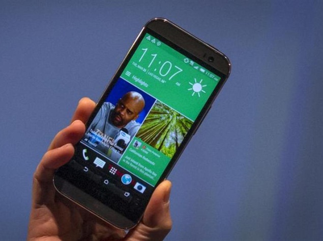
HTC One (M8) review: A worthy upgrade

HTC One (M8) review: A worthy upgradehtc_one_m8_reuters.jpg

The HTC One might be the best smartphone you never heard of.
The phone won critical acclaim last year, yet it barely made a dent in the marketplace. It's overshadowed by Apple's iPhones and Samsung's Galaxy line of smartphones.
Good thing HTC Corp. doesn't understand defeat.
An updated One expands on some of the features that made it notable. The new One has a metal design like last year's model, but it feels smoother and more comfortable in my hands. The back edges are more curved and remind me of the sleek finish in Apple's latest iPads. HTC also turns its hub for personalized content, the BlinkFeed, into a companion rather than an unwelcomed guest.
HTC is making the Android phone available through all major carriers simultaneously this time, starting Tuesday online and by April 10 in retail stores. Verizon customers don't have to wait months, as they had last year. In an apparent concession, Verizon is the first to get them in stores - on Tuesday.
The new phone, known officially as HTC One (M8) (Pictures), will cost about $200 to $250 with a two-year service contract, or about $650 without a contract. Customers can choose gray, gold or silver.
The One still has some flaws - namely, its 4 megapixel rear camera. By comparison, Samsung's Galaxy S5 phone, which comes out April 11, will have 16 megapixels. Sony and Nokia already have phones that exceed 20 megapixels. Apple's iPhones are at 8 megapixels, twice what the HTC One offers. More megapixels typically translate to sharper images and more options for printing and cropping.
HTC is correct in saying the megapixel count is just one factor in what makes a good camera. It prefers making the size of individual pixel sensors larger to absorb more light for night and indoor shots. That's laudable, but Apple's iPhone 5s (Pictures) and Nokia's Lumia Icon are both able to offer decent low-light shots while providing more megapixels than the One.
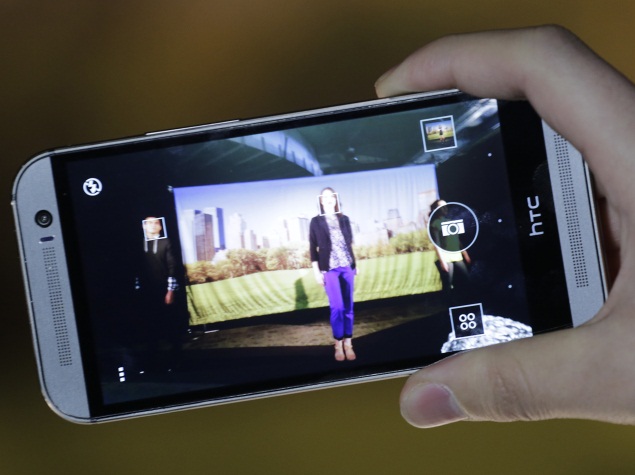
Compared with last year's model, though, the One's camera is much better, even at 4 megapixels. Colors look washed out in day shots I took with last year's camera. The new model seems to have fixed that. The new version also has a 5 megapixel front camera for selfies, far better than what rivals offer.
HTC also has improved its camera software
Thanks to a second lens on the rear, the phone now captures depth information. That lets you decide later through built-in software whether to focus on the foreground or the background while blurring everything else. Other phones also offer this capability, but the One does this automatically. You don't have to switch to a special mode ahead of time.
htc_one_m8_camera_usage_ap.jpg
The One offers plenty of manual settings, as other phones are starting to offer. The One goes further in letting you save frequently used combinations of settings. If you take a lot of action shots indoors, for instance, you can save a combo that uses a fast shutter speed to reduce blurring from motion, while adjusting the white balance to filter out the hint of color from the ceiling lights.
You can pause video recordings. Most phones only let you stop recording, so you have to stitch together several files with software to get the same effect. The Vine and Instagram apps also let you pause video recording, but those clips have length limits. With the One, you're limited only by the phone's storage.
As for watching video, sound quality is wonderful, thanks to the phone's two front-facing speakers. If I hold the phone close enough to my eyes and slide the volume to maximum, I can pretend I'm watching in a movie theater. Phones with rear speakers sound boxy by comparison.
The One also has some useful shortcuts when the screen is off. Swipe from the left to get the BlinkFeed content hub, and swipe from the right to get your regular home screen. Press the volume button to get the camera and press it again to take the shot. Double tap to get the lock screen.
With an optional $50 Dot View case, you can see the time and the weather through the small holes, or dots, on the case's front, flip cover. You can answer and reject incoming call by swiping on the case, without needing to flip over the cover.
As for BlinkFeed, the One now offers more ways to customize it and increases the number of social media services it works with. Through a partnership with Foursquare, BlinkFeed also suggests restaurants based on the time and location. Monday's lunch recommendation was dubious, though: It was suggesting frozen yogurt at Pinkberry as outdoor temperatures in New York hovered at water's freezing point.
I do like that you can get BlinkFeed by swiping from the left. Otherwise, it stays out of the way. To get back to the home screen, just tap the home button once or twice. I hated BlinkFeed in last year's model because there was no easy way to restore the home screen without knowing the proper swipes.
The HTC One is a work in progress, though. There's supposed to be a power-saving mode offering 15 hours of battery life when you're down to a 5 percent charge, for instance. That and other promised features weren't done in time for the U.S. release. But if you buy the phone now, you'll get them through upcoming software updates.
U.S. customers are also eligible for a one-time screen replacement if it cracks in the first six months.
The One doesn't have a fingerprint sensor to bypass the security code on the lock screen. The iPhone 5s has it, as will the Galaxy S5. It's also in the HTC One Max (Review I Pictures), a larger version of last year's model. But HTC's version didn't work well, and the company is wise to leave it out in the One.
There's a lot to like in the new phone. This phone likely won't be as popular as the iPhone or the S5, but the One is one worth considering if you're looking for something that feels right and works nicely.

The HTC One (M8) in pictures

Display

5.00-inch

Processor

2.3GHz

Front Camera

5-megapixel

Resolution

1080x1920 pixels

RAM

2GB

OS

Android 4.4.2

Storage

16GB

Rear Camera

4-Ultrapixel

Battery capacity

2600mAh


Hi guys If u like this post please leave a comment in comment box... comment box will top right of every post and bottom of every post. its useful for me give a better information.. check top of the blog there is menu bar in that go to comments i replied for u r comments because there is no direct option for reply for u r comments. if u want to give any suggestion in bottom of blog there is contact information option please leave a msgs with u r mail id sure i will get u.


Samsung Galaxy Note Pro review

Samsung Galaxy Note Pro review

Samsung_Galaxy_Note_Pro_front_ndtv.jpg
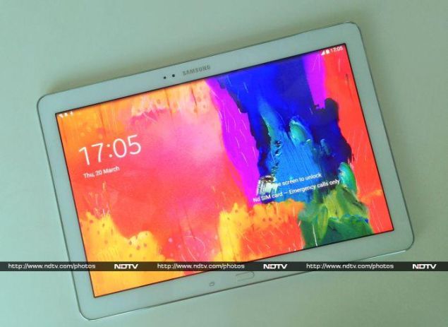
Is 12 inches too big for a tablet screen? We're about to find out. Samsung has decided that the world needs bigger tablets, and so we have not one but two 12.2-inch models from the Korean giant. As if their lineup wasn't expansive enough, these new models are the largest of a range of new Android tablets.
Samsung's lineup of tablets now extends from 7 inches to 12.2 inches. Factoring in the Galaxy Megaand Galaxy Note phones which have screens of up to 6.3 inches, Samsung really does seem to be trying every possible size.
The two biggest models, the Galaxy Tab Pro and Galaxy Note Pro, look identical and have nearly identical features, so it's easy to mix them up. The chief difference is the S-Pen, which has led to this confusing naming scheme. The S-Pen has been reserved for the Galaxy Note series of smartphones, so it probably seemed appropriate to name this tablet Note Pro.
Samsung_Galaxy_Note_Pro_angle_ndtv.jpg
Look and feel
There's no doubt about it; this thing is huge! It's also rather heavy and unwieldy. At 753g, it is lighter than an 11-inch MacBook Air, but you will definitely notice its weight in a shoulder bag. If you're carrying a laptop anyway, you definitely don't want to deal with this much extra weight. The Note Pro thus only makes sense if it can replace your laptop, which is a tall order. Otherwise, it's destined to stay put in an office or home; capable of being carried around from room to room, but not really used as anyone's primary computing device.
The Galaxy Note Pro largely sticks to Samsung's current design formula: the front is sunken white plastic, the edges are chrome, and the rear is textured faux-leather plastic with stitching. We still aren't fans of this aesthetic, but we've resigned ourselves to it. Also true to form, there's a single chrome-ringed physical button for Home, flanked by capacitive Back and Recents buttons.
The Recents button replaces the Menu button, which is no longer necessary in Android 4.4. This means there's a slight difference to how functions are called up, as compared to previous Samsung devices. It only takes a quick tap on the Recents button to switch between apps, and long-pressing it does nothing. A long-press on the Home button now launches Google Now. A long-press on the Back button still pulls up the Multi Window tray, which lets you run more than one app at a time on certain Samsung Android devices.
Samsung_Galaxy_Note_Pro_buttons_ndtv.jpg
Above the screen, you'll see a Samsung logo along with the 2-meagpixel front camera and ambient light sensor. On the top edge right above these, you'll see the Infrared emitter, with a power/standby button and volume rocker off to one side. Most of the ports and slots are located on the right edge: from top to bottom you'll see the S-Pen in its silo, a speaker grille, a Micro-USB 3.0 socket for charging and data syncing, a covered microSD slot and a covered SIM card slot. There's nothing on the right edge apart from a 3.5mm headset jack and a matching speaker. The bottom is completely blank.
The S-Pen is a decent size but is a bit too thin to offer a good enough grip, thanks to the shape of the Galaxy Note's body. It comes with replaceable tips and a little tweezer tool to help pull them out.
Largely due to its size and weight, we found ourselves using the Note Pro flat on a table. Even when reading books, it wasn't comfortable to hold in our hands or rest in our laps. With this in mind, we would have loved to have had a kickstand or some other means of propping it up a bit.
Samsung_Galaxy_Note_Pro_frontcam_ndtv.jpg
Features and specifications
The main attraction of the Galaxy Note Pro is obviously its 2560x1600-pixel 12.2-inch screen. Just for perspective, this is the kind of resolution we used to see on 24-inch and larger desktop monitors. With most PCs and laptops (no matter how large their screens) still inexplicably stuck at 1366x768, it's no wonder that mobile devices are displacing them so rapidly.
Android scales to the high resolution very nicely, and text is readable throughout. Even the stock Web browser uses all available space rather than displaying content 1:1 and crunching it all in the centre. However, Samsung hasn't really taken advantage of this in its UI design. Icons and widgets are almost comically oversized, especially in the notification shade. We often found ourselves leaning in towards it and then jerking backwards, which took away from the usability experience.
Amazingly, despite its high resolution, the screen is quite grainy. This might be due to the digitizer required for the S-Pen, or the fact that Samsung has used a PenTile panel. It's not always a problem, but it becomes especially distracting when reading text. It feels like the enormous potential of a huge screen has been compromised.
Samsung_Galaxy_Note_Pro_rear_ndtv.jpg
The Processor is an Exynos 5420; one of Samsung's own designs. It consists of four ARM Coretex A15 cores running at 1.9GHz and four Cortex A7 cores running at 1.3GHz. In previous implementations, this sort of arrangement meant that only one quad-core cluster could be active at any time, in order to deliver performance or battery longevity when needed. The new Exynos 5420 uses a more advanced model (known as Heterogeneous Multiprocessing, or HMP) which can schedule tasks to any of the eight cores in any combination. Tasks can migrate from higher to lower power cores and vice versa, making for a far more powerful and flexible system.
The rest of the Note Pro's specifications also live up to that high standard. There's 3GB of RAM, 32GB of internal storage, GPS with GLONASS, Wi-Fi b/g/n/ac, 3G data, an enormous 9,500mAh battery, and Android 4.4.2. The rear camera takes 8-megapixel stills, but anyone who would up a 12-inch tablet to take photos shouldn't expect great quality.
The exact model available in India is the SM-P901. Other variants, the P900 and P905, offer 4G LTE and Wi-Fi only connectivity in other regions.
Samsung_Galaxy_Note_Pro_flaps_ndtv.jpg
Software
Samsung's moves to downplay Android have been well documented, and the Note Pro's software is evidence of that too. Taking full advantage of the opportunity to tweak the OS for such a large screen, Samsung has made its Magazine UX a bit more prominent, and the Android app launcher a bit less important.
On first boot, you'll see a home screen with two large widget panels and a row of app icons beneath it. Google's search bar is tucked away rather inconspicuously in the lower left corner, and a grid icon in the lower right corner will take you to the usual app launcher icon grid. If you swipe to the right there's another home screen (and you can of course add more), but when you swipe to the left, you're taken into the Magazine UX.
Samsung_Galaxy_Note_Pro_magazine_ndtv.jpg
This consists of large square panels, somewhat similar to the Windows 8 Modern UI, but occupying the entire screen. You also see that you can now swipe between multiple Magazine screens, not just one, and the traditional Android UI is reduced to a single dot on the scroll bar, no matter how many screens you have.
Samsung has also done a neat job with its keyboard. The keys all have an old-style 3D look, and you have a full layout including Tab, Shift, Caps Lock, Delete, and arrow keys, along with a number row with alternate symbol characters on each key. You can even use shortcuts such as Ctrl+A to select all text, and Ctrl+ X, C and V to cut, copy and paste. There's a second Shift button as well, but it's beyond the arrow keys. Like most soft keyboards, it takes up half the screen. At least with a 16:10 aspect ratio, there's more screen space to work with.
Samsung_Galaxy_Note_Pro_keyboard.jpg
You can have up to six panels on each Magazine screen, which can be news feeds, social feeds, or apps. It looks and behaves a lot like Flipboard, and indeed, most of the news feeds are Flipboard's own. The app panels are basically Samsung's own built-in apps: Email, Gallery, Hancom Office, Messages, Music, S Planner, NYTimes, Samsung's App Store, and Video.
The S-Pen works much as it does on the smaller Galaxy Note devices. Upon pulling it out of its silo, Samsung's floating Air Command menu appears on screen. You can hover over the screen to make a selection, and tap to "click".
Samsung_Galaxy_Note_Pro_stylus_ndtv.jpg
The five major options are Action Memo, which lets you write out an email address or phone number and have it turned into an actionable command; Scrapbooker, whichlets you draw a selection on screen which will then be captured in its original format; Screen Write, if you want to take a screenshot, annotate it and save or share it; S-Finder, a local and Web search app; and Pen Window, which lets you launch apps in floating windows over any app you might have running, without exiting to the app menu.
The S-Pen is handy, but not indispensable. It all comes down to whether you prefer scribbling. You can write out usernames, but not passwords, and Samsung doesn't automatically turn the keyboard into a handwriting recognition area when it knows the S-Pen is out of its silo.
Samsung has also heavily customised the notification shade and quick settings buttons. The Settings app receives an overhaul with items divided into four categories, as with previous Samsung devices. Multi Window functionality has been expanded to allow four apps to work in tiled windows, but we also managed to open five or more apps in floating windows that overlapped each other. Performance definitely took a hit with so many apps open simultaneously, but it goes to show that there's major potential for big, versatile Android devices in the future. 
Samsung_Galaxy_Note_Pro_multitask.jpg
Quite a few apps are preloaded, and the choices seem to lean towards business scenarios, such as Cisco's WebEx, Remote PC, e-Meeting, NYTimes, and Businessweek. Many of these require subscriptions to their vendors' respective services. There's also a version of Autodesk's Sketchbook app, optimised for the S-Pen, which is pretty fun to use, and shows off the Note Pro's pressure sensitive digitiser.
The other app of note is Peel Smart Remote, which uses the built in Infrared port to let you control TVs. It works fine with set-top boxes such as the DTH ones prevalent in India, and includes schedules for lots of local channels. The interface is a little unclear though, and it's a bit of a process to just change channels, since the app insists you browse through a list of shows organised into somewhat unintuitive categories.
Samsung_Galaxy_Note_Pro_top_ndtv.jpgPerformance
Benchmark scores for the Galaxy Note Pro were pretty impressive. SunSpider took only 542.3ms, and Browsermark returned a score of 1913. AnTuTu scored 34,136 points, while Quadrant reached 16,415. Graphics scores appeared poor, but we should remember that the screen resolution is far greater than most other laptops, which means there's a lot more work to be done. When compared to smaller tablets, all graphics benchmark results suffered other than 3DMark's Ice Storm Unlimited runthrough, which renders at a fixed off-screen resolution. When we considered this score, balance was restored.
That still means that gaming won't be much fun on the Note Pro. In any case, it's far too large for mobile games that use tilt controls or virtual thumbsticks.
Samsung_Galaxy_Note_Pro_right_ndtv.jpg
Movies look great on the big screen. Once again we were left wishing there was a kickstand, because this thing could work just fine as a TV or even a secondary monitor at close quarters. It choked on our highest quality H.264 video clip, but everything else in common formats played back well. The two stereo speakers are quite loud and you can fill a small room, but the sound is tinny and compressed.
As expected, there was no problem with performance in general usage. The Note Pro is snappy and responsive, although animations tend to feel laggy because they really are amplified on the big screen.
The battery lasted for 10 hours, 9 minutes in our video loop test, which isn't surprising considering the sheer size of the 9,500mAh battery.
Verdict
It's not hard to imagine that Samsung, having heard rumours of Apple introducing a larger sized iPad, decided to beat them to it. That is to say, they didn't have any purpose in mind when developing this product other than to be the first to do it. It seems a bit far-fetched to us that this product was conceived as a business tool or an office productivity machine. It's an indulgence, pure and simple, and that's not the sort of thing you see in work environments.
You just can't hold it in one hand, and so typing or even using the S-Pen requires that you put it down on a table. That's awkward and uncomfortable, and it's just not the kind of thing you can deal with when you're trying to be productive. Once again, we're left wanting for a stand of some kind. In its current form, the Galaxy Note Pro is much better suited to lounging on a couch with, since at least then you can put your knees up and rest it against your thighs.
Samsung_Galaxy_Note_Pro_widgets.jpg
There still could be applications for this product though. Education springs to mind; surely there are apps for children that would work wonderfully on a bigger screen, especially in classroom environments with groups of students around one device. Maybe it could be a tool for creative professionals in production environments: music and video editing also seem like prime candidates, along with creative illustration, of course. Beyond that, maybe elderly folk or those with mobility impairments would really appreciate the spacious keyboard and simple interface, as compared to laptops or PCs that are generally difficult to use.
We shouldn't have to struggle so hard to justify owning such a product, and so the whole thing just falls flat for us. Sure, it works well and represents some genuine innovation in the market, but how practical is it, really, for most people? That's not even factoring in the amount of money it costs, which could just as easily be spent on a very capable laptop.
Samsung_Galaxy_Note_Pro_box_ndtv.jpgIn fact some convertible Ultrabooks, which offer a balance of tablet and laptop features, cost even less than the Note Pro, such as Lenovo's Ideapad Yoga 13, which comes with an Intel Core i5 CPU, 4GB of RAM, a 128GB SSD and 13.3-inch 1600x900 screen.

So as much as we want to like the Galaxy Note Pro, we really can't see any reason to be excited by it. Perhaps its near twin, the Galaxy Tab Pro, will offer better value for money, but we can't help but feel that as far as Android tablet sizes go, 12.2 inches is well past the point of diminishing returns.
Price: Rs. 65,575

Pros
  • S-Pen
  • Good battery life
  • Potential for multiple uses
Cons
  • Grainy screen
  • Bulky and heavy
  • Expensive  
Ratings (Out of 5)
  • Design: 4
  • Display: 3.5
  • Camera: 2.5
  • Performance: 3.5
  • Software: 3.5
  • Battery Life: 4
  • Value for Money: 3
  • Overall: 3.5


Hi guys If u like this post please leave a comment in comment box... comment box will top right of every post and bottom of every post. its useful for me give a better information.. check top of the blog there is menu bar in that go to comments i replied for u r comments because there is no direct option for reply for u r comments. if u want to give any suggestion in bottom of blog there is contact information option please leave a msgs with u r mail id sure i will get u.


Amazon Fire TV review


Amazon Fire TV reviewamazon_fire_tv_table_ap.jpg

Amazon's new Fire TV streaming device shows a lot of potential in bringing together the best features from competing devices and adding voice search on top of that.
But for now, it's largely promise: Many of the best features work with only a handful of video services, which makes Fire TV primarily a showcase for Amazon's video offerings.
Fire TV, unveiled by Amazon on Wednesday, marks the online retailer's latest push into streaming video.
Amazon has aggressively expanded its video library in recent months, and is now offering its own device to view that content. At $99, Fire TV costs about the same as other full-service streaming devices, namely Roku 3 and Apple TV.
With Fire TV, you can watch video from NetflixHulu Plus and more if you have subscriptions to those services. If you get Showtime and ESPN through a supported cable or satellite TV provider, you can access on-demand video from those channels.
Otherwise, you can use free, ad-supported services such as Crackle, Vevo and YouTube. You can also buy video individually through Amazon Instant Video or get a selection for free through Amazon's $99-a-year Prime program.
You can listen to music, too, through Pandora, iHeartRadio and other services or play one of more than 100 games, some of which require a $40 game controller.
Fire TV offers more than 175 video, music and game apps, but that pales compared with the more than 1,000 available through Roku. Still, it beats the few dozen offered by Apple TV.
Notable omissions in Fire TV's app store include HBO Go, PBS and Apple's iTunes. Major League Baseball, ABC and the Disney Channel are coming soon. Apple TV already has all that, but it doesn't offer Amazon Instant Video directly on the device.
Fire TV, like Apple TV, allows in-app purchases, so you can sign up for Hulu Plus right from the TV and have the monthly subscription fee billed through your Amazon account. But for now, this works only with a handful of services. Netflix isn't one of them. Apple requires all apps to support that so you don't have to pull out your credit card each time.
Fire TV also lacks the interface consistency that Apple insists on. That means on-screen keyboards, layouts and search tools vary from app to app. With Apple TV, all apps share a common look and feel so you don't waste time figuring out what's where.
Amazon's device trumps Roku in keeping audio and video in sync most of the time. I've found that to be a problem with most streaming devices, with Apple TV being the notable exception.
What sets Fire TV furthest apart from competing devices is its voice search. Just speak the title, actor, director or genre into your remote, and Fire TV shows matching content on the TV. There were a few laughable errors. The device searched for "How I Met Your Brother" and "Holly Met Your Mother" when I asked to see the popular sitcom "How I Met Your Mother." But mostly, voice recognition worked well.
amazon_larsen_with_fire_tv_ap.jpg
Unfortunately, voice search works only with a handful of apps. I was able to get content from Amazon Instant Video, Hulu Plus and Vevo, but it missed Netflix and others. Searching "House of Cards" got me season 1 episodes available for purchase through Amazon, even though Netflix had those for free, plus season 2.
Furthermore, the search is rudimentary. Speaking "Sabrina: The Teenage Witch season 4" just got me the entire show, starting with season 1. The voice search recognizes titles of individual episodes, but it'll take me to the show's main page.
You can search while watching video, but that kicks you back to the home screen. It would have been nice to get just Hulu Plus video while in the Hulu Plus app.
One nice touch, though: If video is available for free on Hulu Plus, the search will steer you there, even if Amazon's trying to sell it. Amazon says it hopes to expand that to all other apps.
If you have Amazon's Kindle Fire HDX tablet, you can start video there and switch the feed to the TV. That frees up the tablet screen for supplementary content from Amazon's IMDb video and celebrity database. You can also check email and Facebook. It's akin to Apple's AirPlay feature for iPhones and iPads.
Fire TV is easy to set up, especially if you buy it through Amazon and have your device pre-registered to your account. Just plug the device into an outlet and connect it to the TV with an HDMI cable, which isn't included. You can get on the Internet through Wi-Fi or connect an Ethernet cable - again, not included.
The device is about the size of a double-album plastic CD case. That takes up more desk surface than the Roku 3 or the Apple TV, but it can be placed out of the way, even in a desk drawer. That's because the Fire TV's remote control connects with the device using Bluetooth wireless technology rather than infrared signals, so you don't need a direct line of sight.
amazon_peter_larsen_fire_tv_ap.jpg
Roku 3 (Review) uses Wi-Fi and doesn't need a direct line of sight either. Its remote has a headphone jack that captures audio from shows wirelessly, so you can watch late at night without disturbing others. Fire TV doesn't have that.
As stated previously, Fire TV is comparable in price to the Roku 3 and the Apple TV. Roku has cheaper options, for as low as $50, though it's worth paying $100 for a faster processor and other benefits. Meanwhile, Google Inc. has a $35 streaming device called the Chromecast (Review). It's more of a conduit for flinging video from your phone or tablet to your TV. It's more cumbersome to use than a stand-alone streaming device, and it works with relatively few apps.
With Fire TV, you can stream personal photos and video stored on Amazon's Cloud Drive. A software update coming next month will also give you access to personal music files and to parental controls.
And that goes back to the idea of Fire TV being largely about promise. Many features aren't ready yet, and the ones that are don't work yet with every service.
Fire TV is a good investment if you use a lot of Amazon content, but you'll need patience for features to arrive or get better.


Hi guys If u like this post please leave a comment in comment box... comment box will top right of every post and bottom of every post. its useful for me give a better information.. check top of the blog there is menu bar in that go to comments i replied for u r comments because there is no direct option for reply for u r comments. if u want to give any suggestion in bottom of blog there is contact information option please leave a msgs with u r mail id sure i will get u.


Gionee Elife S5.5: First impressions

Gionee Elife S5.5: First impressionsgionee_elife_s5_5_first_impressions_1.jpg

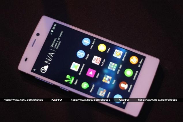
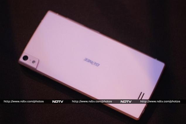
Gionee is trying hard to make a mark in the Indian smartphone market crowded with domestic players. The company has launched several smartphones in India, shortly after their initial Chinese release. One of these is the Gionee Elife S5.5, the 'world's slimmest smartphone' that was launched in China on 18 March, and in India on 31 March.

Notably, the Gionee Elife S5.5 will officially hit Indian shelves on 27 April. At its launch event in Goa, the company claims the Elife S5.5 was the 'best engineered product', and we had a chance to spend some time with the smartphone, to check just how true this claim was.

To be noted, is that our first impressions of the Gionee Elife S5.5 are based on the little time we've spent with the device, and do not constitute the final verdict. We expect to put the phone through our standard, comprehensive suite of tests when we have the unit in the NDTV Gadgets Lab for review.

gionee_elife_s5_5_first_impressions_3.jpgBuild, design and display
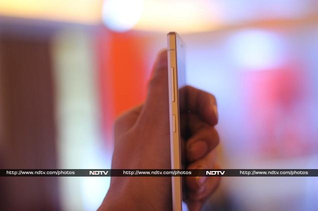
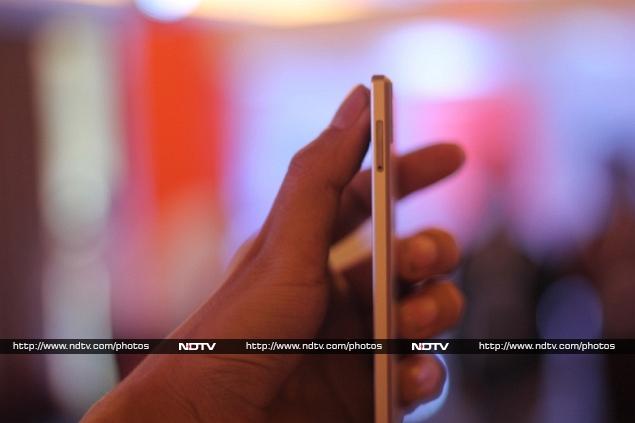
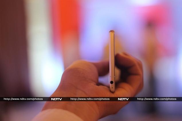
The Gionee Elife S5.5 with its Corning Gorilla Glass display and thin metal chassis looks and feels premium to hold. It also provides good tactile feedback on the power and volume keys (both on the left panel) are pressed. The left hand positioning of the power and volume buttons is good for one hand operation, but awkwardly Gionee decided to put the 3.5mm jack on the bottom, and the Micro-USB charging port on the top.
gionee_elife_s5_5_first_impressions_16.jpg
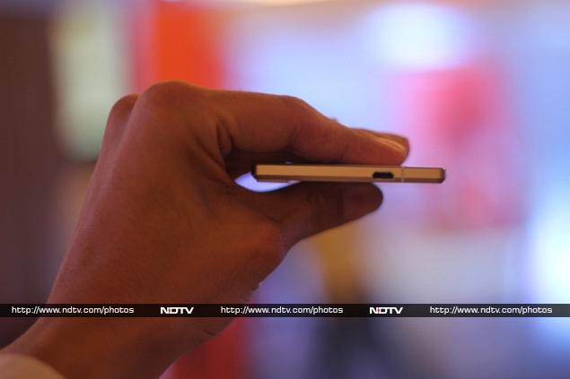
The front and back glass covering is similar to what we have seen on the Nexus 4, but in an extra slim body at 5.5mm and a thin aluminium metal chassis that holds everything. The Elife S5.5 weighs 130 grams, which is little more than iPhone 5s at 112 grams. The right-side panel of the Elife S5.5 featured the rubber-covered SIM-card slot near the top. Overall, with our first impressions of the Elife S5.5, we were left impressed by its build quality and design.
gionee_elife_s5_5_first_impressions_12.jpg
The Elife S5.5's display is a 5-inch full-HD display which features a pixel density of 441ppi. The display isn't very reflective, and features good viewing angles. The colour reproduction was quite accurate, and text looked quite sharp too. While we will reserve our final verdict for the smartphone's review, the display seems like a strong point for the Elife S5.5.
gionee_elife_s5_5_first_impressions_19.jpg
The Gionee Elife S5.5 did pretty well in the video playback department, however, the sound reproduction wasn't very good. The body vibrates a little with sound modulation, which can get irritating after a while. 
CameraWhile it is hard to believe a manufacturer squeezed a 13-megapixel rear camera and a 5-megapixel front camera (said to have a 95 degree wide lens) in a 5.5mm-thin aluminium metal body, until we saw it in our hands. 
gionee_elife_s5_5_first_impressions_9.jpg
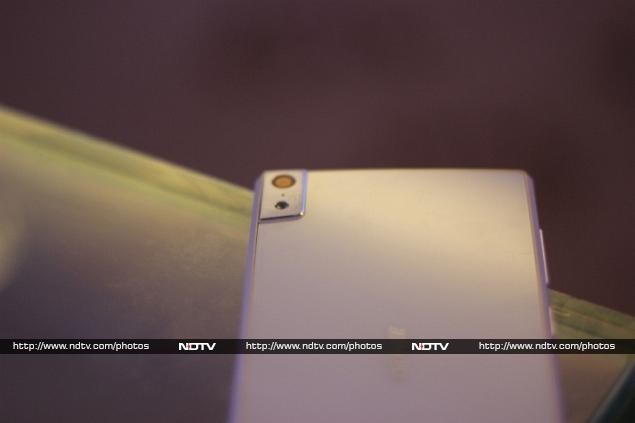
The rear camera with LED flash, however isn't completely in-line with the whole 5.5mm thickness and is slightly out, but it doesn't stick out too much. The edge-placement of the camera was also a slight problem, and we kept taking a part of our finger in the frame while holding it horizontally - though users could get used to this and adjust.
gionee_elife_s5_5_first_impressions_20.jpg
We could only play around with the camera for a while, but found the 13-megapixel offering to be about average. The camera UI is similar to what we have seen on the Elife E7, with similar camera settings that would take some effort to understand. So far, the impression is average on the camera and we will reveal more in our full review.
SoftwareThe Elife S5.5 runs Gionee's customised Amigo UI skinned on top of Android 4.2 Jelly Bean. The feel of the software essentially remains same as the Elife E7, but the company claims it to be an improvement over the last Elife model. We'll have to inspect it further to tell the differences, and improvements if any. Gionee Elife E7 had its share of problems with the software.
Although the software didn't trouble us during the course of our first impressions, the phone did heat up quite a bit. We certainly can't judge the software in a jiffy and it will be further grilled, once it reaches our labs for a full review.

Display

5.00-inch

Processor

1.7GHz

Front Camera

5-megapixel

Resolution

1080x1920 pixels

RAM

2GB

OS

Android 4.2

Storage

16GB

Rear Camera

13-megapixel

Battery capacity

2300mAh


Hi guys If u like this post please leave a comment in comment box... comment box will top right of every post and bottom of every post. its useful for me give a better information.. check top of the blog there is menu bar in that go to comments i replied for u r comments because there is no direct option for reply for u r comments. if u want to give any suggestion in bottom of blog there is contact information option please leave a msgs with u r mail id sure i will get u.


HTML Comment Box is loading comments...
MARUTHU Copyright@2014. Powered by Blogger.