1 "TAKE NO AS A QUESTION "

Friday, 6 December 2013

Lenovo Yoga Tablet 10 review
Lenovo Yoga Tablet 10 review


lenovo-yoga-tablet-10-dimensions.jpg
After forging a formidable reputation for itself in the global market with conventional notebooks and tablets, Lenovo has taken a fresh leap into Android tablet segment and has launched two new tablets dubbed the Yoga Tablet 8 and Yoga Tablet 10
Much like other Yoga devices in Lenovo's line-up, the Yoga Tablet 10 features multimode design and can be used in different 'modes'. The Chinese giant has been touting the Yoga tablets as the company's biggest launch of the year and also hired the Hollywood actor Ashton Kutcher as Lenovo's 'product engineer'. But can the combination of decent hardware, revamped tablet design with sleek form factor and a Hollywood actor make this the turnaround vehicle for Lenovo's tablet segment in India? We try to find out in our review.
Design/ Build
We have always been fascinated by new form factors in devices. Which is why we were so interested in reviewing the Lenovo Yoga tablet.
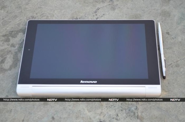
As far as looks go, Lenovo's Yoga Tablet 10 is a complete departure from the tablet norm and features a cylindrical end design at one end, which is reminiscent of a folded magazine (like the Sony Tablet S), while the other end has a sleek profile. The company has been promoting the Yoga tablet's cylindrical design as being more user-friendly when compared to other conventional tablets. 
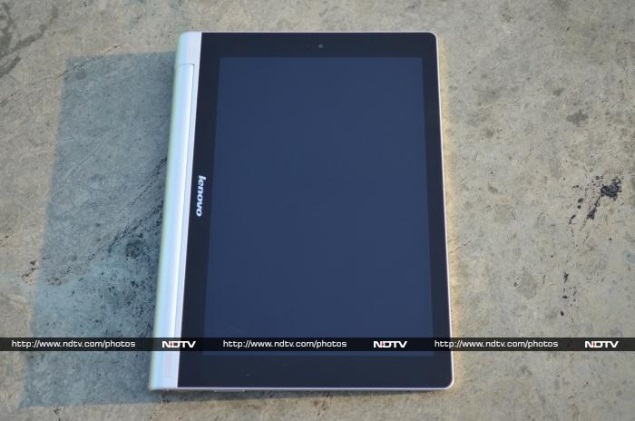
While using the Lenovo Yoga Tablet 10, we experienced that the cylindrical design at one end made it easy to grab and move the tablet around. Further, while using the tablet in portrait mode, the Yoga Tablet 10's cylindrical design was more comfortable to hang on to with the left hand, for example for when reading eBooks or for browsing on the tablet. It took some time for us to get used to the tablet's cylindrical end, though after that period it was quite easy to use the 10-inch tablet with one hand, at times (not always though).
lenovo-yoga-tablet-10-landscaper-mode.jpg
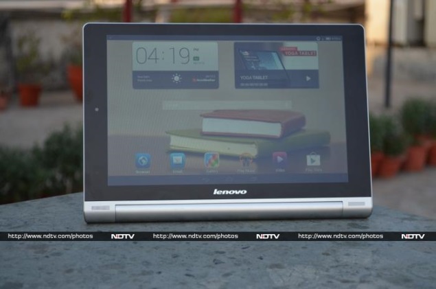
However, the tablet does feel a tad heavy at the bottom when using the Lenovo Yoga Tablet 10 in landscape mode and after a point of time; it doesn't balance well in the hands. At around 600 grams, the Lenovo Yoga Tablet 10 is heavy when compared to some 10-inch counterparts.
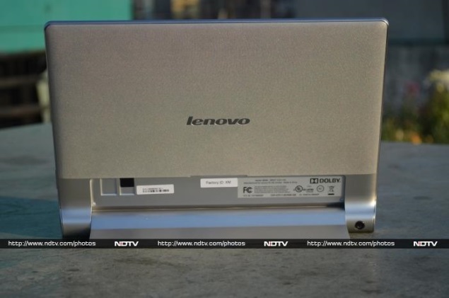
The Chinese major is touting Yoga Tablet 10's multimode design, offering three modes to work - hold, tilt and stand. The tablet's cylindrical end shape is responsible for these modes. Doubling up as a hinged stand that can be folded back at the back of the tablet, enabling stand mode. Second is tilt mode, which refers to placing the tablet on a surface with the cylindrical end offering a tilt shape for users to work. The last is the hold mode, which apparently means holding the tablet by the rounded end. We must confess that we used all the three modes of the tablet, and were impressed with the modes. When compared to normal tablets, a user has to buy separate covers or cases, to use the tablet in these different modes.
lenovo-yoga-tablet-10-stand-mode.jpg
Lenovo Yoga Tablet 10 includes both the aluminium and plastic material in build. The company has smartly used the aluminium on the hinge stand and also at the edges giving tablet a premium look; although in another places the Yoga Tablet 10 is built of plastic material. The rear panel of Yoga Tablet 10 features textured plastic material which doesn't help much in gripping the tablet. The front panel houses dual speakers at the bottom, (when using the tablet in landscape mode) near the edges on the cylindrical end of the Yoga Tablet 10.
One can find the Lenovo logo branding on the front as well as back of the Yoga Tablet 10. The front panel is dominated by the 10.1-inch display with no physical buttons. There is a 1.6-megapixel front-facing camera at the top of the display (when using the tablet in portrait mode).
lenovo-yoga-tablet-10-power-button.jpg
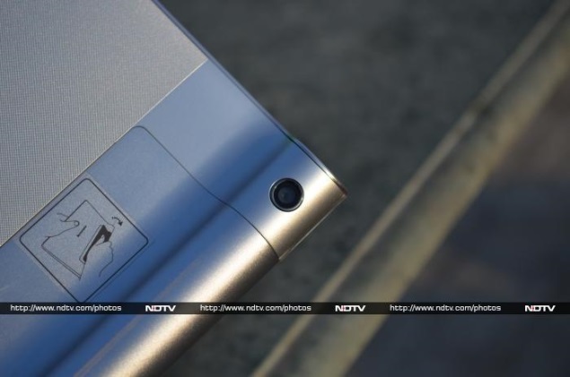
At the back of the Yoga Tablet 10, one can find the 5-megapixel rear camera embedded on the cylindrical end, which at times gets accidentally covered while clicking images. We wish Lenovo could have placed the primary camera of the tablet somewhere else.
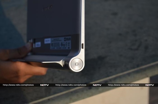
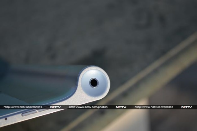
Another interesting feature of the Lenovo's Yoga Tablet 10 design was the power button, which has been built-in the cylindrical end of the tablet at one end, while the other end houses the 3.5mm audio jack. We must confess that Yoga Tablet 10's power button is the biggest ever we have seen on a tablet in terms of size. We had no problems in hitting the power button, sometimes even when not looking at the tablet, thanks to the placement. The top of the tablet houses the Micro-USB charging port, while the volume rocker buttons are placed at the bottom, when using the tablet in portrait mode. Overall, the Lenovo Yoga Tablet 10 as a package exudes power and sturdiness in terms of design.
Display
Lenovo may have spent a lot in terms of R&D for the new Android Yoga Tablet 10 but unfortunately, much of that effort goes in vain due to the display of the tablet. When we first time switched on the tablet, the 10-inch display was a let-down.
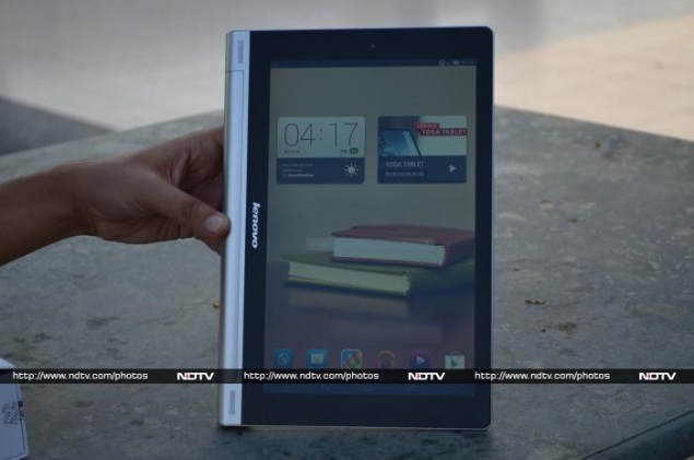
At 1280x800 pixels resolution, the Yoga Tablet 10 display offers a pixel density of just 149ppi. The resolution and pixel density of the Lenovo Yoga Tablet 10 is far lower than some of its 10-inch tablet competitors such as the year-old Nexus 10 that offers a resolution of 2560x1600 pixels or the Apple's new iPad Air which offers 2048x1536 pixels. However, the prices of both the Nexus 10 and iPad Air are way above the price of Lenovo's Yoga Tablet 10. There is no doubt that Lenovo has chosen to compromise the screen of the Yoga Tablet 10 to bring down the price.
lenovo-yoga-tablet-10-homescreen.jpg
Further, the Yoga Tablet 10's display is a let-down by its colour reproduction, which is not particularly accurate and the colours appear washed out. We were also surprised to see the Yoga tablet's homescreen icons looking a little blurred.
The Yoga tablet's screen is very reflective and this hampers visibility under the sunlight and also due to the low resolution of the screen, images and videos played on the tablet appear less sharp. The company has equipped an IPS LCD technology on the Yoga Tablet 10's display, which does help in viewing angles.
Camera
lenovo-yoga-tablet-10-rear-camera.jpg
The Lenovo Yoga Tablet 10 sports dual cameras - a 5-megapixel rear camera and a 1.6-megapixel front-facing camera.
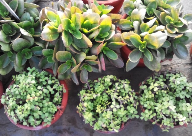
In our testing of the Yoga tablet's rear camera in outdoor, dim and indoor environments, we found that picture quality was average. The clicked images were a bit washed out and grainy at edges. They were nowhere near to a smartphone picture quality. The Yoga Tablet 10's camera disappoints while clicking low-light shots, which had a lot of noise.
lenovo-yoga-tablet-10-camera-sample-1.jpg
The Yoga Tablet 10's camera app takes few seconds to start, with another few seconds for the auto-focus to set-off. At times, we noticed the shutter speed was comparatively slow than the Android tablets, which means this will not take pictures in a pinch.
Users can choose from a host of camera settings on the Yoga Tablet 10, like face detection, self timer, ISO, exposure, colour effects, scene mode and white balance. It also offers a burst mode, letting users click 40 to 99 shots at once; users just need to long-press the camera soft key on the display to take burst shot.
Lenovo claims that the Yoga Tablet 10 is capable of recording videos at full-HD quality. Though due to lack of details and a lot of noise, the Yoga tablet's recorded videos were no were near to the full-HD quality we'd normally expect.
lenovo-yoga-tablet-10-camera-sample-2.jpg
The Yoga Tablet 10's front facing 1.6-megapixel camera is pretty decent, when compared to the primary camera. We were impressed with quality of some selfies that we clicked. It can be used well for video calls.
Software/ Interface
lenovo-yoga-tablet-10-software-page.jpg
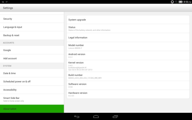
The Lenovo Yoga Tablet 10 runs Android 4.2.2, which seemed to be the OS of choice in Android based tablets in the country until few months. However, we expect Lenovo to soon rollout the Android 4.3 Jelly Bean update for the Yoga tablet. Considering that the company has positioned the Yoga Tablet 10 as its biggest launch of the year, we assume that the Chinese major might even think of skipping the Android 4.3 Jelly Bean update and directly release the Android 4.4 KitKat update for the Yoga tablet.
Talking about the Yoga Tablet 10's interface, Lenovo has given it a complete overhaul, which we feel is more inspired by Apple's iPad tablet interface. When we first unlocked the tablet, we found three homescreen panes filled with apps. It can include up to seven homescreens.
lenovo-yoga-tablet-10-quick-settings.jpg
After spending some time with the Yoga Tablet 10, we realised that Lenovo has removed the main menu which houses various apps and widgets in Android tablets. We even struggled to find apps when required, due to lack of menu view and at times had to use Google to search for pre-installed or downloaded apps on the tablet. Thankfully, the new downloaded apps on the homescreen panels sport a 'New' tag until, someone opens the app for the first time.
Next thing we noticed in the Yoga Tablet 10 was the oversized app icons, which looked blurred. We tried to fix the issue by reducing the app icon size but couldn't find a way to change it. Due to the large-sized app icons, we experienced some confusion at times. When we downloaded the Temple Run and Temple Run 2 on the Yoga Tablet 10, instead of showing the full name of the later app, it only showed Temple Run for both the apps.
lenovo-yoga-tablet-10-shortcuts.jpg
Further, Lenovo has completely skinned UI elements of the operating system on the Yoga Tablet 10. The tablet offers four themes that come with different icon set but even the default theme on the tablet that offered stock icons has undergone some minor tweaks with Lenovo choosing a circled icon look instead of the plain that is being offered on stock Android.
At the bottom of the Lenovo Yoga Tablet 10's display one can find apps for default browser, email, gallery, Play Music, default video player, and Google Play store. These apps remain fixed at the bottom on all homescreen panels.
One can get lock-screen widgets on the Yoga Tablet 10, which is an Android 4.2 feature. This Android 4.2 Jelly Bean feature enables users to perform certain app actions even when the device is locked.
Surprisingly, Lenovo has removed the option to directly launch the camera app from the lockscreen of the Yoga Tablet 10, a feature we have seen on all Android tablets. While unlocking the device one can choose from the calendar, Gmail, Google Now, and Google+ posts.
Similar to other Android 4.2 Jelly Bean-based devices, the notifications tray on the Yoga Tablet 10 features a settings shortcut and a clear all button. The Yoga Tablet 10 much like other Android 4.2 tablets come with two separate notifications tray - one with Quick settings and other with email, messages, and other alerts.
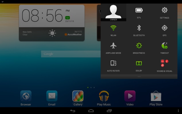
On expanding the Quick Settings notification tray on the Yoga Tablet 10, one can find options for quick access to the owner's profile, battery status, settings shortcut, Wi-Fi, Bluetooth, GPS, airplane mode, brightness, screen timeout, auto rotate, Dolby and audio profiles for three modes - namely hold, stand and tilt modes.
The Lenovo Yoga Tablet 10 also comes with Google Now, an Android 4.2 feature which is a voice-based information assistant and an extension of Google search. It uses cards which are essentially small boxes that offer different sets of information like weather forecast, directions, traffic information, scores, appointments and currency conversion etc.
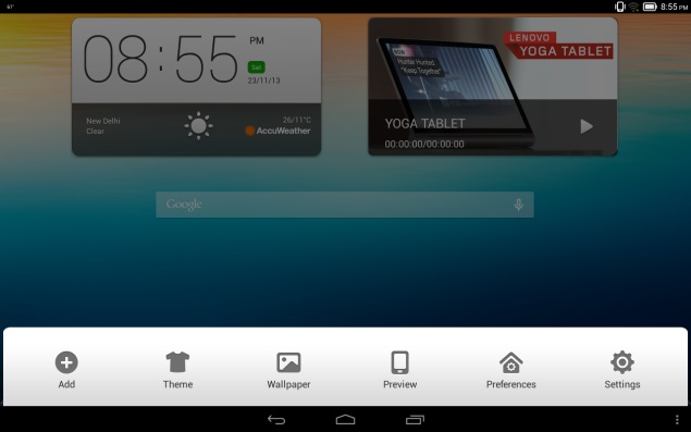
The Yoga Tablet 10 also includes three dots at the bottom right panel, which opens a new tray that includes tablet themes, wallpapers, preview, preference and settings. Users can add or remove apps from the tray.
lenovo-yoga-tablet-10-skype-app.jpg
We were a bit surprised to see the limited number of apps preloaded on the Yoga tablet 10. Some of the apps pre-installed on the tablet include Norton Mobile for warding off virus and malware attacks; Navigate 6, a navigation app; AccuWeather, an app to track the weather conditions; SHAREit, an inter-tablet content transmission app; Kingsoft Office Suite, for creating and editing MSOffice files, and Skype for having video calls over Wi-Fi. However, the Norton Mobile app is not completely free and users need to pay for using the premium features of the app.
lenovo-yoga-tablet-10-dolby-app.jpg
The Lenovo Yoga Tablet 10 also comes preloaded with host of Google apps such as Gmail, Google Search, Google+, Hangouts, Google Maps, Play Books, Play Movies and TV, Play Store and YouTube.
Performance/ Battery Life
lenovo-yoga-tablet-10-portrait-mode.jpg
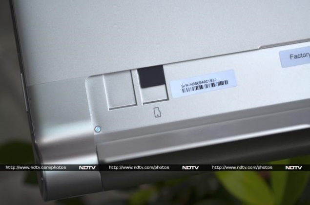
The Lenovo Yoga Tablet 10 is powered by a quad-core MediaTek chipset (MT8389) clocked at 1.2GHz along with 1GB of RAM. There is 16GB of inbuilt storage, which is further expandable up to 64GB with the help of microSD card.
Without any doubts, the Lenovo Yoga Tablet 10's specifications sound quite acceptable on paper. But unfortunately, the same is not the case in real life performance. We found the tablet lagging in launching some apps. Admittedly, the lag is not that consistent but considering that a quad-core processor backs the Yoga tablet, it is quiet disappointing.
lenovo-yoga-tablet-10-microsd-card.jpg
At a time when tablet manufacturers are moving towards more serious architecture and choosing Qualcomm, Exynos and Nvidia chipsets to power the devices, Lenovo has chosen MediaTek. The company has clearly compromised the hardware for keeping price of the Yoga tablet as low as possible. Thankfully, the touch experience was good on the Yoga Tablet 10.
We played some of our favourite games on the Yoga Tablet 10, including Temple Run 2, Subway Surfers, Dead Trigger, Vector and Shadow Gun, the tablet fared well, except for some odd lags at times, Overall, we got an acceptable gaming experience.
lenovo-yoga-tablet-10-audio-jack.jpg
However, the biggest compromise for playing games for longer periods on any device, a tablet or a smartphone, is the battery backup. But thankfully, the company has equipped the Yoga Tablet 10 with huge 9000mAh battery and that delivers. The Yoga Tablet 10 in our rundown video playback tests lasted for more than 8 hours of continuous video playback. The company claims that the Yoga Tablet 10 can deliver up to 18 hours of browsing, although we couldn't test this.
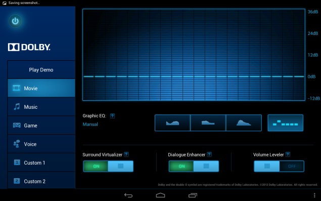
The Yoga Tablet 10 was able to playback all popular formats including MKV, MP4, MOV and AVI. Further, the tablet played full-HD videos with minimal fuss and thanks to the 10-inch large screen size, watching movies is a pleasure. Lenovo has not included its music player, but has instead decided to stick with Google's own Play Music app. The music player does not come with too many tweaking options but offers acceptable experience through earphones/ headphones. Unfortunately, we cannot say the same for the dual-front speakers. The dual speakers are powered by Dolby Sound but give average sound quality. We played some music on the Yoga Tablet 10 through the speakers, and at loud volumes the sounds seemed to break.
As mentioned earlier, the Lenovo Yoga Tablet 10 packs a large 9000mAh battery and in our usage, it easily lasted for more than a day. We charged the tablet in the morning, and with medium to heavy usage, including notifications for two email accounts configured, listening to some music, long hours of gaming (Temple Run 2, Skiing Fred, Plants Vs Zombies2 and Shadow Gun), taking some casual photographs and chat notifications, the tablet lasted for almost a day, with at least 30 to 40 percent battery still left. It's worth pointing out that we had turned on Wi-Fi and the display was set on to full-brightness. Changing these settings may help in increasing the phone's battery life, depending on your usage pattern. In terms of battery backup, we can safely say that the Lenovo Yoga Tablet 10 is one of the best in the segment.
Verdict
There is no doubt that Lenovo has put in a lot of thought in the whole design of the tablet, making it stand out from the routine crowd. Additionally, it's worth pointing out that Lenovo's Yoga Tablet 10 multimode feature includes those modes, which generally require a separate cover or a stand for a tablet. While it does live up to what Lenovo's Yoga line-up is known for (multimode design), we feel that a better chipset and a higher-resolution display could have helped the cause.
In our opinion, the Lenovo Yoga Tablet 10 delivers in some departments though disappoints completely in others. And while everything generally worked well on it, we did experience the odd lag, making us wonder whether the MediaTek's quad-core processor was a good choice by the company. Another deal breaker is the Yoga Tablet 10's display, being a 10-inch device with a display sporting lower screen resolution looked awful, we admit. The company has made changes to the UI of the tablet, but that too does not help much in the overall experience. Further, the tablet sports dual front loudspeakers but the sound experience was not that great.
At Rs. 28,999 for the 16GB and Wi-Fi + 3G edition of the Lenovo Yoga Tablet 10 is priced decently. Those looking for alternatives can look for the Apple iPad 2, which is a dated device but offers a better package. In case, one wants a refreshed tablet can also go for the Apple iPad Mini with Retina Display which is expected to be launched in India next week at a price of Rs. 28,900 (16GB), or for those who want a 10-inch tablet, the Wi-Fi only Apple iPad Air, which is also expected to launch next week at an price of Rs. 35,900 (16GB).
Price: Rs. 28,999
Pros
  • New (refreshed) tablet design
  • Battery life outstanding
  • Multimode design helpful at times
Cons
  • Disappointing camera
  • Average speaker performance
  • Low-resolution display
Ratings (Out of 5)
  • Design: 4
  • Display: 2.5
  • Camera: 2.5
  • Performance: 3
  • Software: 2.5
  • Battery Life: 4
  • Value for Money: 3
  • Overall: 3


Hi guys If u like this post please leave a comment in comment box... comment box will top right of every post and bottom of every post. its useful for me give a better information.. if u want to give any suggestion in bottom of blog there is contact information option please leave a msgs with u r mail id sure i will get u.


Xolo Q2000 review

Xolo Q2000 review


xolo-q-2000-10.jpg
Indian handset brand, Xolo, recently launched its new smartphone or rather phablet, the Xolo Q2000, which features the company's biggest screen on a smartphone, yet. The phone boasts of decent hardware specifications and promises to offer all the features of a modern phablet at an economy price point. Is it good enough to take on the likes of Samsung's phablets? We try to find out in our review.

Build/ Design
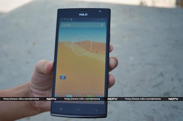
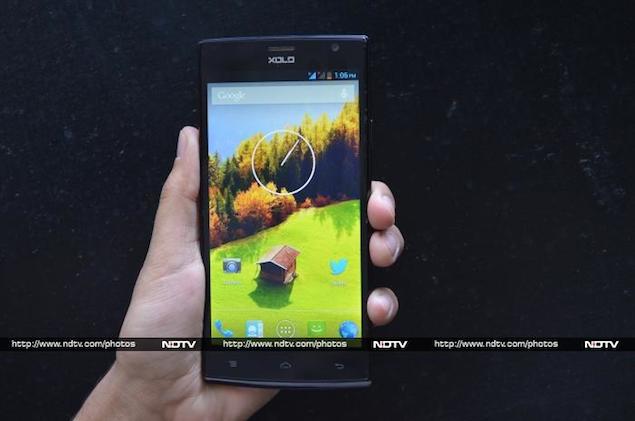
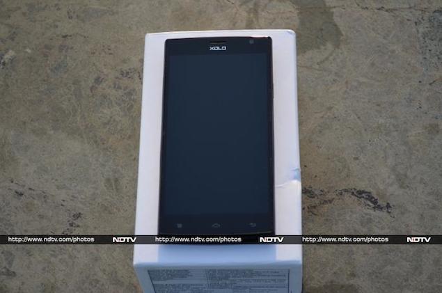
When you first look at the Xolo Q2000, you realise it's a big black slab with a utilitarian design, not evoking any emotions. The phone's front features its massive 5.5-inch IPS display, the three capacitive touch buttons for navigating around the phone's interface placed below it, and the sensor array and the front-camera lens, placed above it. Enclosed in a plastic frame, the bottom edges out, creating a small chin-like extension.

The Q2000 is rectangular with corners that are not rounded, giving it a sharp look.

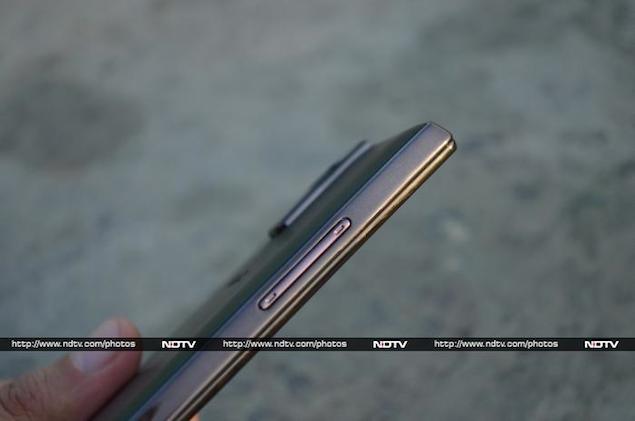
xolo-q-2000-5.jpgThe left edge of the Xolo Q2000 features the Power/ Screen lock key, while the left edge houses the volume rocker. Both the keys are made of plastic and offer decent tactile feedback. The top edge sports the Micro-USB port and the 3.5mm headset jack. The edges feature a sturdy frame which appears to be made from polycarbonate, bearing a glossy finish.

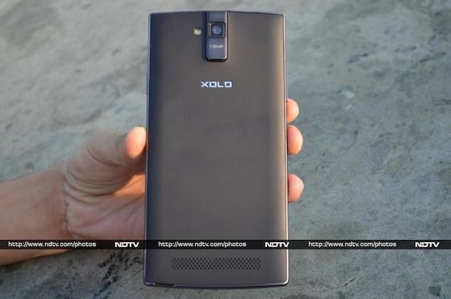
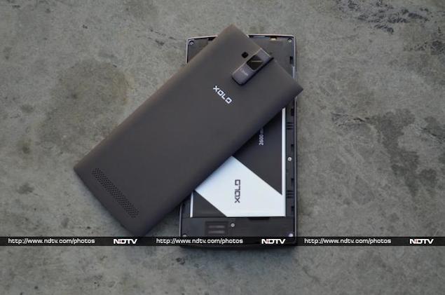
The back of the Xolo Q2000 features a thin plastic cover that hides the battery compartment holding a 2600mAh battery, apart from the SIM card and microSD card slots.  The cover sports a matte finish, and felt very flimsy in contrast to the otherwise sturdy-build of the phone. A rectangular strip, made from the same material that we've seen on the edges protrudes out, right at the top, featuring the rear camera lens. 

xolo-q-2000-7.jpgOverall, barring the back cover, the Xolo Q2000 looks and feels solid, though it's not really optimised for one-handed usage.

Display
The Xolo Q2000 features a 5.5-inch IPS display with a 720x1280 pixel resolution and pixel density of 267ppi. The panel supports 5-point multi-touch. 

The viewing angles of the Xolo Q2000's display looked good, and the brightness of the phone was optimum. Outdoor visibility was above average though the screen was a bit reflective. While the display sports a decent resolution, at times it looked pixelated, probably due to the bigger screen size resulting in less number of pixels per inch.

xolo-q-2000-20.jpgOne issue that we encountered with the phone was its inconsistent touch sensitivity. A number of times, the onscreen keyboard failed to register key-strokes. This issue makes using the phone frustrating. We're not sure if it was limited to our review unit.

Camera
The Xolo Q2000 features an 13-megapixel autofocus shooter that takes great images in daylight. Even in low-light conditions, apart from some noise, we felt that the rear shooter does a nice job of capturing stills.

We were also satisfied with the quality of pictures taken by the Xolo Q2000 indoors, though we did find them to be a little grainy occasionally.

xoloq2000-cam1.jpgXolo Q2000 can record full-HD videos and we found that the quality of videos captured through the back camera was good. It also offers EIS or Electronic Image Stabilisation to minimise distortions caused by shaking of hands while shooting a video. Unfortunately, the camera saves videos in the archaic .3GP file format.

The 2-megapixel front facing camera on the Xolo Q2000 also takes decent quality shots with good lighting conditions and is great for video calls. Overall, the phone is pretty good for casual photography.

The Xolo Q2000 comes with a customised Camera app, and allows you to capture photos in HDR, 'face beauty' mode, Panorama modes, 'auto-scene detection', and 'best shot' modes in addition to an EV bracket mode for taking multiple exposure photos.

xoloq2000-cam2.jpgThe Q2000's camera app also comes with the usual controls including settings for Exposure, Colour effect, White balance, Scene Modes and ISO, among others. The phone's camera also supports continuous shots taking up to 40 shots in that mode, smile detection and face detection. Some of the options in the camera app's interface are not self-descriptive which makes it a little unintuitive for new smartphone users.
 
Software/ User Interface
The Xolo Q2000 runs Android 4.2.1, and the company has not customised the user interface much, except for offering four preloaded themes, namely Mint, Mocha, Raspberry and the default theme that bring minor changes in the phone's colour scheme.

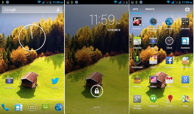
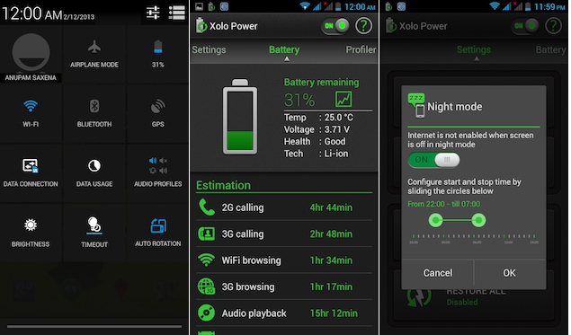
The notification tray on the Xolo Q2000 features a settings shortcut and a clear-all notifications button, along with expandable notifications (expanded with the two-finger pull gesture). It features the same setting toggles shortcut that's found in stock Android and adds some of its own as well, for quick access to airplane mode, battery status, Wi-Fi, Bluetooth, GPS, data connection, data usage, audio profiles, brightness, screen-backlight timeout and auto rotation.

xoloq2000-UI1.jpgSimilar to most other Android devices, there are five customisable home screens on the Xolo Q2000's UI that can be filled with app shortcuts and widgets. The three capacitive buttons, Menu, Home and Back, help in navigating through the phone, with the Home button also doubling up as an app switcher on long press. One major gripe with these buttons is that they don't light-up in the dark even when the screen is on until you press one of them.

You also get lock-screen widgets  on the Xolo Q2000 - an Android 4.2 feature. You can choose from the Clock, Camera, Gmail, Google Now and Messaging widgets in addition to widgets offered by third-party apps installed on your phone. These widgets offer 'glance-able' information from the apps and allow users to perform certain app actions even when the phone is locked.

The phone also offers another Android 4.2 feature, Daydream, that displays photo albums or the clock while the phone's charging. The option to wirelessly mirror the phone's display with an HDMI-enabled device through a wireless display adapter is also present.

xoloq2000-UI2.jpgXolo has also bundled some apps with the phone including NoteBook for creating colour coded notes and task lists; PlayApp - an app recommendation utility; a File manager; a video player app, and Xolo Power and Xolo Secure apps for power management and security.

The Xolo Power app claims to allow you to track battery consumption by checking your usage pattern and making changes to settings to optimise it. The Xolo Secure app claims to allow you to protect, locate and wipe data in case your phone gets stolen.

Performance/ Battery Life
The Xolo Q2000 is powered by a 1.2GHz Mediatek MT6589 quad-core processor. It has 1GB RAM onboard, and PowerVR SGX 544MP chip for processing graphics. There is 8GB of internal storage, which is expandable up to 32GB via a microSD card.

With Android 4.2.1 Jelly Bean, the overall experience of navigation through the interface was impressive, thanks to the phone's quad-core processor. We did not experience any lag while launching apps, scrolling web pages or switching between apps.

xolo-q-2000-15.jpgWe were able to play games like Temple Run 2 and Subway Surfers, without encountering any lag. However, graphics intensive games like Asphalt 7 did not run smoothly on the Q2000, dropping frames.

We were able to play full-HD clips smoothly and the phone supported formats like .AVI and .MOV, natively. The speaker on the Xolo Q2000 delivers decent quality sound at high volume levels, but there's some muffle when the phone lies on its back, as the speaker grill is located on the back. The headphones that come with the phone offer average quality sound output. The phone also offers FM Radio. 

Call quality of the Xolo Q2000 was good during our testing process, and phone was also able to get a GPS lock rather easily while using the Maps app.

The Xolo Q2000 comes with a 2600mAh battery, and based on our experience, it will last you a full day with medium to heavy usage, including 1-1.5 hours of phone calls, two e-mail accounts with push notifications, screen at maximum brightness, playing some music and video clips, Twitter notifications and WhatsApp chats. 

It's also worth pointing out that we had turned off Wi-Fi and auto-brightness, and the phone was hooked to a 3G network. Altering these settings might help in running the phone for a longer duration, depending on your usage pattern.

Verdict
At a price of Rs. 14,999, the Xolo Q2000 is a good budget phablet that delivers decent performance, without burning a hole in your pocket. However, the display, which is one of the major factors for choosing a large screen device, could have been better in terms of resolution, and definitely in terms of overall touch sensitivity. 

xolo-q-2000-1.jpgIf you don't mind the non-expandable storage, and are ready to shell out more, you can also take a look at the Micromax Canvas Doodle 2. The Samsung Galaxy Mega 5.8 is also a similar device, though we weren't really satisfied with it in terms of hardware performance. If you can settle for a 5-inch screen, than the Zen Ultrafone 701 is our pick. 

Overall, the Xolo Q2000 just falls short of being the perfect economy phablet.

Price: Rs.14,999

Pros
Good camera
Decent battery backup

Cons
Low resolution screen
Poor touch sensitivity
Flimsy back cover

Ratings (Out of 5)
Design: 3
Display: 2.5
Performance: 3.5
Software: 3.5
Battery Life: 3
Value for Money: 3.5
Camera: 3.5
Overall: 3


Display

5.50-inch

Processor

1.2GHz

Front Camera

2-megapixel

Resolution

720x1280 pixels

RAM

1GB

OS

Android 4.2

Storage

8GB

Rear Camera

13-megapixel

Battery capacity

2600mAh


Hi guys If u like this post please leave a comment in comment box... comment box will top right of every post and bottom of every post. its useful for me give a better information.. if u want to give any suggestion in bottom of blog there is contact information option please leave a msgs with u r mail id sure i will get u.


Samsung Galaxy Note 10.1 (2014 edition) review


Samsung Galaxy Note 10.1 (2014 edition) review


samsung-galaxy-note-10.1-635.jpg
Remember when people used personal computers - desktops and laptops - to check email, view video and keep tabs on Facebook? Back in that far-away era, I'd have several windows open for Web browsers, a word processor, a photo editor and sometimes a reader for PDF documents.
I miss that capability on mobile devices, particularly on full-size tablets with a decent amount of display space. With iPads and Android tablets, I'm typically limited to one window displayed at a time; other apps run in the background, out of sight. With Windows 8 tablets, I can run two windows side by side, but I'm constrained in what I can do with them. It gets better with the Windows 8.1 update due out next week, but it's still not the free-for-all I had with PCs.
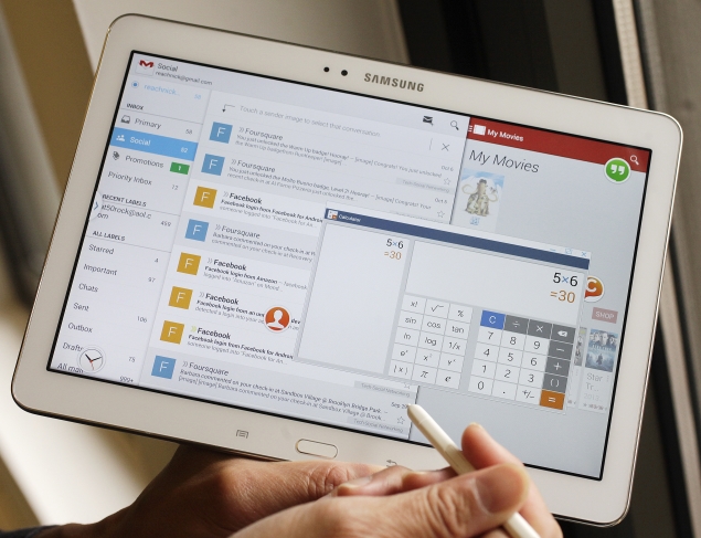
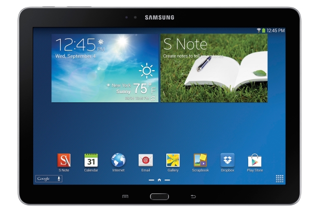
So I marveled at a pair of multitasking features that come with Samsung's new tablet, formally called Galaxy Note 10.1 - 2014 Edition. Sporting a 10.1-inch display, measured diagonally, the Note tablet goes on sale in the U.S. on Thursday at a starting price of $550.
The first of the multitasking features, called Multi-Window, has been available in Samsung devices for about a year, but it works with many more apps now. You can run two apps side by side, such as Facebook on one side and YouTube video on the other.
Like Windows 8 tablets, you're limited to just two apps. You can change how much of the screen each one takes, a capability coming with Windows 8.1, but you can't choose to have a window take up just the top left corner, the way you can on PCs. In addition, Multi-Window isn't a universal feature. Apps for Netflix and Hulu won't work, for instance. You currently have about 18 apps to choose from, including Facebook and a variety of Google and Samsung apps.
Galaxy-Note-10_1_635_multi_window.jpg
With that limitation, it's nice that Samsung Electronics Co. is supplementing Multi-Window with a feature called Pen Window.
With it, simply draw a box on the screen with the included stylus, and choose one of seven apps to open in a new window. Do it again and again until you open all seven apps, if you wish. That's nine in all, counting the two with Multi-Window. Each Pen Window app appears in a window that floats over your main app (or two apps if you use Multi-Window). You can move that window around on your screen and resize it, just as you can on PCs. Need a break from it? Just minimize it into a small dot and move it out of the way.
Like Multi-Window, you're restricted in what apps you can use with Pen Window, though I expect more to get added over time. For now, Pen Window on the tablet works with YouTube, the calculator, the alarm clock, your contacts list, the Web browser and two chat apps - Samsung's ChatOn and Google's Hangouts. I like the fact that you can open all of them and keep them out of the way in a minimized state. That way, it's just one click when you need the calculator and one click when you're done.
The iPad doesn't do that. Amazon's Kindle Fire doesn't do that. Other Android tablets don't do that. Windows 8.1 won't do that - at least not in the tablet-style viewing mode that Microsoft prefers you stick with. You'll have to go to the classic, desktop mode to resize windows, which defeats the purpose of having Windows 8 or 8.1. Windows 8.1 will go further than Multi-Window in letting you run up to four apps side by side, but that works only on larger screens, not portable tablets.
Beyond multitasking, the new Note tablet offers a My Magazine mode giving you personalized highlights, such as news topics of interest, content from your social media feeds and suggestions on things to do and see, based on your current location. It's a good concept, though Facebook isn't available through it yet.
galaxy_note_10_1_635_with_stylus.jpg
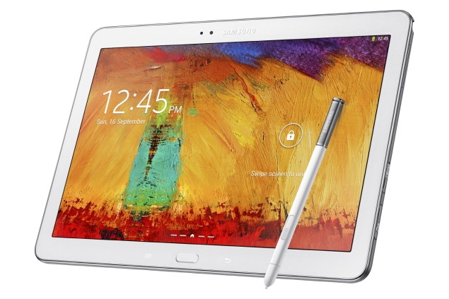
The new tablet also gives you quick access to the tools you can accomplish with its stylus. Pen Window is one. Another feature lets you add notes to a screenshot of what you see. Another lets you clip a section of a Web page and store it with a Web link.
Unfortunately, not everything worked. Text recognition was poor. I'm supposed to be able to jot down an email address or a phone number with the stylus and have that handwriting converted into a contacts entry. But the device constantly confuses the letters "o" and "l" with the numerals "0" and "1."
Pen Window also is more difficult than necessary to set up. You need to take out the stylus for an Air Command tool to appear on the screen. You choose Pen Window, then draw a box on your screen with your stylus. Then you choose the app you want to open. Do all of that again to get additional apps, after figuring out how to get Air Command again with your stylus already out. It would have been simpler to have a button on the home screen that you can tap with your finger or stylus.
In addition, Samsung could have done more with the apps in minimized state. Google's chat app is reduced to a circular icon. It could have flashed or changed colors to notify me of a new chat message, rather than make me open and close it regularly to check.
galaxy_note_10_1_635_back.jpg
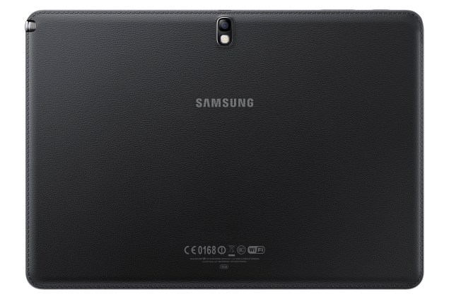
The tablet's back is still made of plastic, but it feels like leather - an improvement over previous Samsung devices. The tablet does feel heavy, at 1.2 pounds, but that's still lighter than the 1.4 pounds for the full-size iPad. If you want light, wait until early November for the large-size version of Amazon's Kindle Fire HDX. It weighs just 0.83 pound.
Samsung's tablet is also pricey - the $550 starting price tops the iPad's $499 and the Fire's $379. Of course, neither the iPad nor the Fire includes a stylus.
One more complaint: Although the tablet uses the latest version of Android, 4.3, it doesn't offer that system's feature of letting multiple people share a device with separate profiles.
With the Note, it's clear some of the functionality we've long associated with PCs is coming to devices we're just getting to know. There's more to be done, including support for multiple users, but I'm glad Samsung is leading us in that direction.


Hi guys If u like this post please leave a comment in comment box... comment box will top right of every post and bottom of every post. its useful for me give a better information.. if u want to give any suggestion in bottom of blog there is contact information option please leave a msgs with u r mail id sure i will get u.


Moto G review: Not the best, but decent for $179

Moto G review: Not the best, but decent for $179


motorola-moto-g-front.jpg
You're not getting the best or the latest technology with Motorola's $179 Moto G smartphone. What you do get is a great price for something close.
Motorola bills the Moto G as the phone for the rest of us - the ones who can't afford $500 to $700 for a high-end smartphone. That's a big deal overseas, where carriers don't subsidize phones with two-year service contracts the way they do in the United States. But even in the U.S., more people are moving to contract-free plans and ones that offer frequent upgrades, meaning the full retail price is what's going to matter.
The Moto G started shipping in the U.S. this week, initially for the GSM networks used by AT&T and T-Mobile. I spent the past week testing the Moto G, comparing the phone primarily with its more expensive cousin, Motorola's $500 Moto X. I also put it up against another lower-cost phone, Google's $349 Nexus 5, as well as the premium, $649 iPhone 5s from Apple.
Where the Moto G fell short was in its camera, battery life and inability to access faster, 4G LTE cellular networks. For everything else I tested, the Moto G stood up well.
Motorola, which is owned by Google Inc., doesn't skimp in equipping the Moto G with a speedy processor. Apps launch almost as quickly as they do on the phone's pricier rivals. The Moto G runs a fairly recent version of Google's Android system, with a promised upgrade to the latest, Kit Kat, early next year.
The Moto G also has a decent screen. It's about as sharp as the Moto X's and the iPhone's, enough for 720p video, though the Nexus and various Samsung phones do better by offering full, 1080p high definition. The Moto G's screen measures 4.5 inches (11.4 centimeters) diagonally, which is larger than the iPhone's but small for Android. Colors aren't as rich as on the Moto X's display, but if I want a superb visual experience, I'd turn to a tablet, a TV or even a movie theater. For a phone, the Moto G's screen delivers video quite well.
motorola-moto-g-front-back-635.jpg
The Moto G doesn't win points on size and weight. Although the screen is smaller than the Moto X's 4.7-inch (11.9-centimeter) display, the phone overall is a tad bulkier and 10 percent heavier. The Moto G has a larger frame surrounding the screen - something phone makers have been trying to shrink.
As for the other shortcomings
Cellular access
The Moto G delivers 3G performance at best. Many parts of the world are moving to 4G, but Motorola points out that many of its target markets are still upgrading to 3G. Even in the U.S., many regions lack 4G. If I'm doing a lot of things requiring top-notch speeds, I'm better off finding a Wi-Fi network anyway.
Battery life
The Moto G has 6 percent less battery capacity than the Moto X. I got about up to eight hours of streaming video on Hulu with the Moto G, compared with nine to 10 hours on the Moto X. Although the Moto G has a removable plastic back, the battery can't be exchanged with a spare. That said, eight hours for streaming video is a lot, and you can stretch it to a full day with more moderate use.
motorola-moto-g-camera.jpg
Camera
The main camera has a resolution of 5 megapixels, less than the 8 megapixels on the iPhone and the Nexus and the 10 megapixels on the Moto X. There's more to a good camera than the pixel count, but the pictures I took with the Moto G weren't particularly good, especially in low light. They are passable for selfies and Facebook posts, but you'll want a better camera for keepsakes. Perhaps the money you save on the phone can go to a point-and-shoot camera that takes better pictures.
The Moto G is also short on frills. Part of that stems from Motorola's philosophy not to tinker with the Android operating system too much. Many rival phone makers do just that and wind up creating more chaos and confusion.
Instead, Motorola tries to limit what it adds. In the case of the Moto X, you can twist the phone to automatically launch the camera. You can initiate voice commands by saying, "OK, Google Now." The Moto X also offers unprecedented customization when you order; you can choose everything from the color of the power button to a personalized message on the back cover.
motorola-moto-g-covers-635.jpg
The Moto G has none of that. The frills are limited to an FM radio tuner, something rare in smartphones. Just plug in a pair of headphones, which serves as the antenna. You can swap the back with a new plastic cover, but the phone isn't assembled at the factory to your specifications.
Be aware that the $179 price gets you 8 gigabytes of storage, half of what most phones offer. Given all the room your photos and video will need, pay the extra $20 for a 16 gigabyte model. Unfortunately, there's no slot for memory cards, as some Android phones offer.
Motorola sells the phone unlocked, meaning you can switch carriers as long as they use GSM. Verizon and Sprint are among the few carriers in the world using a different technology, CDMA. A Verizon version is coming early next year, while Sprint won't say whether it will have one.
Phone makers have been trying to set themselves apart by loading phones with more and more features, only some of which are useful. Motorola doesn't try to do that with the Moto G, apart from including an FM tuner. Instead, it's distinguishing itself through price. No one can question whether that's useful.

Moto G - Google and Motorola's new budget smartphone

Display

4.50-inch

Processor

1.2GHz

Front Camera

1.3-megapixel

Resolution

720x1280 pixels

RAM

1GB

OS

Android 4.3

Storage

16GB

Rear Camera

5-megapixel

Battery capacity

2070mAh


Hi guys If u like this post please leave a comment in comment box... comment box will top right of every post and bottom of every post. its useful for me give a better information.. if u want to give any suggestion in bottom of blog there is contact information option please leave a msgs with u r mail id sure i will get u.


Samsung Galaxy S Duos 2 dual-core 4-inch smartphone launched at Rs. 10,999


Samsung Galaxy S Duos 2 dual-core 4-inch smartphone launched at Rs. 10,999


samsung-galaxy-s-duos-2-listed.jpg
After being leaked in full via images, prices and specifications, Samsung's latest smartphone the Galaxy S Duos 2 is now official. The smartphone is now listed on the Samsung's India online store for Rs. 10,999. However, there is no word on the availability of the device, with the page providing a 'Notify Me' option for consumers.
The Galaxy S Duos 2 is also available through online retailers for a discounted price of Rs. 10,730, quoting roughly 3 business days of delivery time.
The Samsung Galaxy S Duos 2 comes with a 4-inch WVGA (480x800) TFT display and is powered by a 1.2GHz dual-core processor (unspecified chipset). It is a dual-SIM (GSM+GSM) smartphone and runs Android 4.2 Jelly Bean with TouchWiz UI on top.
The Galaxy S Duos 2 sports a 5-megapixel rear camera with LED flash and also includes a VGA front-facing camera. The smartphone comes with 768MB of RAM and 4GB of inbuilt storage, which is further expandable up to 64GB via microSD card. 
Connectivity features on the Galaxy S Duos 2 include Wi-Fi, Bluetooth, EDGE, GPRS and 3G. There is a 1500mAh battery backing the device which the company claims can deliver up to 8 hours of talktime and up to 280 hours of standby time. The Galaxy S Duos 2 has dimensions of 121.5x63.1x10.57mm, and weighs 118 grams.
Recently, Samsung announced the successor to the Galaxy Grand, the Galaxy Grand 2. Though, the South Korean handset maker has not revealed the price for Galaxy Grand 2 and has also not announced the availability details for the smartphone.
The Samsung Galaxy Grand 2 runs Android 4.3 Jelly Bean out-of-the-box. The Galaxy Grand 2 is a dual-SIM device with support for GSM+GSM. It features a 5.2-inch HD TFT display with a resolution of 720x1280 pixels.
The Galaxy Grand 2 is powered by a 1.2GHz quad-core processor alongside 1.5GB of RAM. It sports an 8-megapixel autofocus rear camera accompanied by an LED flash. It also houses a 1.9-megapixel front-facing camera. It comes with 8GB inbuilt storage, which is further expandable up to 64GB via microSD card.

Mobiles launched in November 2013

Samsung Galaxy S Duos 2 key specifications
  • 4-inch WVGA (480x800) TFT display
  • 1.2GHz dual-core processor (unspecified chipset)
  • 768MB of RAM
  • 4GB inbuilt storage, expandable up to 64GB via microSD card
  • 5-megapixel rear camera with LED flash
  • VGA front-facing camera
  • Dual-SIM (GSM+GSM)
  • Android 4.2 Jelly Bean with TouchWiz UI
  • Wi-Fi, Bluetooth, EDGE, GPRS and 3G
  • 1500mAh battery
  • 121.5x63.1x10.57mm


Hi guys If u like this post please leave a comment in comment box... comment box will top right of every post and bottom of every post. its useful for me give a better information.. if u want to give any suggestion in bottom of blog there is contact information option please leave a msgs with u r mail id sure i will get u.


Amazon testing delivery packages using drones, CEO Bezos says


Amazon testing delivery packages using drones, CEO Bezos says


amazon-prime-air-635.jpg
Amazon CEO Jeff Bezos revealed Sunday that his company is looking to the future with plans to use "octocopter" mini-drones to fly small packages to consumers in just 30 minutes.
The US retail giant's ambitious project still requires additional safety testing and federal approval, but Bezos estimated that Amazon "Prime Air" would be up and running within four to five years.
A demo video posted on the company's website showed the tiny robotic devices picking up packages in small yellow buckets from Amazon's fulfillment centers and then whizzing through the air to deliver the items to customers just 30 minutes after they made their purchase on Amazon.com.
"I know this looks like science fiction. It's not," Bezos told CBS television's "60 Minutes" program.
"We can do half-hour delivery and we can carry objects, we think, up to five pounds (2.3 kilograms), which covers 86 percent of the items that we deliver."
The mini-drones are powered by electric motors and could cover areas within a 10-mile (16-kilometer) radius of fulfillment centers, thus covering a significant portion of the population in urban areas.
They operate autonomously and drop the items at the target locations thanks to GPS coordinates transmitted to them.
"It's very green, it's better than driving trucks around," said Bezos.
Amazon said the octocopters would be "ready to enter commercial operations as soon as the necessary regulations are in place," noting that the Federal Aviation Administration was actively working on rules for unmanned aerial vehicles.
It projected a more optimistic timeline than Bezos himself for the project to be activated, saying the FAA's rules could be in place as early as 2015 and that Amazon Prime Air would be ready at that time.
Bezos hinted that part of the motivation behind the mini-drones was to make sure Amazon remains on the cutting edge of the retail industry.
"Companies have short life spans. And Amazon will be disrupted one day," he said.
"I would love for it to be after I'm dead."


Hi guys If u like this post please leave a comment in comment box... comment box will top right of every post and bottom of every post. its useful for me give a better information.. if u want to give any suggestion in bottom of blog there is contact information option please leave a msgs with u r mail id sure i will get u.


iPad Air, iPad mini with Retina display to be available in India starting December 7


iPad Air, iPad mini with Retina display to be available in India starting December 7


ipad_air_new.jpg
iPad Air and iPad mini with Retina display will be available in India starting December 7, Apple's authorised distribution partner Ingram Micro has announced via a press release.
The distributor also confirmed that 16GB Wi-Fi iPad Air and iPad mini with Retina display will be available for Rs. 35,900 and Rs. 28,900 and respectively. These prices are in line with what we hadexclusively revealed around 3 weeks back.
According to the information we received earlier, but not announced by the distributor yet, the 32GB, 64GB and 128GB iPad Air Wi-Fi only models will be priced at Rs. 42,900, Rs. 49,900 and Rs. 56,900 respectively. The 16GB iPad Air with cellular connectivity will be priced at Rs. 44,900. The 32GB, 64GB and 128GB models will be priced at Rs. 51,900, Rs. 58,900 and Rs. 65,900 respectively.
Similarly, the 32GB, 64GB and 128GB iPad mini with Retina display Wi-Fi only models will be priced at Rs. 35,900, Rs. 42,900 and Rs. 49,900 respectively. The 16GB iPad mini with Retina display and cellular connectivity will be priced at Rs. 37,900. The 32GB, 64GB and 128GB models will be priced at Rs. 44,900, Rs. 51,900 and Rs. 58,900 respectively.
As we mentioned in our earlier report, Apple will continue to sell the 16GB iPad mini without Retina display for Rs. 21,900 for the Wi-Fi version. However, the cellular model is expected to get a price bump from Rs. 29,900 to Rs. 30,900. The iPad 16GB iPad 2 will continue to sell for Rs. 28,900 and Rs. 37,900 for the Wi-Fi and cellular models respectively.


Hi guys If u like this post please leave a comment in comment box... comment box will top right of every post and bottom of every post. its useful for me give a better information.. if u want to give any suggestion in bottom of blog there is contact information option please leave a msgs with u r mail id sure i will get u.


Apple buys Topsy, a company specialising in Twitter search and insights

Apple buys Topsy, a company specialising in Twitter search and insights


topsy-635.jpg
Apple Inc has acquired social media search and analytics startup Topsy, an unusual purchase for a hardware-focused company that has made few forays into social networking.
Apple confirmed the acquisition but would not say why it bought the company, which specializes in analyzing Twitter data and providing insights into current sentiment on a variety of topics.
The Wall Street Journal, which reported the news earlier, cited people familiar with the deal as saying Apple paid over $200 million.
"Apple buys smaller technology companies from time to time, and we generally do not discuss our purpose or plans," spokeswomanKristin Huguet said.
Topsy did not respond to requests for comment.
The iPad and iPhone maker often does what it calls "bolt-on" acquisitions, small deals to acquire technology that then gets integrated into existing or future products. Many of its acquisitions in recent years have been angled toward improving hardware.
This year, it paid a reported $350 million for Israeli 3D chip developer PrimeSense Ltd, perceived as an effort to incorporate gesture technology into its devices. And in 2008, it paid a reported $280 million for a semiconductor designer that eventually yielded the current line of processors that power the iPhone and iPad.
Apple's main effort in social media has revolved around Ping, a music-centered social sharing network that was at one point integrated into its iTunes app. The service, which lets users post music tracks they liked to a news feed, didn't catch on and was shut down.
But the California gadget maker has been increasingly making it easier for people to share photos, videos and news through its devices and directly to social networks such as Facebook and Twitter.
It also operates iTunes Radio, an online streaming music service that competes with Pandora and could benefit from Topsy's data on consumer sentiment.
Apple closed 0.9 percent lower on Monday and was holding steady in after-hours trading.
Why?
Speculation on Apple's motives ran the gamut on Monday, but some industry experts thought it likely that the company - which continually tries to enhance its iPhones, iPads and Macintosh computers in the face of ever-strengthening competition from the likes of Samsung Electronics - is looking to beef up customer-facing software.
"From an usage perspective, they can use it for the app store and iTunes," said Gartner analyst Carolina Milanesi, who added thatTopsy could be used, for instance, to better serve app recommendations to users.
"With apps, it is really difficult to find good recommendations," she said. "It's much harder to see what people use and why."
Apple also bought app-search tool Chomp last year, with the objective of sprucing up its online apps store, still one of the largest in the mobile industry along with Google Inc's Play for Android devices.
San Francisco-based Topsy is one Twitter's partners, enjoying direct access to the messaging service's billions of tweets over several years - and has indexed all them to make them readily and rapidly search-able.
The startup has received funding from BlueRun Ventures, Ignition Partners, the Founders Fund and Scott Banister.


Hi guys If u like this post please leave a comment in comment box... comment box will top right of every post and bottom of every post. its useful for me give a better information.. if u want to give any suggestion in bottom of blog there is contact information option please leave a msgs with u r mail id sure i will get u.


HTML Comment Box is loading comments...
MARUTHU Copyright@2014. Powered by Blogger.