1 "TAKE NO AS A QUESTION ": BUSINESS
Showing posts with label BUSINESS. Show all posts

Friday 16 May 2014

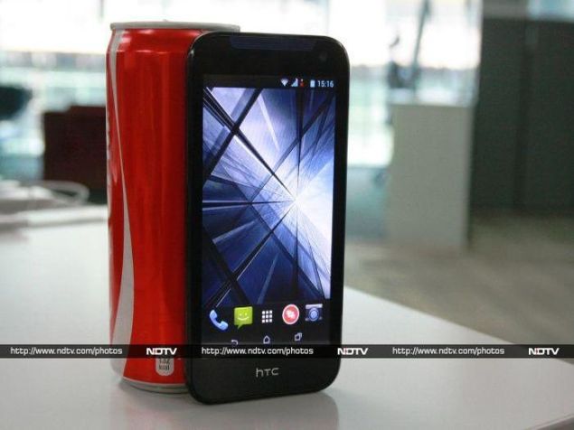
HTC Desire 310 review: A budget smartphone not worth its salt
HTC Desire 310 review: A budget smartphone not worth its salthtc_desire_310_cover_ndtv.jpg

Technology journalists and industry analysts have spent a lot of time lately discussing how vital the newly launched One (M8) is for the struggling HTC's survival. However, the company is where it is largely because it hasn't had a strong strategy in the low-end and mid-market segments. HTC has neglected a huge audience, and it also needs to get pricing right.
At least it seems as though HTC has now understood this, and has announced a few devices in the low-end segment. We have the HTC Desire 310 for review, which is HTC's first budget Android device in a long time. Along with the HTC Desire 210, which will be priced even lower when it hits stores, we hope this device can kick off a revival of sorts for HTC. Read further to find what the Desire 310 means for HTC's entry-level aspirations.
htc_desire_310_cover1_ndtv.jpg
Look and feel
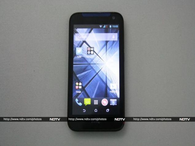
In a world in which manufacturers are clamouring to showcase how thin their devices are, HTC has created a smartphone that is rather overweight. The Desire 310 has a thickness of 11.25mm and weighs 140g. If you like a solid grip, you'll find the contours actually make for good ergonomics.
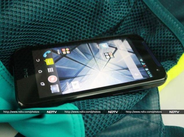
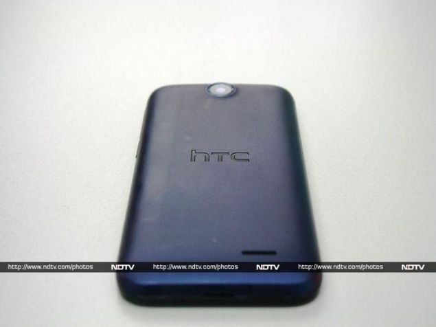
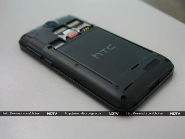
The 4.5-inch screen of the Desire 310 is great for single-handed operation. We got the dark blue variant for review, and it looks good. The phone is also available in white. The rear cover is removable, and beneath it you'll find the 2000mAh battery, slots for both SIM cards, and a slot for the micro-SD card.
htc_desire_310_back_ndtv.jpg
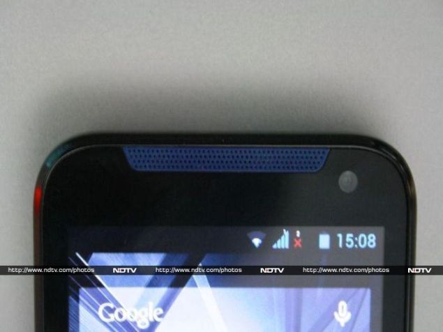
The left edge of the HTC Desire 310 is completely bare, and the right edge features the volume rocker and power button, which are too soft in our opinion and might get damaged if it is not handled with care. Above the screen are the front-facing VGA camera and front-firing speaker, which is always a bonus. HTC foregoes physical buttons for on-screen ones for navigation. In regular usage, we found that for a device of this size it was a hindrance, especially, when using the on-screen keyboard.
Features and specifications
The HTC Desire 310 has a Mediatek MT6582 quad-core processor clocked at 1.3GHz, with Mali 400MP2 graphics. The phone has 512MB of RAM, which we feel is too little. Surprisingly, the European edition of this phone has 1GB of RAM. HTC provides 4GB of internal storage of which only one gigabyte is available to use. You'll have to expand it  using a microSD, and this phone supports up to 32GB.
The HTC Desire 310 has a 5-megapixel rear camera with no flash or autofocus, which is a disappointment. The front-facing camera can shoot VGA images. Surprisingly, the rear camera can capture video at 1080p. The two Micro-SIM cards work in active standby mode.
htc_desire_310_dual_SIM_ndtv.jpg
The 4.5-inch screen has a resolution of 854x480, and in our opinion is dull and lifeless. The viewing angles are bad and legibility under sunlight takes a hit. As we mentioned earlier, the phone has on-screen buttons which take up a portion of the screen, and especially because an older version of Android has been used, apps lose screen space to the black button bar.
Software
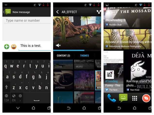
The HTC Desire 310 runs Android 4.2.1 (Jelly Bean) but not the usual customised Sense UI interface. The BlinkFeed visual news reader is still present and the app drawer is borrowed from Sense, but all the icons are stock Android.
The phone has three homescreens, but you can add up to three more. To the left of the default screen is BlinkFeed, HTC's attempt to aggregate content from various sources including social networks, much like the very popular Flipboard. It is a fairly convenient tool and we ended up using it quite often.
desire_310_screenshot.jpg
HTC bundles a few third-party apps with the phone, such as WeChat, Twitter and Polaris Office Suite, all of which could be useful. A video highlights app collates pictures to create an instant slideshow to which a user can add music or a theme. It is nothing fancy, but is definitely an interesting inclusion.
Camera
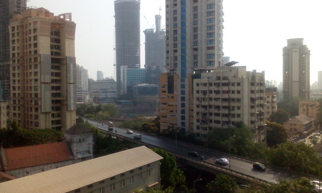
We want to get one thing out of the way: the HTC Desire 310's 5-megapixel rear camera is quite bad. This is mainly because it doesn't have auto-focus. Images have a lot of noise, even those captured in daylight. In low light, it is almost unusable. The rear camera captures video at 1080p which is totally pointless since that kind of resolution goes waste when the footage itself is devoid of any detail.
htc_desire_310_camera_ndtv.jpg
(click for full size)

There is no hope with the front camera either, since the maximum resolution is a lowly 640x480. 

The camera app is stock and there are a few modes like panorama and HDR available but there is no point in discussing them since we expect users won't even bother with this camera.
Performance
Ever since Google introduced Ice Cream Sandwich or Android 4.0 to the world, it was clear that optimisation could work wonders. But performance is still highly dependent on what a smartphone packs under its hood. The HTC Desire 310 features a quad-core Mediatek MT 6582 processor clocked at 1.3GHz. Let's check how it performs.
htc_desire_310_speaker_ndtv.jpg
The AnTuTu benchmark returned a score of 17,136 which is fairly decent for phone in this price range. Quadrant gave us a result of 5,962 which is once again, an acceptable score. However, we faced a roadblock when we tried to run the GFXbench test. It just didn't work. 3DMark's Ice Storm runthrough returned a score of 3,090 which indicates casual gaming will just about be okay. All scores aside, we want to reiterate that 512MB of RAM is insufficient and could be one of the things that caused the device to stutter and lag in day-to-day operation.
The battery lasted us 6 hours, 23 minutes during our continuous video loop test before it died. This should translate to a day's usage in real-world conditions. The one department where HTC shines is the quality of sound from both, the speaker and the bundled earphones. Could it be a Beats branding hangover? 
The phone cannot handle 1080p videos without artefacting or skipping frames, but it managed to play 720p videos just fine, which is what we expected. It had no problems making calls even in low network areas and the clarity of sound during phone calls is really good. 
htc_desire_310_front_ndtv.jpg
Verdict
The HTC Desire 310 has very few positives going for it. You could use it as a phone with basic media playback features, but not much more than that. Moreover, HTC is not doing itself any favours by pricing the phone at Rs. 11,358 which is very close to the Moto G - by far a superior performer. HTC needs to do a lot better than this to do well in today's mid-budget market.

HTC Desire 310 in pictures
  • Design
  • Display
  • Software
  • Performance
  • Battery life
  • Camera
  • Value for money
  • Good
  • Good music playback
  • Addition of Blinkfeed is a nice touch
  • Bad
  • Terrible camera
  • Underwhelming display
Read detailed HTC Desire 310 review


Hi guys If u like this post please leave a comment in comment box... comment box will top right of every post and bottom of every post. its useful for me give a better information.. check top of the blog there is menu bar in that go to comments i replied for u r comments because there is no direct option for reply for u r comments. if u want to give any suggestion in bottom of blog there is contact information option please leave a msgs with u r mail id sure i will get u.


LG L90 Dual Review: New Wine in an Old Bottle


LG L90 Dual Review: New Wine in an Old BottleLG_L90_hand2_ndtv.jpg

LG competes with Samsung in nearly every imaginable category of electronics and appliances, but while both companies are well known for TVs, refrigerators and air conditioners, Samsung clearly has the lead when it comes to smartphones. Nearly everyone knows of Samsung's Galaxy line of phones, but there aren't that many who could even name a recent LG model.
That's why we're particularly interested in LG's latest launch, the L 90 Dual. This phone is part of LG'sthird-generation L series, which is the company's mid-budget range. This phone is priced with the mass market in mind, but there's tough competition to overcome. Let's see if Samsung has any reason to be worried.
LG_L90_angle_ndtv.jpg
Look and feel
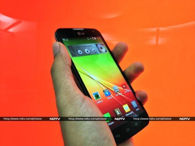
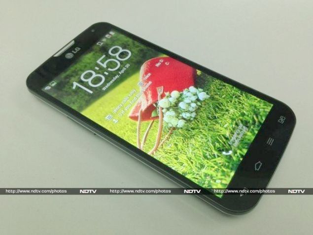
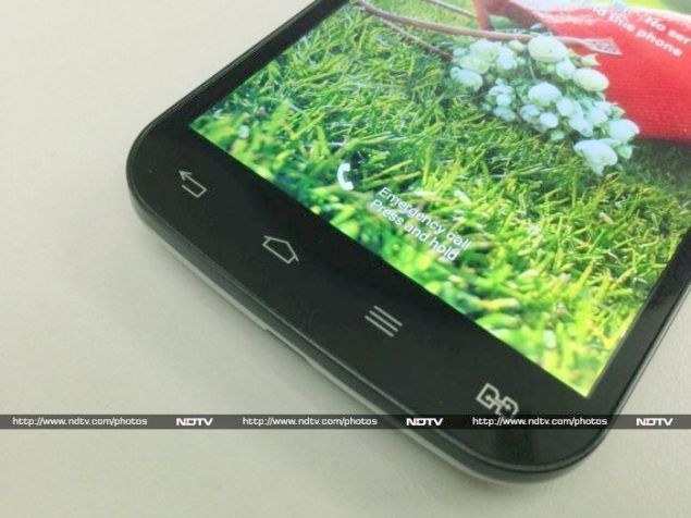
The LG L90 is a fairly ordinary-looking phone; not too big and not too small. Its most distinct feature is the rather busy line of capacitive touch buttons beneath the screen. While most phones today aim for a minimalist style or use backlit buttons that fade away when not needed, LG has four large icons printed right there. The standard Home and Back buttons are placed next to a Menu button (more on this later) and a special button for LG's dual-SIM management settings.
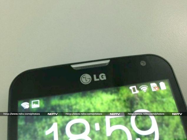
Above the screen, there's a big silver earpiece and LG logo. We have to say all these distractions on the front face make the phone look a lot less appealing than some of its contemporaries.
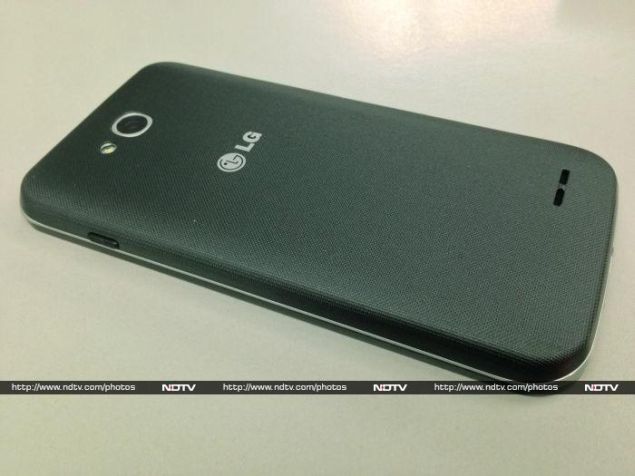
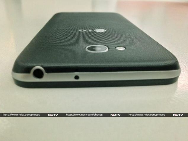
The removable rear panel is made of grey plastic with a very rough texture. It's great for grip, but not the most comfortable in our hands. The L90 Dual actually looks quite good from this angle, with silver accents around the phone's edges and surrounding the camera lens, though we could have done without another LG logo in the centre of the rear panel.
LG_L90_rear_ndtv.jpg
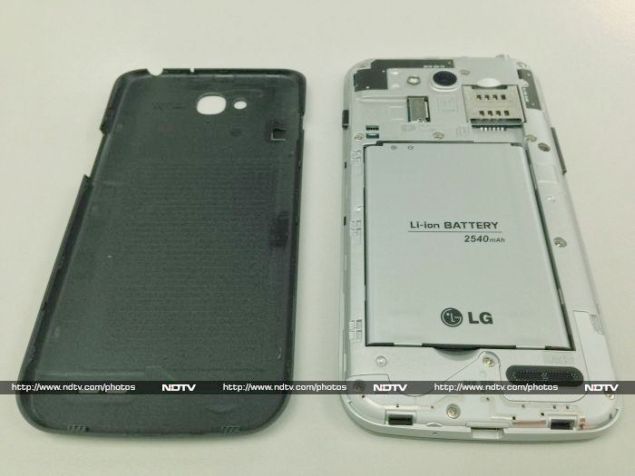
The power button on the right and volume rocker on the left are both thin and shallow, and we sometimes had to fumble around while reaching for them. Under the cover, there's space for two SIM cards, a microSD card, and a decent 2,540mAh battery. You'll find an infrared LED on the top, right next to the 3.5mm headset socket, with a standard Micro-USB port on the bottom.
When you power it on, you'll immediately notice that the screen has a grainy quality to it. That's because despite having a 4.7-inch screen, the resolution is only a lowly 540x960, commonly known as qHD. This was a huge disappointment to us, since even 720x1280 is low-end these days.
We like how light the L90 Dual is, and if not for the sandpapery texture, it would feel very good to hold and use.
LG_L90_buttons_ndtv.jpg
Specifications and software
LG has gone with a fairly competent Qualcomm Snapdragon 400 processor, which is something we like seeing in this price range rather than lower-performing processors with inflated core counts. It's supported by 1GB of RAM and 8GB of built-in storage space. Oddly, our review unit reported a total capacity of only 3.87GB.
Connectivity comes in the form of Infrared, Bluetooth 4.0, Wi-Fi b/g/n and of course USB. The L90 has A-GPS and an accelerometer as well as a digital compass. There's an app that lets you use the IR emitted to control your TV, set-top box and home theatre receiver.
While most of the spec sheet reads like something a year or two old, the L90 actually runs Android 4.4.2. LG's custom UI is typically over the top, with extensive visual tweaks and loads of little features scattered around. It just doesn't seem as though this phone was designed for KitKat - the most obvious example being the Menu button on the front panel which has been completely deprecated. You'll wind up seeing the Android menu overflow button on loads of screens, and tapping both that and the actual button bring up the same menu, just on different parts of the screen. It's a complete waste, and makes the phone less easy to use too.
LG_L90_top_ndtv.jpg
Since there are already four buttons beneath the screen, there's no place for a Recents button. You'll need to long-tap the Home button to bring up the list of recently used apps. It's just awkward and unnecessary. Without backlighting, it's also easy to miss the off-centre Home button in the dark.
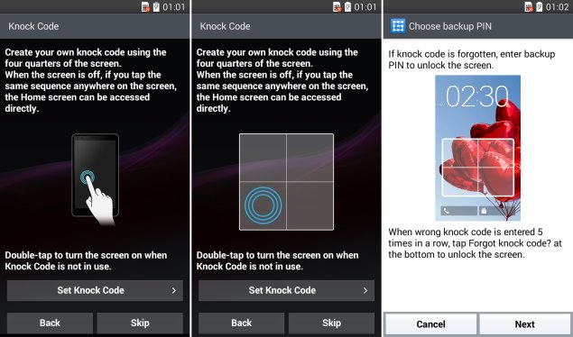
LG's headline software feature, which is prominently advertised on the L90 Dual's box and web page, is called Knock Code. This is a security method similar to the pattern swipe option, except that you tap within a square area on screen rather than drawing a line between points. It works really well, even though there are only four "zones" to tap, rather than the 16 points you get with a pattern swipe code.
There's no need to actually knock the screen; ordinary taps will do. The method does not check for the actual rhythm or timing you use while tapping, only the sequence. It's really easy to use and those paranoid about security will like the fact that there's no traceable smudge on the screen that can be used to decipher your code.
LG_L90_knockcode_ndtv.jpg
Your code can have up to seven taps, and you'll have to set up a four-digit PIN to fall back on. We like what LG has come up with here - it's far less gimmicky than face recognition and some of the other tricks we've seen over the years. You can also double-tap the screen to wake the phone from sleep.
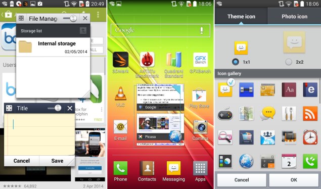
LG throws in tons of animations and flourishes, including three options for the effect you see when the phone goes into standby, and seven options for the effect used when flipping between home screens. Icons on the home screen can be scaled to four times their default size, and ones such as the Android browser icon will become an interactive list of recently visited tabs which can be scrolled through in place. For some unimaginable reason, there's also an option to change icons, with a few dozen preset options as well as the ability to create a new icon out of any saved image.
The notifications area and options screens are prime targets for customisation, and LG has gone quite wild in both places. There's a row of quick toggle buttons and another of shortcuts in the notifications area, plus a brightness slider that's always on. The options have been divided into four tabs, and several of the individual screens, such as the battery usage graph, are completely unique to LG. Animations take way too long, and there were too many little things we needed to discover (the choice of screen unlock methods can be found under Display rather than the more relevant Security tab) which really made us miss the simplicity of stock Android at times. Even LG's keyboard is garish and cluttered.
LG_L90_interface_ndtv.jpg
You can set the phone to keep the screen on while your face is in front of it, and pause video when you move away. Thankfully, options like these are off by default. LG advertises 100 free minutes' worth of calls using the Nimbuzz app, which is not preloaded. There are also loads of obscure features which are named but not always explained, such as Eco Mode (a battery saving option), Clip Tray (a clipboard that can hold multiple things), Plug & Pop (lets you launch apps automatically when connecting a headset), Privacy Keeper (prevents caller ID information from being displayed), Quick Memo (take a screenshot and draw over it before sharing it) and even more.
One useful tool is Qslide - that row of shortcuts in the notification area actually launches apps in floating windows, rather than fullscreen. You can have two open at once and even adjust their opacity. They're always on top till you dismiss them. This is a neat trick on higher-end handsets, but on the L90's low-res screen, it's all a bit pointless. Yes, floating apps could come in handy, but not that often.
LG_L90_fronttop_ndtv.jpg
Camera
LG has of course customised the camera app, but it's fairly straightforward. You get a choice of shutter release sounds (because why not), basic colour effects, a "cheese shutter" which detects smiles, a timer, and flash control. Interestingly, there's an option to disable autofocus, and a dedicated face tracking autofocus mode.
Photos taken with the 8-megapixel rear camera are actually very good. There's definitely a lot of compression, but details are generally well defined. Distant objects become a bit blurry and edges aren't all that sharp, but close-ups look good, and you won't notice the flaws unless you zoom in to 100 percent.
Video can go up to 1080p, but the default is 1280x720. Again, we liked what we saw in daylight, though low light wasn't all that good. The front camera has a lowly VGA resolution, and we weren't impressed by anything it managed to achieve.
LG_L90_camsample_ndtv.jpg
(Click to see full size)
Performance
The LG L90 struggled quite a bit in our benchmark tests, often losing out to much cheaper devices such as the Motorola Moto G and Xolo Q1100. Performance trailed both those two models in nearly every test, except some of the graphics-intensive ones, though this could be explained away by the lower screen resolution which means there's less work to do.
The L90's screen was the device's biggest letdown. It isn't all that vivid unless you really push the brightness level up, and viewing angles are disappointing. The low resolution is noticeable no matter what you do, and text is especially jarring. Maybe we're just used to higher pixel densities, but we felt somewhat shortchanged by the L90.
HD 1080p videos were laggy and skipping around the timeline often resulted in long pauses while the phone caught up. High-bitrate clips were unplayable, but stepping down to 720p seemed to take care of most problems. Sound was surprisingly clear though, and this phone can get pretty loud.
We didn't notice anything out of the ordinary with the L90 Dual's battery life in ordinary use, but we encountered bizarre behaviour in our battery test. On its first run, the LG L90 lasted an atrocious 4 hours, 24 minutes. We ran the test again out of sheer disbelief, and got a much more impressive time of 10 hours, 34 minutes. All conditions and settings on the phone were consistent between runs, so we hope the first score was just an aberration with our review unit. 
LG_L90_cover_ndtv.jpg
Verdict
We have mixed feelings about the LG L90. It could have been a great phone, but it just feels old and underpowered, with modern software bogging it down. LG seriously needs to take care of issues like the pointless Menu button, and tone down its UI. Its biggest problem is its pricing. Even the current street price is well above the level that competitors such as the Moto G and Xolo Q1100 sell at, andboth models beat it in terms of specifications as well as performance.
LG is going to have to do a lot more work developing products and understanding the markets. The L90 could be a good budget phone, but it just isn't right at this price.

LG L90 Dual in pictures
LG L90 Dual

LG L90 Dual

Rs. 19000
  • Design
  • Display
  • Software
  • Performance
  • Battery life
  • Camera
  • Value for money
  • Good
  • Comes with Android 4.4
  • Knock Code is innovative and easy to use
  • Lightweight, easy to grip
  • Bad
  • Low-resolution screen
  • Mediocre performance
  • Awkward physical button scheme
  • Inconsistent battery life test results.
Read detailed LG L90 Dual review


Hi guys If u like this post please leave a comment in comment box... comment box will top right of every post and bottom of every post. its useful for me give a better information.. check top of the blog there is menu bar in that go to comments i replied for u r comments because there is no direct option for reply for u r comments. if u want to give any suggestion in bottom of blog there is contact information option please leave a msgs with u r mail id sure i will get u.


Alleged iPhone 6 Dummy Video Tips 6.5mm Thickness and Single-LED Flash

Alleged iPhone 6 Dummy Video Tips 6.5mm Thickness and Single-LED Flashapple_iphone_6_dummy_alleged_video_zing_screenshot.jpg

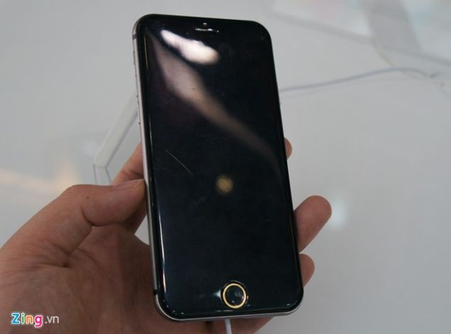
After a number of leaks and rumours for the yet-to-be-announced next Apple iPhone, tipped as theiPhone 6, we now have another clear look at the alleged iPhone 6's dummy, courtesy a video from Vietnam.
The images show what seems to be the rumoured 5.5-inch screen-sized iPhone 6, which said to be similar in shape to the current generation iPod touch. Previously rumours also indicated the device has a current-generation iPod touch-like design because it is actually the next-generation iPod touch - though this seems a little unlikely. The grey coloured device seen in the video (via GSMArena) was found at Apple8, a Vietnamese store.
It has been reported that the handset might come with an aluminium body, and plastic lines on its back panel that are meant to separate the antenna elements. The iPhone 6 dummy was said to be lightweight, though of course, the weight of the dummy is not necessarily indicative of the weight of the actual iPhone 6.
While on Wednesday we saw some images giving a slight glimpse of what the dimensions for the next iPhone can be courtesy some leaked cases, from these latest images it has been understood that the dummy iPhone 6 measures roughly 6.5mm in thickness. There is still no word on the length and breadth of the actual device.
Furthermore, the back panel is said to sport a single-LED flash instead of dual-LED as seen on the Apple iPhone 5s. The website also mentions that the alleged iPhone 6 will be introduced officially in September.
A recent report also states that the Cupertino-based company is testing a higher screen resolution of 960x1740 pixels on at least one of the two iPhone models (5.5-inch and 4.7-inch screen variant) likely to debut this year. It has been also speculated that the next generation handset will come with a pixel-tripling (3X) mode.
Previously it was rumoured that the high-end 5.5-inch iPhone model would boast of a higher screen resolution at 1080x1920 pixels (full-HD), with a pixel density of 401ppi, while the 4.7-inch model is said to pack a lower resolution screen at 750x1334 pixels and might offer a pixel density of 326ppi.


Hi guys If u like this post please leave a comment in comment box... comment box will top right of every post and bottom of every post. its useful for me give a better information.. check top of the blog there is menu bar in that go to comments i replied for u r comments because there is no direct option for reply for u r comments. if u want to give any suggestion in bottom of blog there is contact information option please leave a msgs with u r mail id sure i will get u.


Samsung Galaxy Tab S Expected to Be Launched at Scheduled June 12 Event

Samsung Galaxy Tab S Expected to Be Launched at Scheduled June 12 Event

samsung_galaxy_premiere_2014_invitation.jpg
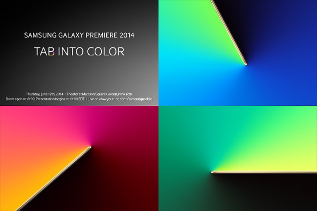
Samsung on Thursday has sent out invites for the Samsung Galaxy Premiere 2014 event in New York City, scheduled to be held on June 12. The multi-coloured invitation to the event reads, "Tab into color", indicating that the South Korean giant has plans to introduce new tablets only, probably with the colourful OLED display.
The company is expected to announce a tablet series, rumoured to be called Samsung Galaxy Tab S. The series is said to feature two AMOLED display size variants, 8.4-inch and 10.5-inch, with the same specifications. Other than these tablets, Samsung is rumoured to be developing a huge Galaxy tablet with a 13.3-inch AMOLED display, but we are not sure that it will also be introduced on this event.
For the rumoured Galaxy Tab S series, Samsung is said to be using its first AMOLED tablet displays since 2011. The Galaxy Tab S series is also said to be the first to feature fingerprint sensors.
Earlier there were reports claiming that Samsung will offer four variants in the new series as Galaxy Tab S 8.4-inch Wi-Fi (SM-T700), and LTE (SM-T705), Galaxy Tab S 10.5-inch Wi-Fi (SM-T800), and LTE (SM-T805). One of the tablets has also been spotted in leaked live images suggesting similar design to the Galaxy NotePRO (Review | Pictures).
Last year in an event in London around same time, Samsung unveiled the Galaxy S4 miniGalaxy S4 ActiveGalaxy S4 Zoom and a range of Ativ devices. Although the invite doesn't hint anything about the much-anticipated Samsung Galaxy S5 Prime and other variants, but we are hopeful that company might give a sneak preview. The alleged Galaxy S5 Prime is also expected to be launched in mid-June.


Hi guys If u like this post please leave a comment in comment box... comment box will top right of every post and bottom of every post. its useful for me give a better information.. check top of the blog there is menu bar in that go to comments i replied for u r comments because there is no direct option for reply for u r comments. if u want to give any suggestion in bottom of blog there is contact information option please leave a msgs with u r mail id sure i will get u.


iOS Leads Android in US, Canada Mobile Web Traffic Share: Study

iOS Leads Android in US, Canada Mobile Web Traffic Share: Study

chitika_report.jpg
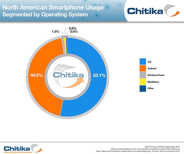
In North America (Canada and the US), Windows Phone now accounts for the third largest share in mobile Web traffic, overtaking BlackBerry for the first time, according to a report by mobile ad network Chitika. The top spot remains a contest between iOS and Android, at 53.1 percent and 44.5 percent of all mobile Web traffic respectively, with Windows Phone accounting for only 1 percent of traffic, ahead of BlackBerry's 0.8 percent.
According to a post on Chitika's website, the company measured "hundreds of millions of US and Canadian smartphone-based online ad impressions between February 1 and April 30, 2014."
The company states that ad impressions for Windows Phone have been relatively flat in this two month period, while BlackBerry has continued to decline steadily.
The company also pointed out that while iOS users continue to generate the majority of North American smartphone Web traffic, the upcoming flagship device launches from large manufacturers could affect the balance.
The firm did not share manufacturer specific data in its report, so just based on this information, it isn't possible to say whether the Android traffic comes from high end flagship devices or the cheaper entry level handsets; nor is it clear if any one manufacturer has a lead in this metric.
Chitika concludes that the flat rate of growth for Windows Phone over the past several months makes it likely that Apple and Google's offerings will remain frontrunners stateside.
Globally the picture is a little different. Both Android and Windows Phone have been gaining, particularly in developing markets, and according to a February report by IDC, Android accounted for 78.1 percent of the global smartphone share, while Windows Phone saw 46.7 percent year-over-year growth.


Hi guys If u like this post please leave a comment in comment box... comment box will top right of every post and bottom of every post. its useful for me give a better information.. check top of the blog there is menu bar in that go to comments i replied for u r comments because there is no direct option for reply for u r comments. if u want to give any suggestion in bottom of blog there is contact information option please leave a msgs with u r mail id sure i will get u.


Google Works on Tool to Remove Links

Google Works on Tool to Remove Links

google_logo_mirrors_sand_reuters.jpg
Google will announce by the end of the month a mechanism for consumers to request that links to information about them be removed from the company's search engine, a leading European regulator said Thursday. It was one of the first signs that Google was working through how to operate after a court ruling said consumers could make such requests.
Ulrich Kuhn, head of the technical department at Hamburg's data protection regulator, one of Germany's leading data protection agencies, said a basic online tool for people to ask Google to take down potentially harmful links would be in place in about two weeks.
Google would not comment on when the mechanism would be online or how the tool would work.
In a statement, the company said Tuesday's ruling by the Court of Justice of the European Unionwould have implications for how the company handles requests for information to be taken down.
"This is logically complicated," Google said in a statement. "As soon as we have thought through exactly how this will work, which may take several weeks, we will let our users know."
The decision by Europe's top court to allow individuals to demand that Google take down links in certain instances has been seen as a landmark case in the Continent's push toward increased data privacy.
The court's ruling centered on the so-called right to be forgotten, which would allow people to ask Google to remove links to certain online information about themselves.
European data protection authorities say that since the ruling, the number of complaints from people seeking ways to take down online links to their past activities has increased.
Kuhn said his office had received almost 20 complaints from Germans since Tuesday. On average, two people had contacted the authority each week before the Google court decision.
"The ruling took us by surprise," said Kuhn, who contacted Google on Wednesday to find out how it would adjust to the court's decision. "The court has cemented the right to be forgotten into European law."


Hi guys If u like this post please leave a comment in comment box... comment box will top right of every post and bottom of every post. its useful for me give a better information.. check top of the blog there is menu bar in that go to comments i replied for u r comments because there is no direct option for reply for u r comments. if u want to give any suggestion in bottom of blog there is contact information option please leave a msgs with u r mail id sure i will get u.


Sony Xperia Z2 Review: A Top-Tier Contender


Sony Xperia Z2 Review: A Top-Tier Contender

sony_xperia_Z2_new_angle_ndtv.jpg
Sony is steadily climbing up the smartphone market share rankings, thanks to recent launches that have worked very well in their price bands. The company has had its ups and downs over the years, with a few models that have caught on, but no long-running success till very recently. Samsung is the dominant force in India as far as Android phones go, and Sony is only just beginning to establish itself as an alternative, with a distinctive identity that extends through hardware and software design.
With that said, even though the Xperia Z2 is a significant improvement over its predecessors, the Zand Z1, there isn't really any kind of standout feature for the company to shout about. Samsung'sGalaxy S5 has its heart rate monitor and health-related accessories; HTC has created a dual-camera system for the new One (M8). That's what Sony is up against, and it will have a hard time pushing the Xperia Z2 even though all its important features and specifications are totally top-of-the-line.
We've already tested the Galaxy S5 and One (M8), so now it's time to see whether the Xperia Z2 can take them on, and whether Sony's understated approach helps it or hurts it.
sony_xperia_Z2_new_screen_ndtv.jpg
Look and feel
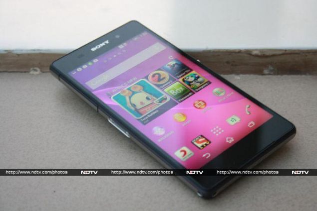
Visually, there isn't much to differentiate the Xperia Z2 from its predecessors. It's almost exactly the same size as the Z1, give or take a few millimetres here or there, but it is a bit lighter at 163g. Sony hasn't even freshened up its colour options - you still have only white, black and purple to choose between. It has the same blunt rectangular shape, like a slab of glass with slightly chiselled edges and corners.
The front and back of our review unit were perfectly black, but the sides are silver with a very deep purple trim around the edges. It's extremely subtle and you'll only see it when the light catches it at a particular angle, which gives the whole phone a bit of character.
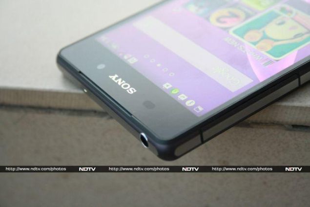
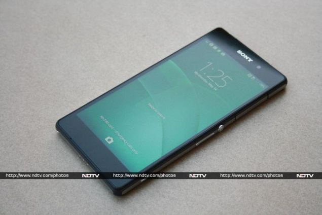
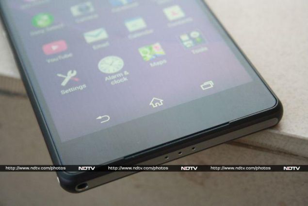
The front face is almost completely black, thanks to the move to on-screen buttons. There's only a classic Sony logo on top, with the front camera lens peeking through the black glass next to it. You can barely see the twin cutouts in the plastic edging which house the front-firing stereo speakers, except when LEDs in the upper cutout light up to notify you of calls, messages or charge status.
sony_xperia_Z2_new_topfront_ndtv.jpg
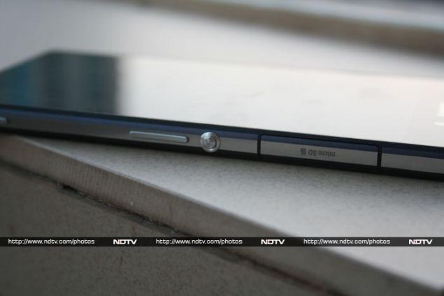
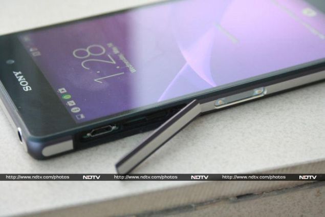
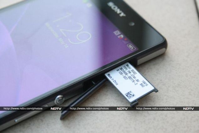
Sony's distinctive round power button is in its now-familiar spot in the middle of the right edge, with the volume rocker and camera shortcut button below it, and a flap above it protecting the microSD card slot. Sony's magnetic charging connector is on the opposite side, along with another flap which protects the Micro-USB charging port and SIM card slot.
The flaps are lined with rubber, which was necessary to ensure waterproofing and dustproofing - Sony says the Xperia Z2 has an IP58 rating, which means it should be able to withstand up to 30 minutes of immersion in up to 1.5m of freshwater. The 3.5mm headset jack on top isn't protected, and there are microphone holes on the top and bottom, but the rear panel isn't removable and the battery is sealed inside.
sony_xperia_Z2_new_rear_ndtv.jpg
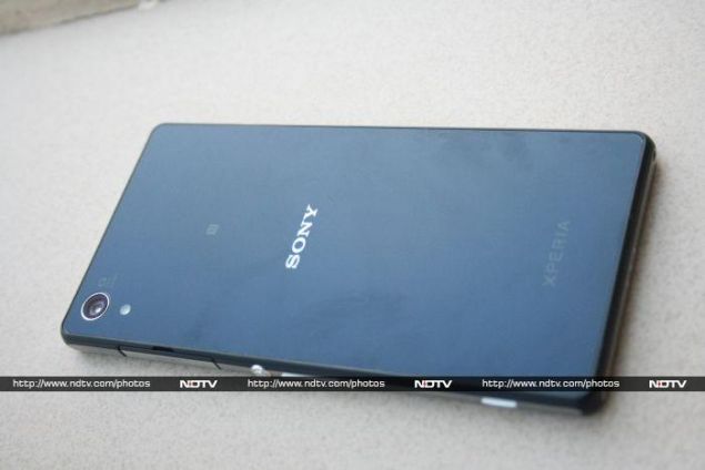
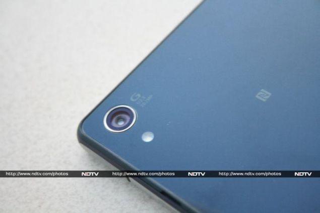
The 20.7-megapixel camera lens in ringed with silver and placed in the upper left corner of the rear panel, along with an LED flash. Despite the fact that all regulatory messages are hidden away on a retractable tab under the microSD card flap, Sony clearly couldn't resist littering the back with a logo for the camera, one for NFC, another Sony logo and an Xperia logo as well. Both the front and back are highly reflective and pick up fingerprints like crazy.
The Xperia Z2 is a chunky phone, and it felt solid in our hands. It isn't the most comfortable to hold, and the edges where glass meets metal are just a bit too rough. Still, it feels solid and imposing, without being loud. We really like what Sony's managed to pull off - it's only a slight refinement of its predecessors' designs, but somehow doesn't feel old.
sony_xperia_Z2_new_buttons_ndtv.jpg
Features and specifications
It seems you can't be a flagship phone in 2014 without a Snapdragon 801 processor (or equivalent). Sony has gone with the flow, but the one in the Z2 is a tiny fraction slower than the one in the M8, at 2.3GHz instead of 2.5GHz. On the other hand, there's 3GB of RAM rather than the 2GB HTC went with.
The 16GB of built-in storage can be expanded by up to 128GB. MicroSD cards of that capacity are rare and expensive now, but it's nice to know they'll work in the future. Wi-Fi b/g/n/ac and Bluetooth 4.0 are standard, but Sony also includes NFC. There's no infrared remote control, which is something both primary competitors offer.
The screen is a large 5.2-inch full-HD display, and Sony has applied its Bravia-derived "Triluminous" and "X-reality for Mobile" buzzwords to it. The screen is pretty sharp, and blacks are indeed quite deep. It isn't the brightest or most vivid in its class, but it's still a fantastic screen to watch movies and play games on.
sony_xperia_Z2_new_camera_ndtv.jpg
Sony pays equal attention to sound, and there are plenty of buzzword-toting enhancements. The twin front-firing speakers definitely add an important dimension to movies and games too, and we wish this was more standard on smartphones.
The other major feature is the 20.7-megapixel camera. Sony is particularly proud of it, touting the unusually high pixel count as well as a sensor that's claimed to be 30 percent larger than standard. We're particularly intrigued by the claim that the Z2's camera is "on par with [Sony's] compact digital cameras". Pretty much every parameter is touted as superior - low light performance, contrast, clarity, depth, colour accuracy, detail, and lack of noise. The dense sensor is even supposed to be able to replicate optical zoom, by trading image size for clarity.
Of course there's also 4K video recording. If Samsung hadn't beaten Sony to market, this would have been an exclusive feature. If you step down to 720p, you can shoot at up to 120fps and add a dramatic slow-motion effect to your clips.
sony_xperia_Z2_new_port_ndtv.jpg
Software
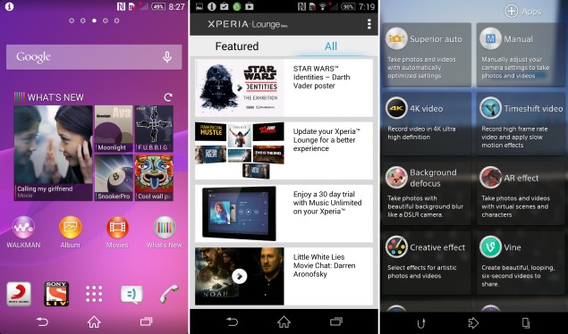
Android 4.4 brings several important improvements to the user interface, and Sony's Xperia UI customisations are also pretty extensive. For starters, the default wallpaper has a "live" swirl that animates on its own as you swipe between screens, and the whole thing keeps cycling between colours. It feels unnecessary and is often distracting, but of course you can just turn this off.
Sony loads up the interface with its own branded apps and content - one of the first things you see on the default home screen is a widget called "What's New", which is basically an advertisement for assorted Sony content, though only themes and recommended third-party apps show up in India. The constant refreshing is bound to eat up 3G data, so you might want to get rid of this widget entirely. On the next home screen, there's a carousel of videos and an audio player widget, both of which lead to apps preloaded with Sony content. Two of the four icons in the dock also lead to Sony apps - Liv and Sony Music Jive, which might appeal to Indian buyers but didn't have to be so in our faces.
sony_xperia_Z2_screens.jpg
The custom Walkman-branded music player can handle loads of formats including FLAC, but its design is quite frustrating. Amongst the several other apps are TrackID, a useful music identification service; WisePilot, a maps and traffic guide app; Sony Select, yet another app directory; Smart Connect, a tool to automate phone behaviour when accessories are plugged in; and Xperia Lounge, which displays - guess what? - even more Sony promotional content, except this time including special offers for Xperia device owners.
Chrome is the default and only browser. There's also Facebook, Socialife News, Vine, Line, X4 Video Player, Pixlr Express, Google Drive, Box, LinkedIn, and a view-only version of MobiSystems OfficeSuite.
Sony might have overdone it with the apps, but the general Xperia UI is surprisingly similar to stock Android. The notifications shade seems bare compared to Samsung's and LG's implementations, and even the Settings app is largely untouched. These are typically areas in which companies try to offer users more flexibility and personalisation. At least the app switcher includes four shortcuts to "small apps" - you can choose from a limited selection including the calculator, browser, screenshot utility, timer, Gmail, and calendar.
sony_xperia_Z2_new_flap_ndtv.jpg
Camera
Apart from the hardware described above, Sony has done a fair bit of work with its camera app. The default mode is Superior Auto, which hides most options in the interest of simplicity. Manual mode, despite its name, doesn't offer conventional manual controls, but instead lets you tweak settings and use different scene modes such as Soft Skin, Anti Motion Blur, Night Portrait, Document, Fireworks, and even a Gourmet mode, presumably for Instagram-worthy shots of your dinner.
The third mode is 4K video - as it turns out, videos shot in the normal camera modes top out at 1080p. The other modes, or "camera apps", include Vine, Sweep Panorama, Timeshift Burst, and AR Effect. We've seen many of these before, and some are definitely less useful than others. AR Mode is just for silly fun, Background Defocus doesn't always work or look realistic even though you can tweak it manually, and Social Live is only for compulsive Facebook sharers.
sony_xperia_Z2_camsample_ndtv.JPG
(Click to see full size)
Image quality is very impressive. We were able to take some great shots, including difficult subjects such as moving cars, birds in flight, and areas half in and half out of shadow. Colours were accurate and focusing was usually spot on, but our mileage varied when it came to capturing detail. Close-up shots fared better than landscapes. We even got some decent depth-of-field effects without any post-processing trickery. Low-light shots were impressive - in our limited testing, the flash lit up subjects evenly and even without it, there wasn't as much noise as we expected.
The camera on the Xperia Z2 is truly impressive, and we can easily imagine people buying this phone just to have something this impressive in their pockets all the time.
(Click to see full size)
Performance
Surprisingly, raw performance was a mixed bag with the Sony Xperia Z2. We never felt any slowdowns or lag in general usage, but our CPU-bound benchmarks produced consistently lower scores on this phone than they did on the Samsung Galaxy S5 and HTC One (M8). Variations ranged from slight to dramatic, but we wouldn't put down the Z2 for this since it's known that HTC and Samsung have manipulated benchmark scores in the past (and at least HTC proudly continues to do so now). Even with that in mind, the Xperia Z2 is a phenomenally fast phone, and is right at the top of the charts, ahead of last year's best performers.
The graphics-intensive tests were much more evenly matched between the three flagship phones. We did, however, notice the Xperia Z2 getting almost uncomfortably hot when running demanding tasks.
Audio and video were both excellent, and the 1080p screen is just large enough to make videos immersive without compromising on sharpness. Volume was impressive, even if the sound wasn't all that rich or clear in action scenes heavy EDM tracks.
The battery lasted for 11 hours, 42 minutes in our video rundown test. That should be more than enough to get through a full day's work, including relatively heavy video and camera usage.
sony_xperia_Z2_new_bottomfront_ndtv.jpg
Verdict
Whatever Sony's doing, it seems to be working. The third iteration of its top-end Xperia Z model is the slickest yet, with all the features that anyone today might care about, in a package that is as understated as it seems possible to create. This is undoubtedly one of the most satisfying phones to own and use.
With that said, it is still a bit too large for many people's tastes - we hope a Z2 Compact is on its way - and the squared-off body makes it a bit less comfortable to hold and use than the Galaxy S5 and One (M8). Those two phones also have their own defining features, which are admittedly pretty attractive.
The Z2 doesn't stick its neck out with anything groundbreaking, but it is probably the most well-rounded of the three (and Sony's launch offers don't hurt either). It's hard to pick between them, so you'll have to decide based on personal preferences. We're happy that Sony has delivered such a strong contender - Samsung definitely isn't the only game in town anymore.

Sony Xperia Z2 in pictures
Sony Xperia Z2

Sony Xperia Z2

Rs. 49990
  • Design
  • Display
  • Software
  • Performance
  • Battery life
  • Camera
  • Value for money
  • Good
  • Brilliant full-HD screen
  • Great performance and value
  • Excellent camera
  • Good construction quality
  • Bad
  • Tons of bloatware and Sony cross-promotions
  • Slightly unwieldy and difficult to hold
Read detailed Sony Xperia Z2 review


Hi guys If u like this post please leave a comment in comment box... comment box will top right of every post and bottom of every post. its useful for me give a better information.. check top of the blog there is menu bar in that go to comments i replied for u r comments because there is no direct option for reply for u r comments. if u want to give any suggestion in bottom of blog there is contact information option please leave a msgs with u r mail id sure i will get u.


HTML Comment Box is loading comments...
MARUTHU Copyright@2014. Powered by Blogger.